Erin Condren Life Planner 2019 | Review
Well friends, every year we await the new launch of the Erin Condren planner lineup, and the 2019 lineup is finally here! I’ve got the brand new coiled LifePlanner and its sister, the LifePlanner binder system – all so you can look at the detail and check out the prices and info BEFORE you shop!
These planners and all the accessories in this post are launching May 8, 2019. If you happen to be signed up to be an EC Insider, you get early access to these products and can shop on May 6. (Go sign up!!) I want to offer you a coupon code if you’re a first time Erin Condren customer!Head over through this link and set up an account and Erin Condren will email you a $10 coupon to use on your order!
All of the links in the post are affiliate links and I am very grateful to you if you use them! They cost you nothing, but if you order through the link, I may earn a small commission – thank you! At the end of my post, I’m going to link you to a roundup of some of my dearest planner friends who also have the new Erin Condren LifePlanners so you can check out some other reviews!
All photos are copyright, Jen Mackintosh, 2019. You are welcome to grab any photo to share or pin as long as you link back to this post directly! Thanks!
So, let’s get started! First, thank you to Erin, Sam, and the team at Erin Condren for making these products available to me early so that I can share with all of you!
This year’s theme is kaleidoscope. From EC:
True beauty lies in seeing the same thing just a little bit differently. Our interpretation of the kaleidoscope is about crystallizing your vision to transform plans into reality.
I’m smitten with the kaleidoscope theme! I think it’s a stunning combination of geometry, pattern, and color!

YOUR PLANNER – YOUR WAY
Before we go into all the details about the new 2019 Life Planner, I wanted to give you a brief outline of the customization options you’ll have if you order a LifePlanner. Years ago, I was initially attracted to Erin Condren for three reasons: the beautiful designs, the functional layouts, and the customization options. Over the years, Erin Condren has extended many of the areas we can customize our planners! Because we don’t all plan the same way! You build your planner to fit YOU! How do you plan? How do you want your planner to look? What’s most intuitive to you? We each have different planning styles; for a planning tool to be a good fit, it should reflect that style! And there are so many ways to do that with an Erin Condren Life Planner!
Planners this year start at $55.00 (both the coiled LifePlanner and the Binder System LifePlanner); adjusting some customization options will increase the price. (coil, personalization, etc.) Let’s hit the specs and the details of ALL of the CHOICES you’ll encounter as part of the ordering process for the coiled Life Planner (there are other planner options on the EC website), and after this, we’ll walk through all the photos. If you have questions let me know!
CALENDAR OPTIONS:
- 18 month planner (July 2019 – December 2020)
- 12 month planner (July 2019 – June 2020)
- 12 month planner (January 2020 – December 2019)
INTERIOR COLOR THEMES OPTIONS:
- Colorful (a vibrant, colorful planner)
- Neutral (a slate gray/soft pastel option that is streamlined and gorgeous! There is some color in this planner, but it is minimal and soft – not bright. NOTE: the planner reviewed in this post is a neutral color theme) The neutral planner has undergone a makeover from past years. The new neutral is a slate gray – from the tabs to the font text.
LAYOUT OPTIONS – Each planner contains a monthly spread (for a big picture monthly overview), followed by the weekly spread – see your week at a glance. It’s this feature that brings me back again and again. What your week looks like in your planner is up to you – you choose:
- Hourly Layout (the coiled planner pictured in this post is hourly)
- Vertical Layout
- Horizontal Layout (the Binder System planner pictured in this post is horizontal)
COIL OPTIONS:
- Gold (the planner pictured in this post has a gold coil)
- Rose Gold
- Black
- Silver
COVER OPTIONS:
- Choose your own cover to reflect your personality! Let your cover become another accessory!
- The laminated covers are interchangeable!
- Many times the colors on a cover are customizable – on the website, when you’re ordering, look for the square color swatch icon under the cover choices – if it’s there, you can choose your own colors for your planner cover!
For this review post, I’ve got two planners to review for you – the coiled LifePlanner with a gold coil and neutral hourly layout. After walking through the coiled LifePlanner, I’ll share the LifePlanner binder in neutral horizontal layout.
MY 2019-2020 PLANNER
I thought it might help if I identified which color, layout, coil, and covers I chose because they’ll be pictured throughout this review. My planner:
- COLOR: NEUTRAL
- LAYOUT: HOURLY
- COIL: METALLIC GOLD
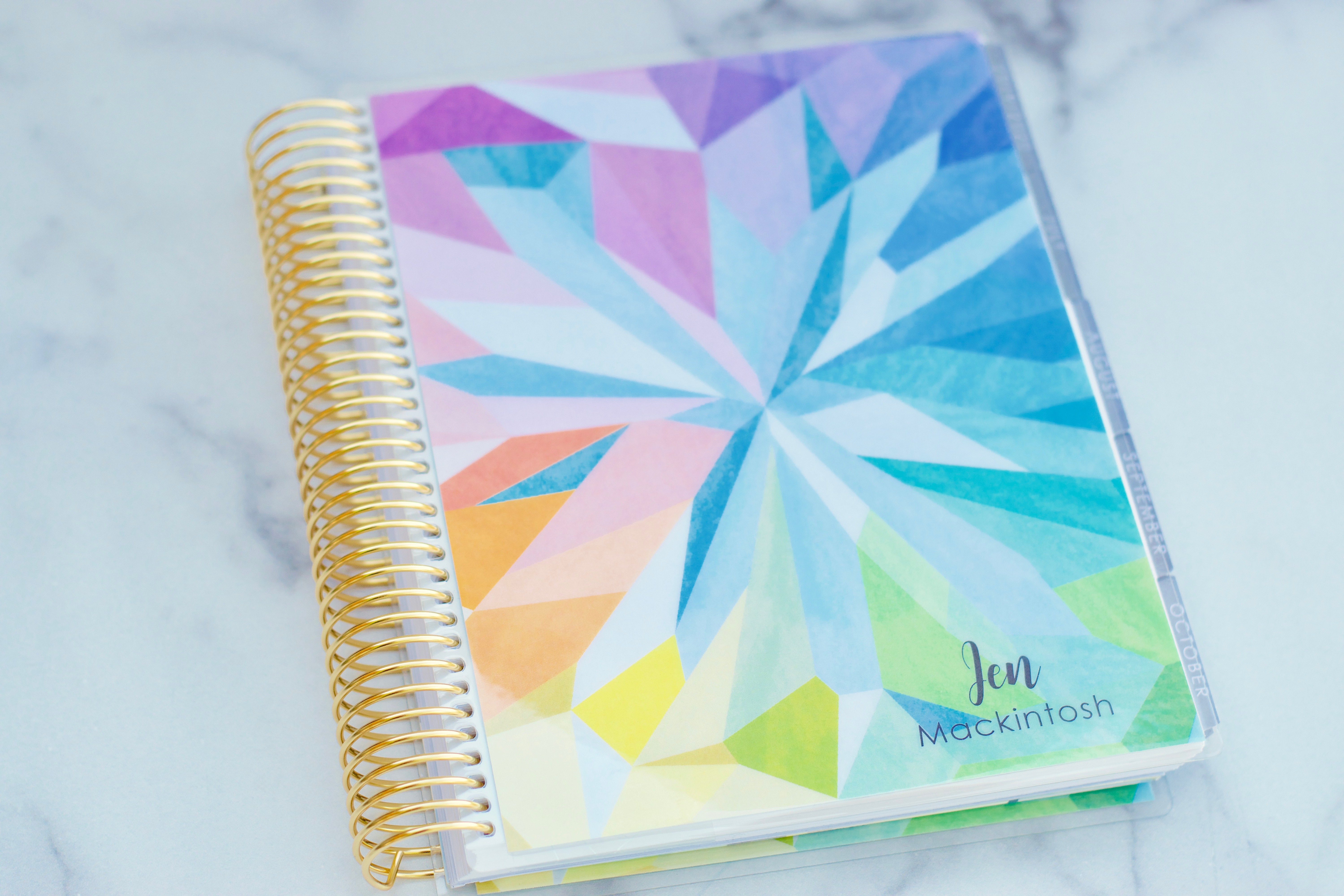
- COVERS PICTURED: KALEIDOSCOPE COLORFUL — BRAIDED BEAUTY
- CALENDAR: 18 MONTH
- BINDER: BLUSH BOOK CLOTH (it has a linen feel)
- COLOR: NEUTRAL
- LAYOUT: HORIZONTAL
- ACCESSORIES: NEUTRAL – not all of the accessories follow a neutral or colorful theme, but many of them this year do! If this was an option, all of the accessories sent to me were neutral.
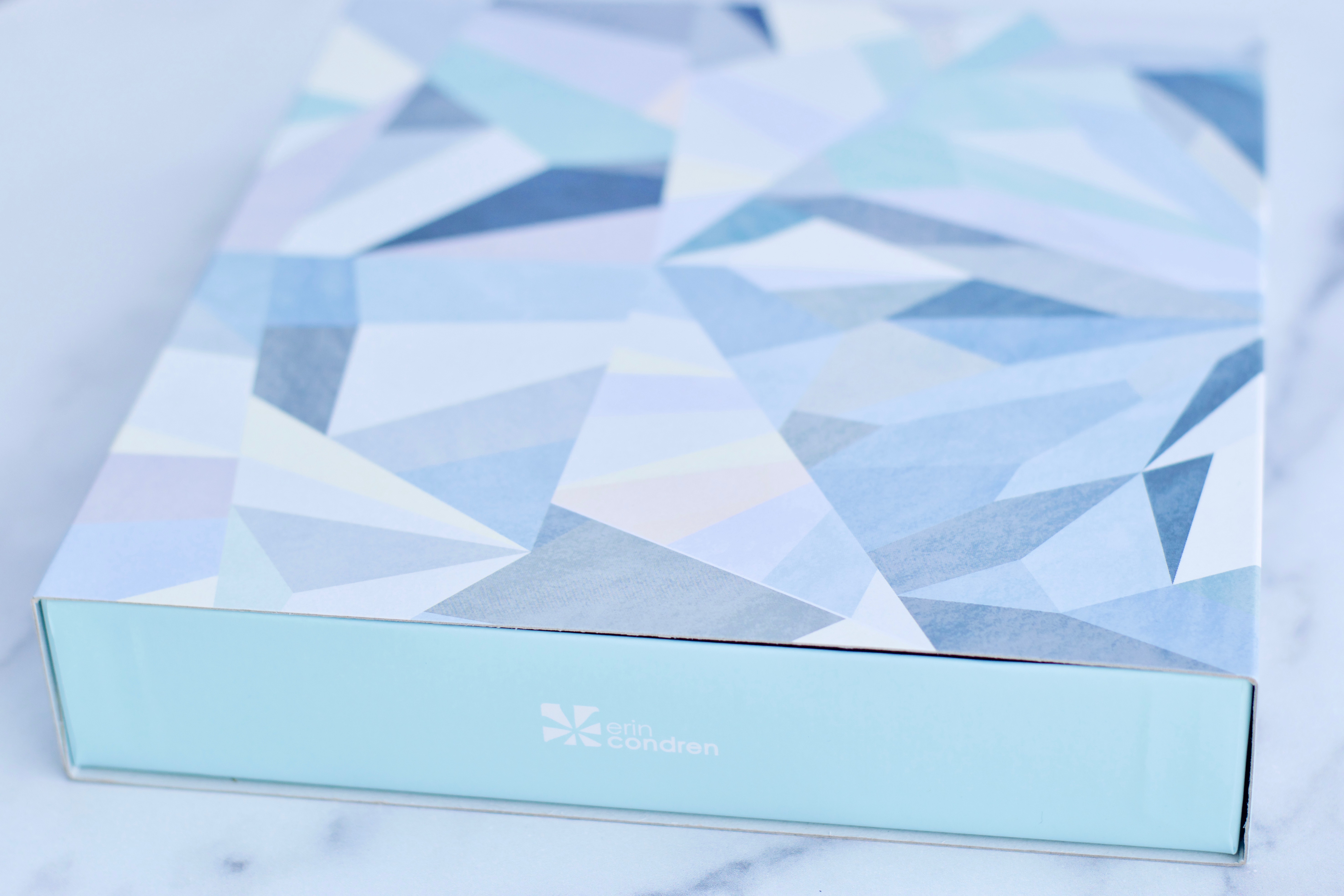
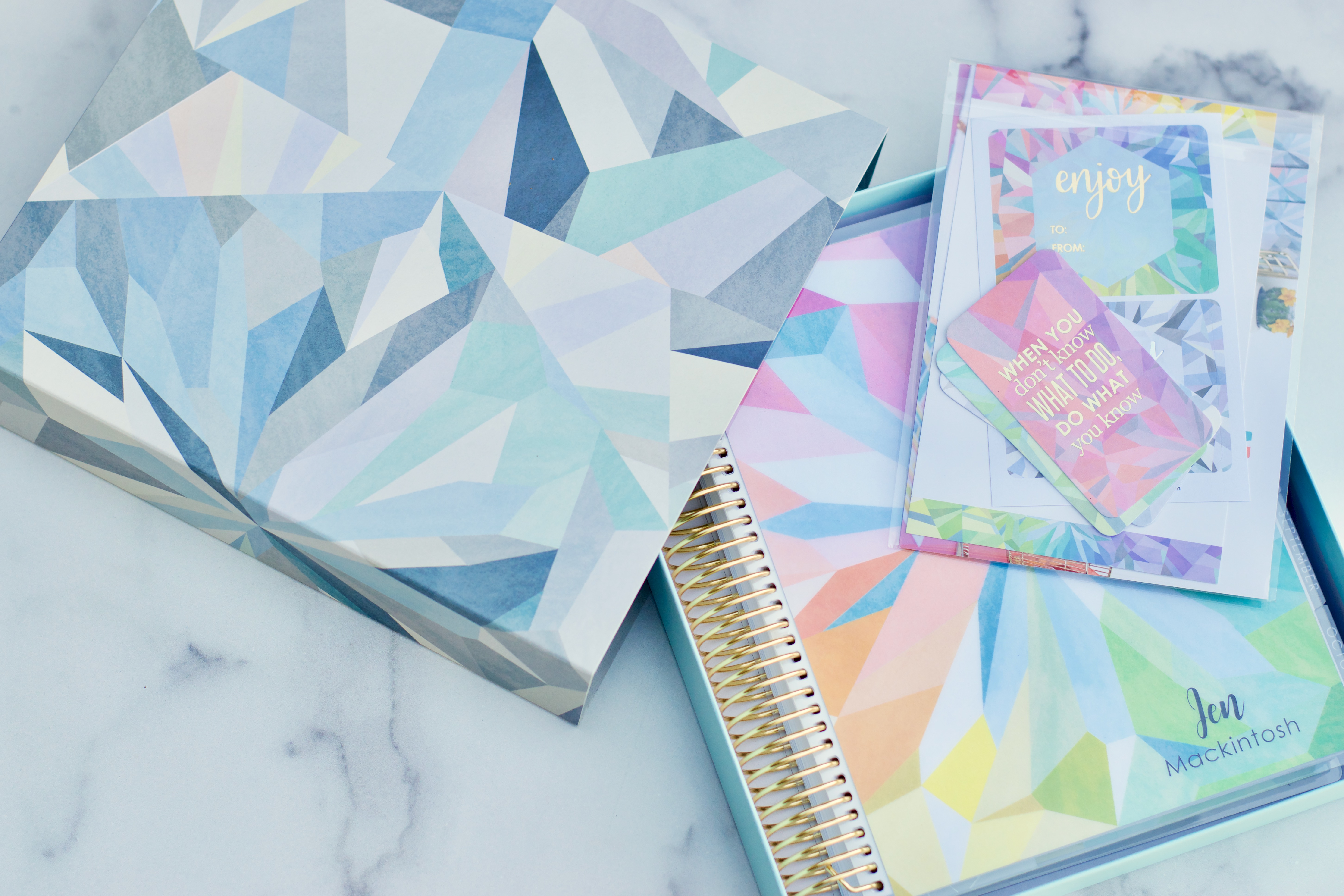
This year, Erin Condren is going to send your planner to you in a beautiful keepsake box (colorful box | neutral box)! It’s stunning and I intend to use that gorgeous light robin’s egg blue box as an organizing tool somewhere in my home – likely as a drawer organizer! You can also purchase the box individually from the website for $6.00.
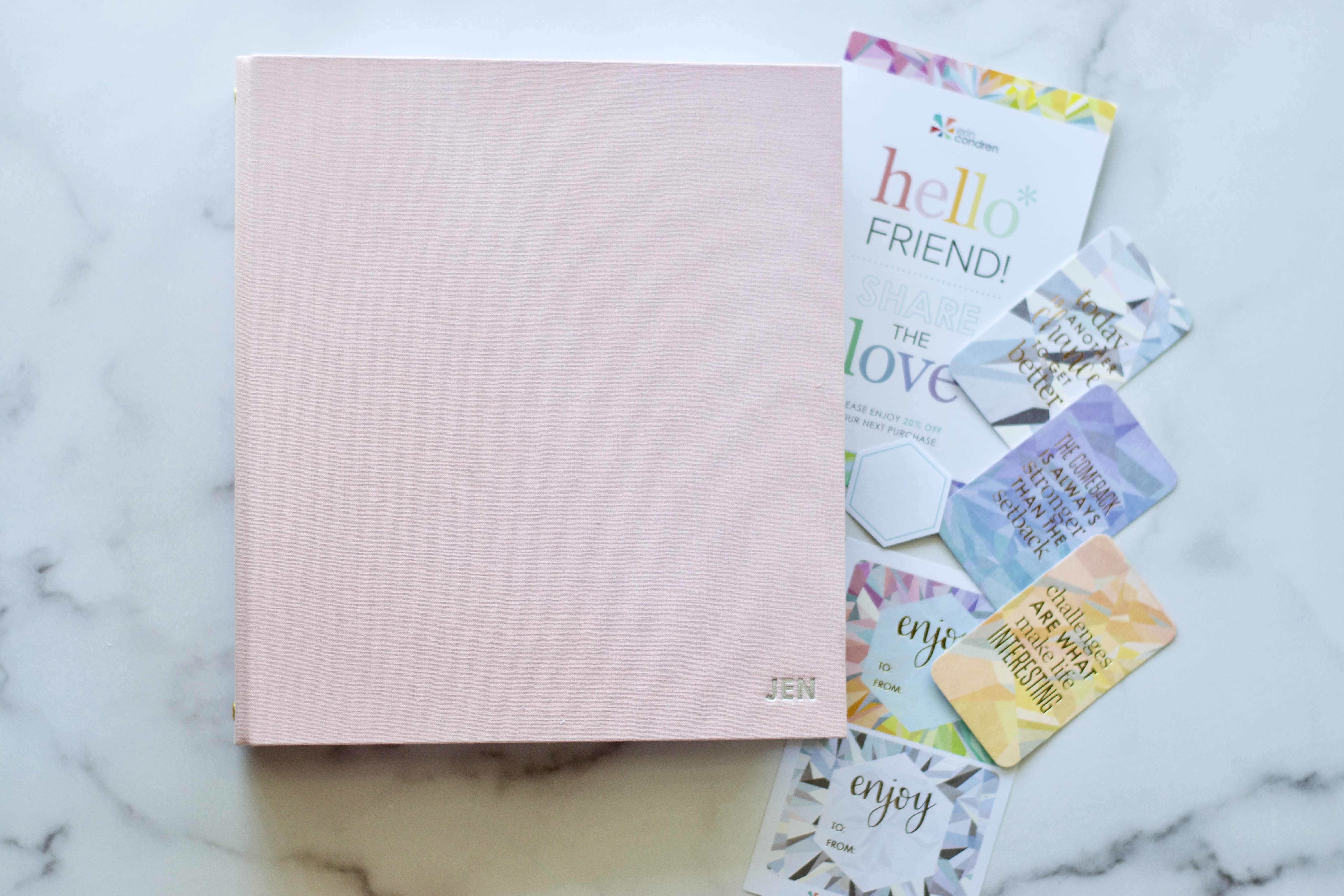
With every Erin Condren planner there is a little planner-care-package – a coupon code for future orders, a hexagon sticker (to label the year on the spine of your box – how pretty would that be on your shelf?) You also get a couple of gift labels and three compliment cards to share. In past years a clear pouch was included with each LifePlanner, but based on customer feedback there is no clear pouch included this year. The clear vinyl pouch is still available on the website.
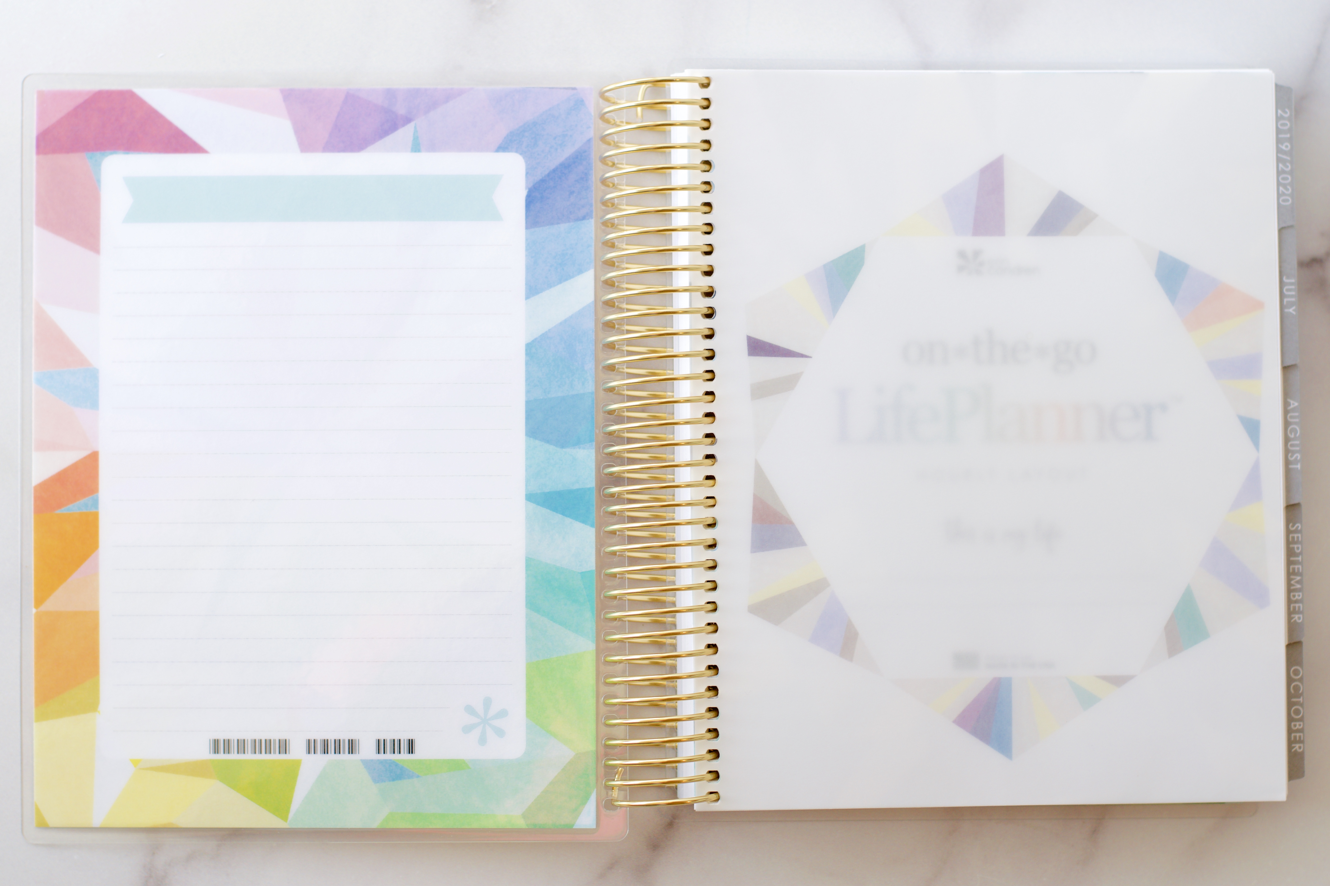
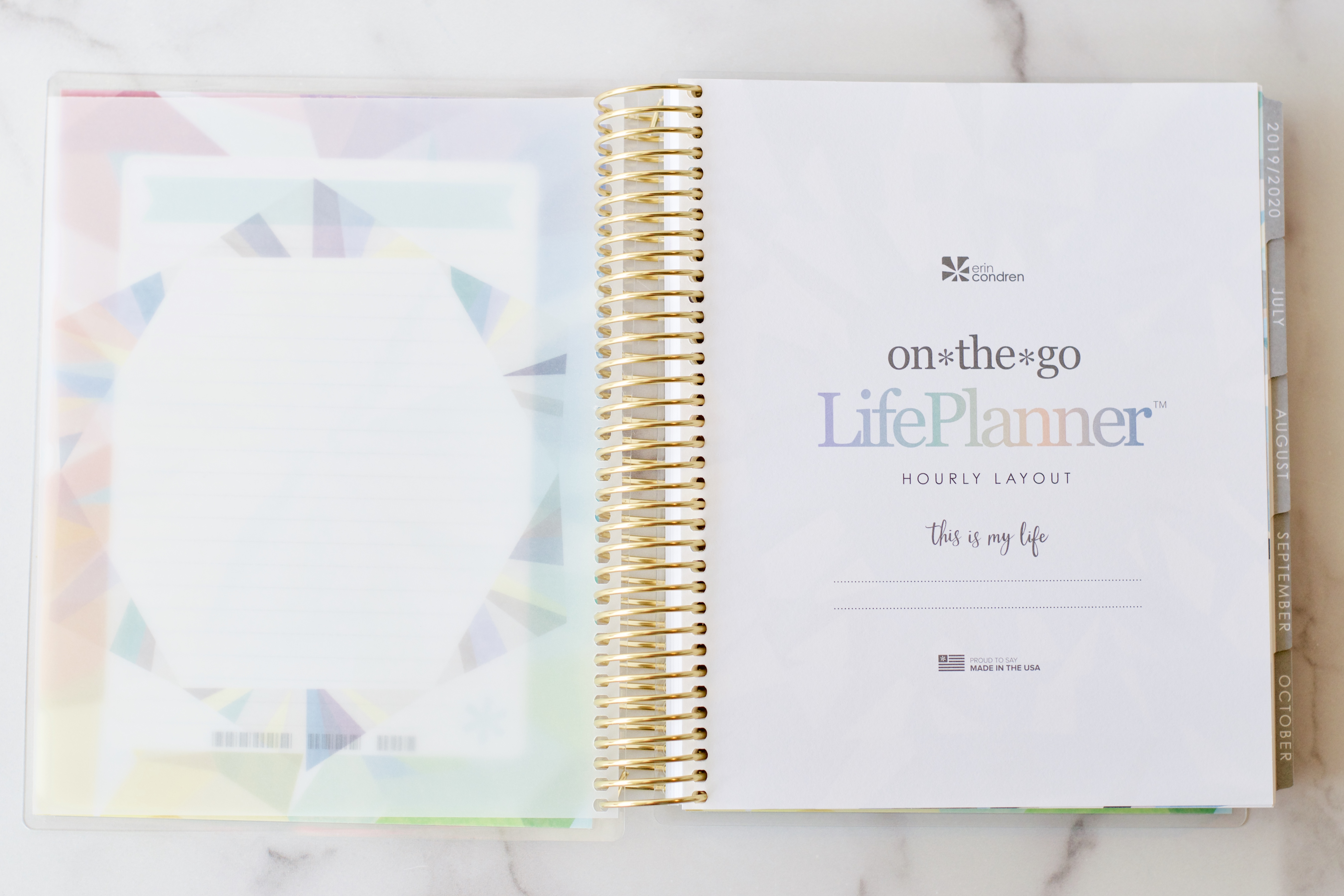
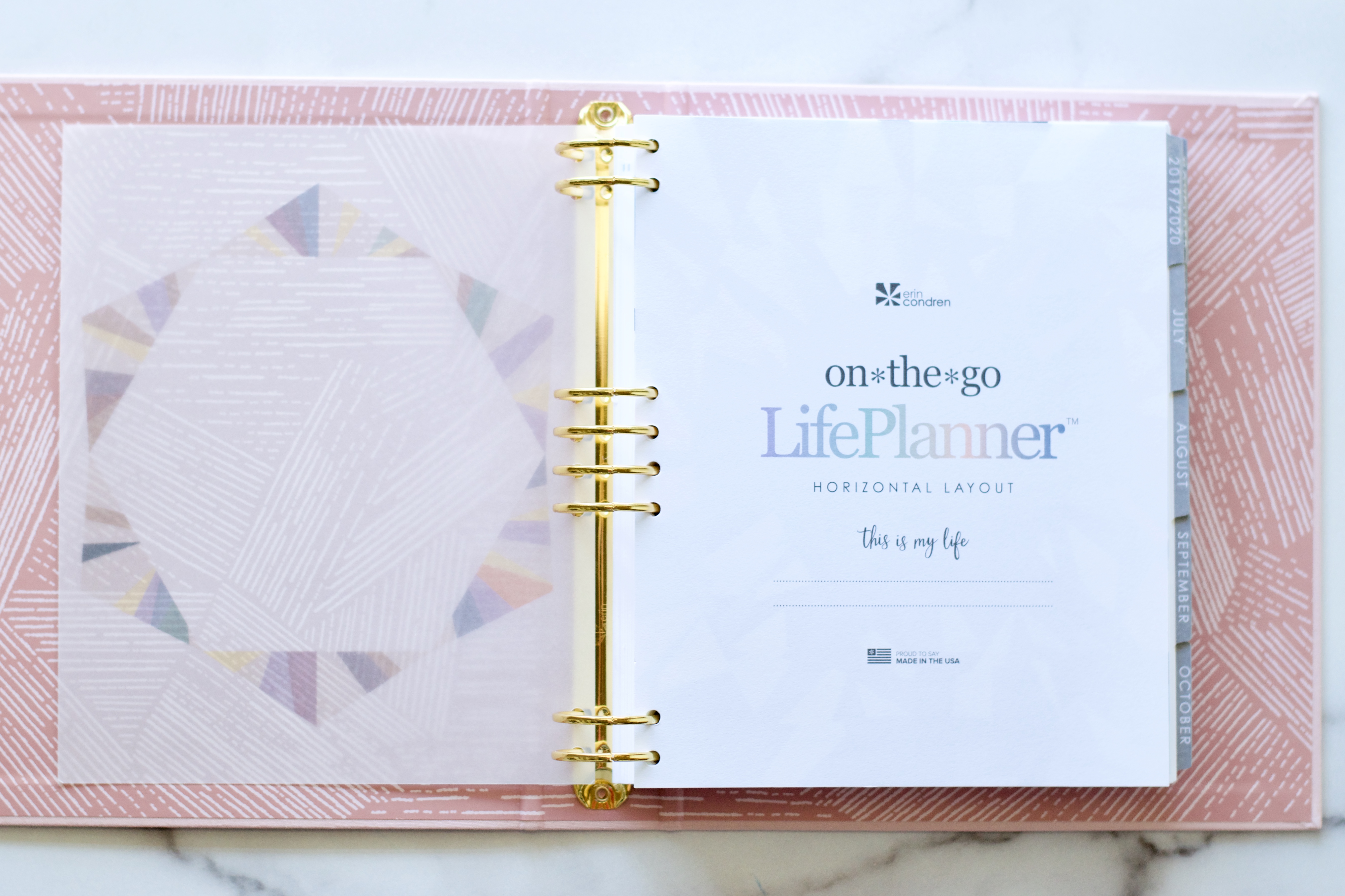
The first element of an Erin Condren LifePlanner is the beautiful vellum title page overlay.
Mine reflects the neutral theme of my planner.
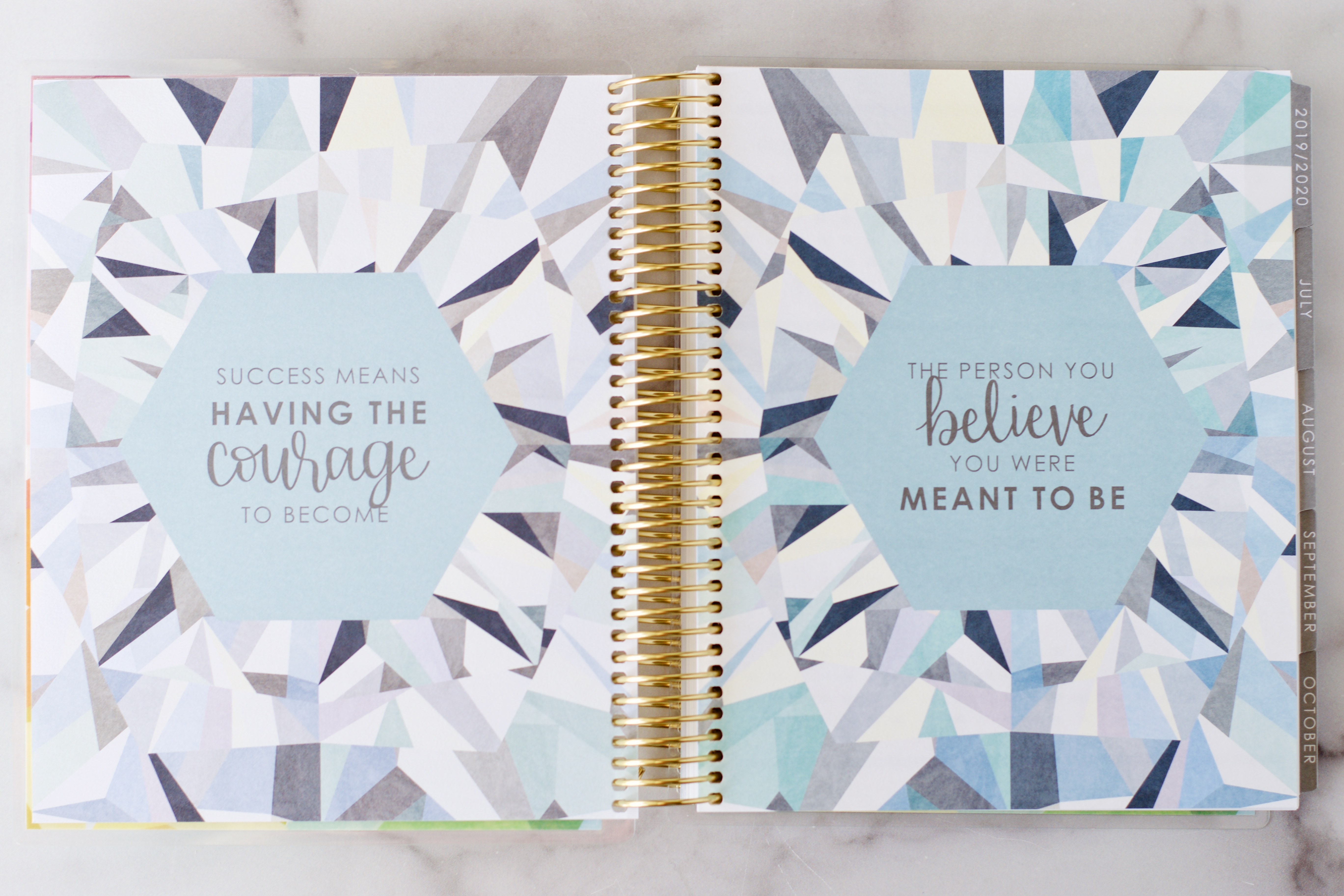
And then, following the title page are the two design theme pages. Mine reflect the neutral theme in my planner. The colorful planner will be much more vibrant.
These pages set the tone for the neutral this year. The overall feel is very cool with an emphasis on cool lavenders and soft blues.
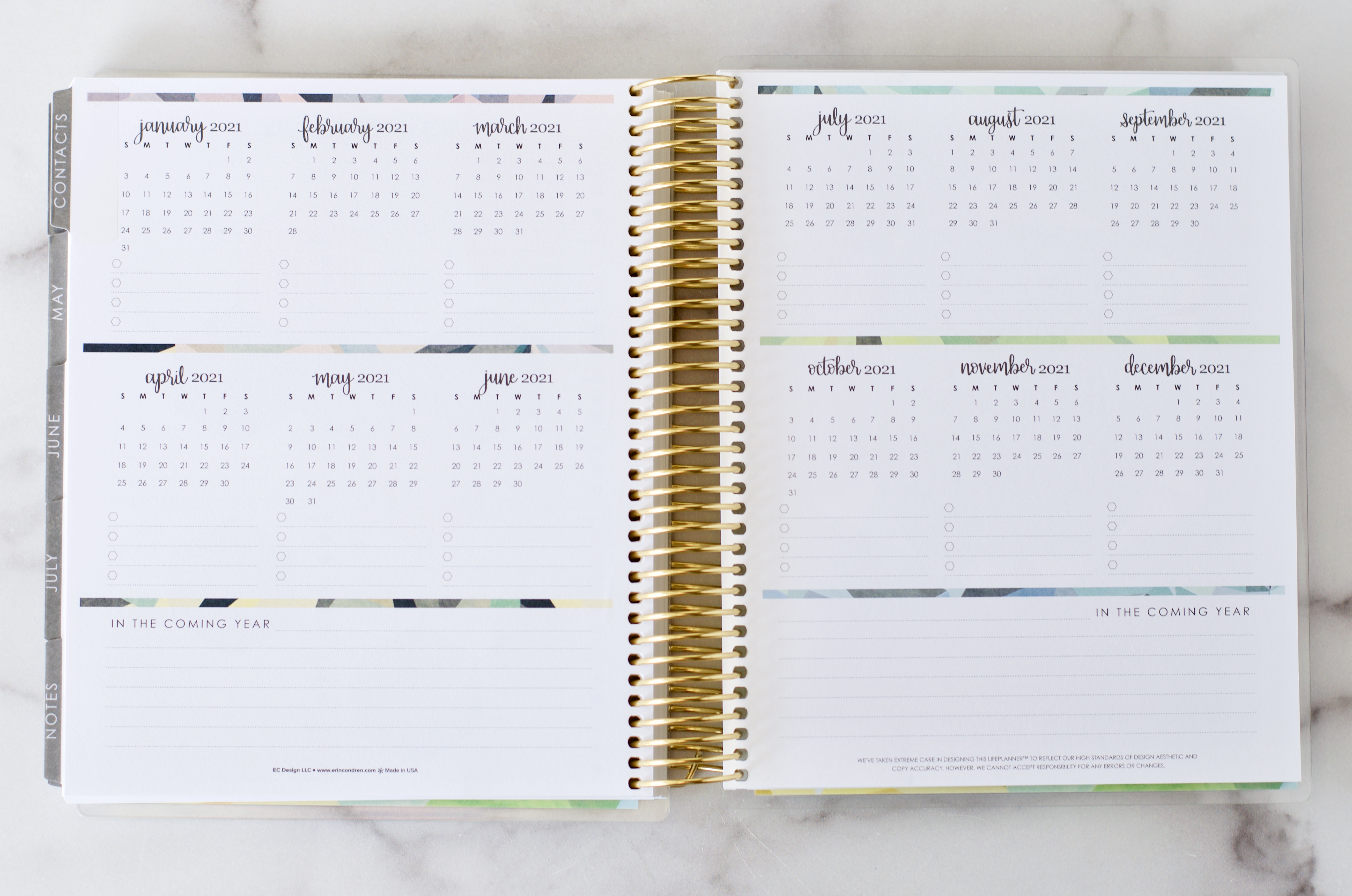
The calendar overview pages are next and I love using the transparent circle dots on these calendar pages to map out the big events for the upcoming year.
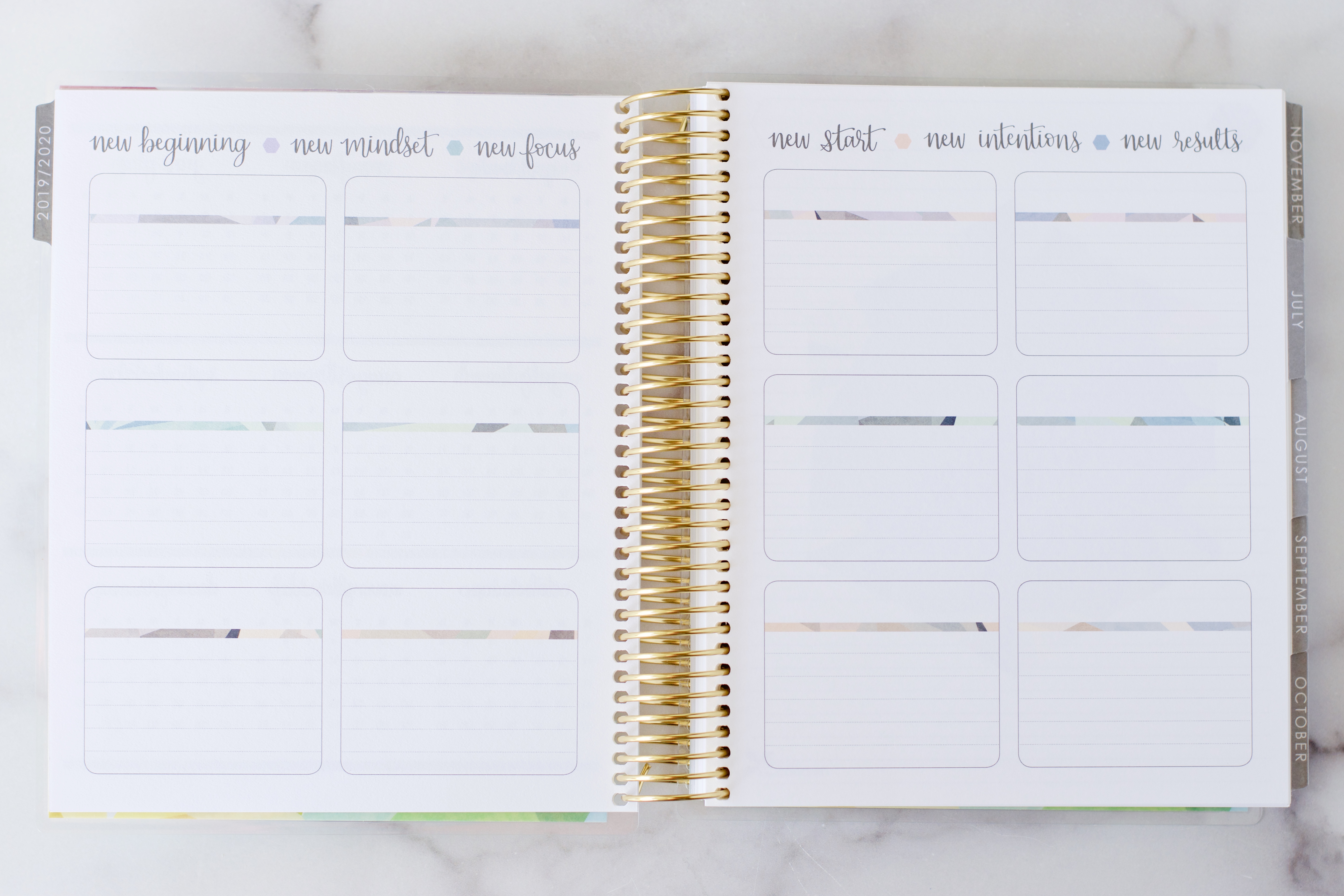
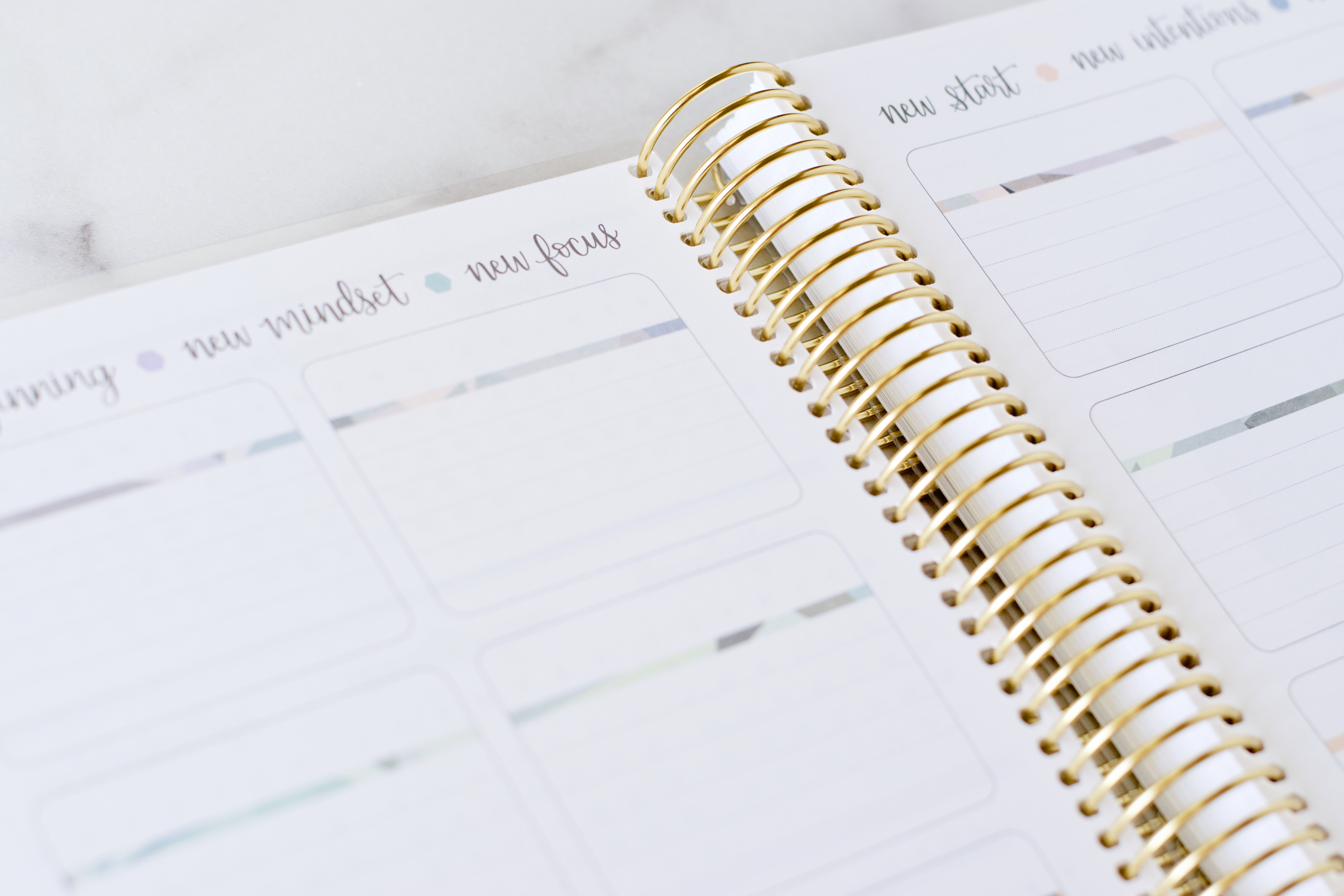
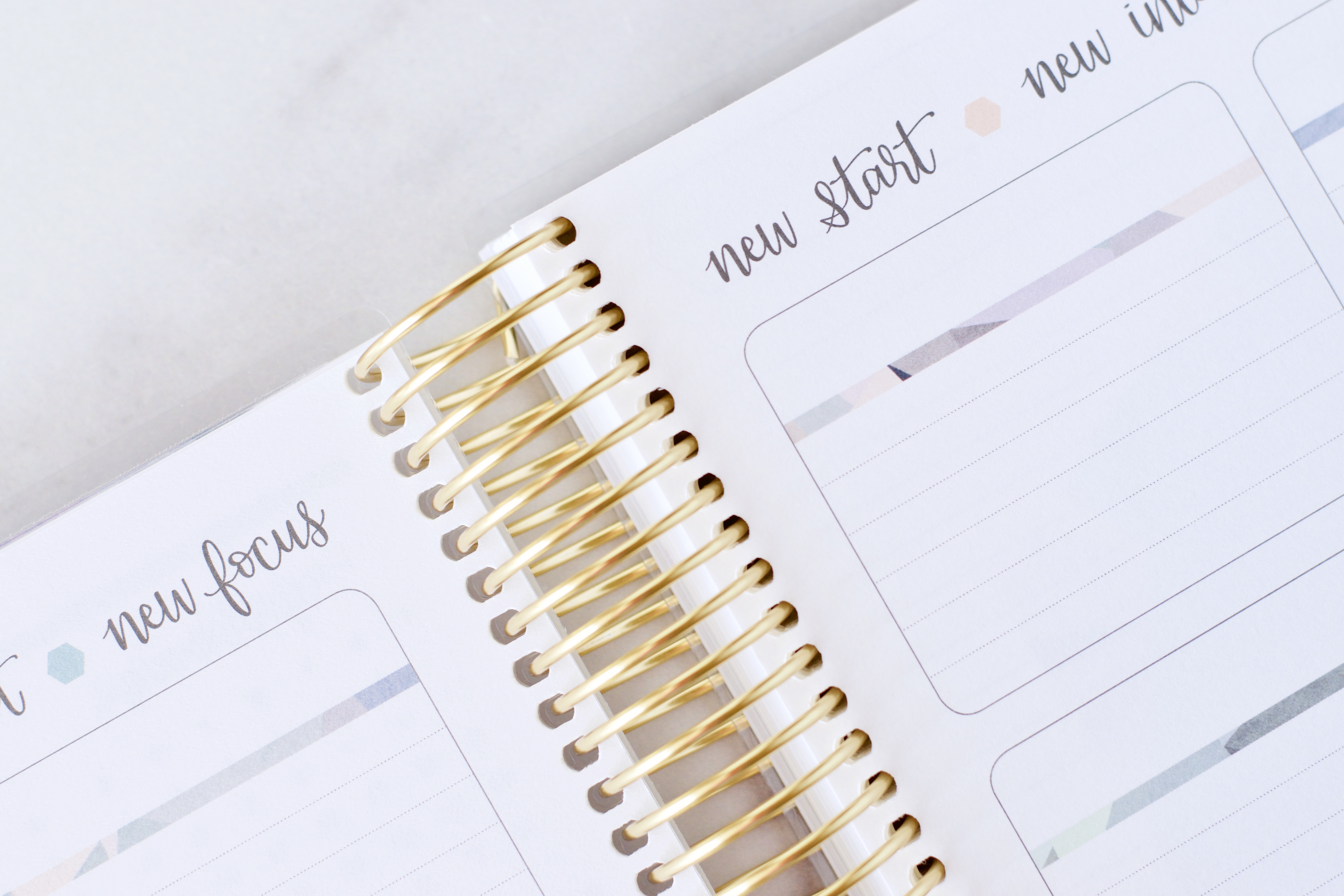
Next up are some goal planning pages. I LOVE-LOVE-LOVE that these boxes are lined this year!!! #Ineedlines (Note that if you choose the colorful themed planner it will still have the same twelve boxes and general design, but there will be much more color on this page!) I really love these pages!!
Think “outside the box” when it comes to dropping notes and goals here!
Here are some ideas based on different ways I’ve used these pages over the years:
- Use the twelve boxes to correspond with the twelve months of the year and list your top goals along with action steps for each month.
- Divide up the boxes by rooms of your home to help set action steps for a big home decluttering and organizing project.
- Designate your personal self-care goals into themes – workouts, health, wellness, special dietary goals, etc.
- Note 1-3 favorite memories from each month. Or use it to journal a few moments of gratitude each month.
- Think of the different hats you wear and the different aspects of your life that are important – faith, relationships, finances, friendships, mom life, volunteer, blogger, homeschooler, mompreneur, reader, gardener, etc. – and label each of your boxes. List the goals you have for yourself in those areas that are important to you.
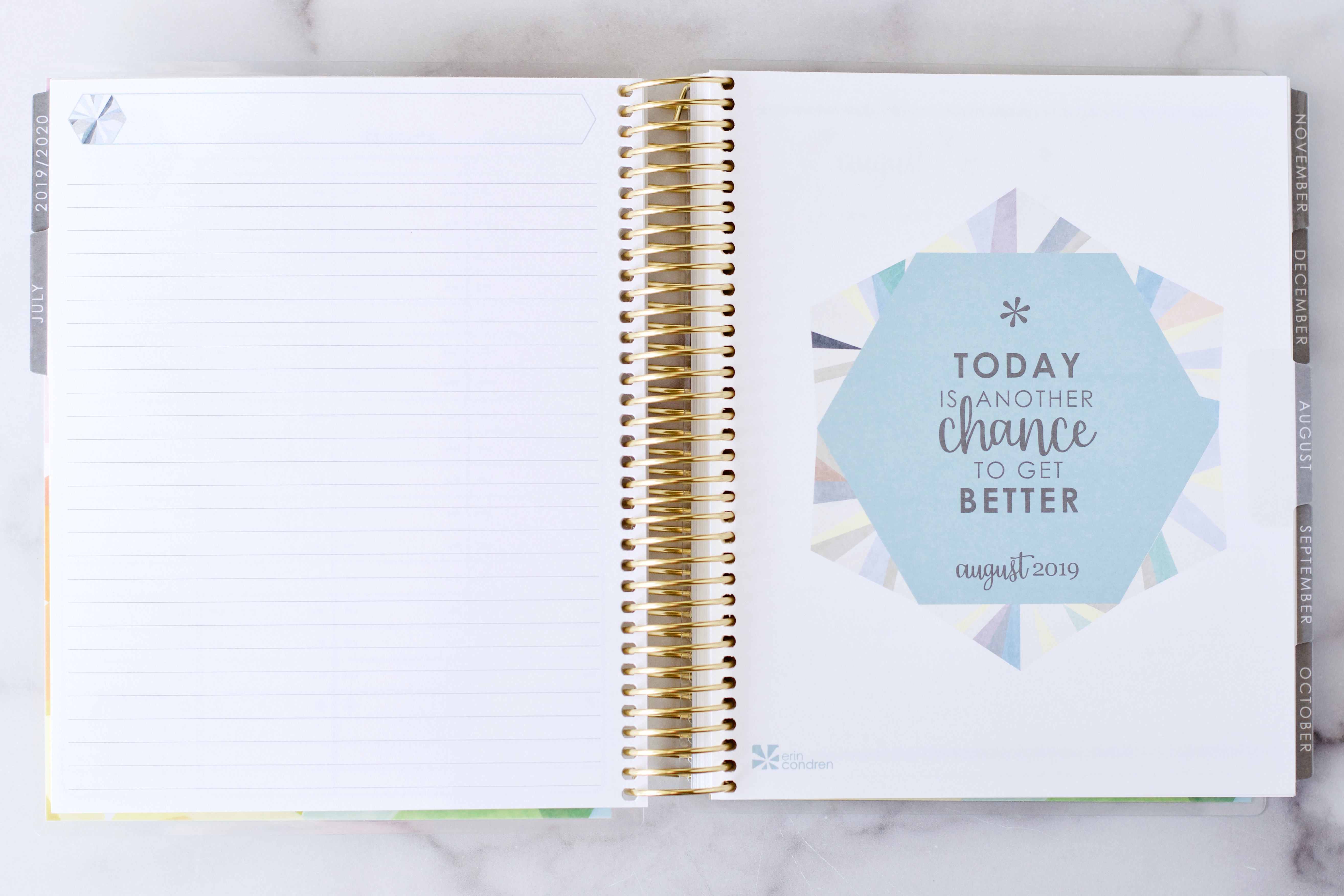
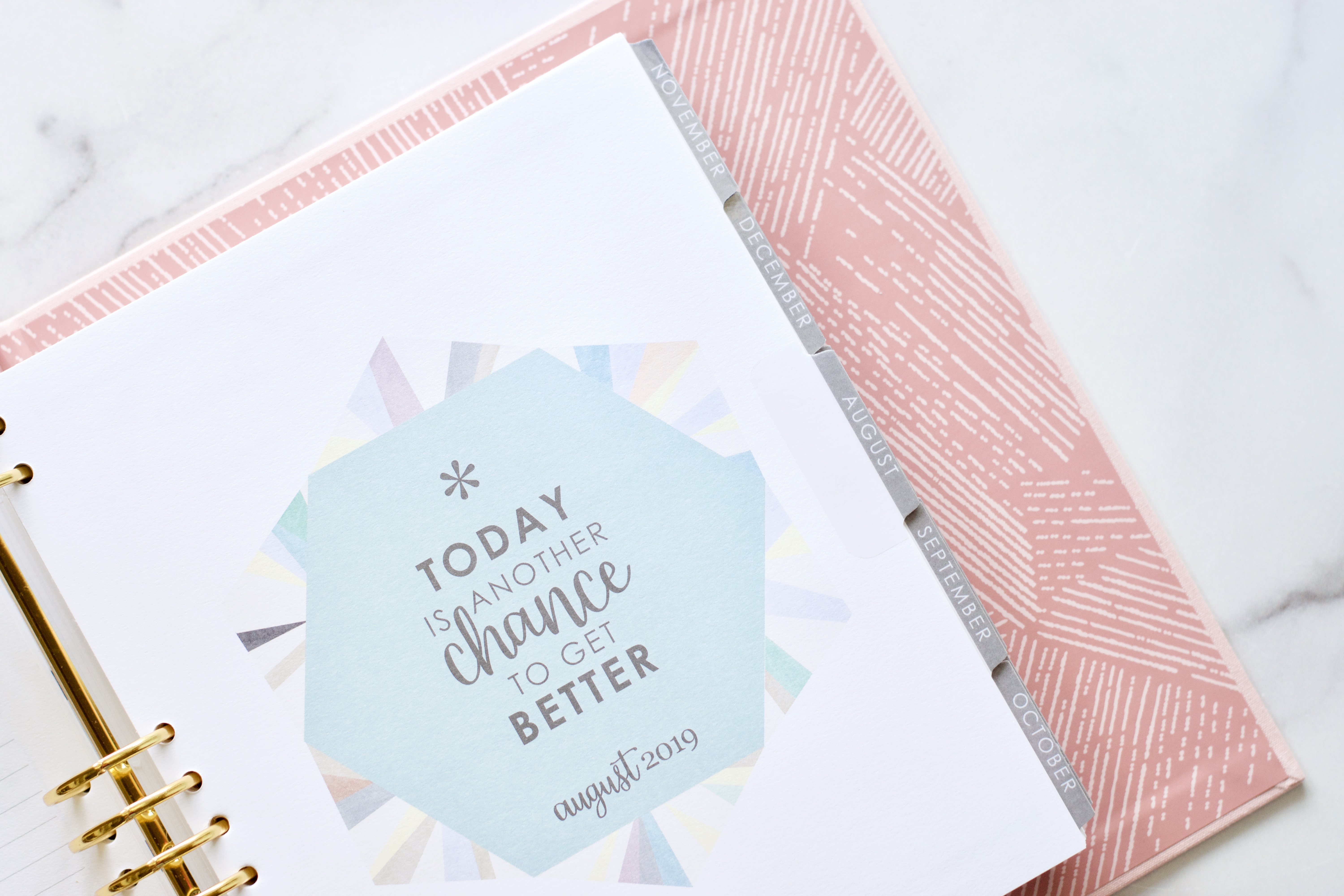
And here we are. The new academic year LifePlanners kick off in July 2019 but I loved the soft aqua so much that I decided to photograph August for you!
Each month now has a total of 4 pages before each monthly spread. The first two pages are pictured above – a fully lined page and an inspirational quote page.
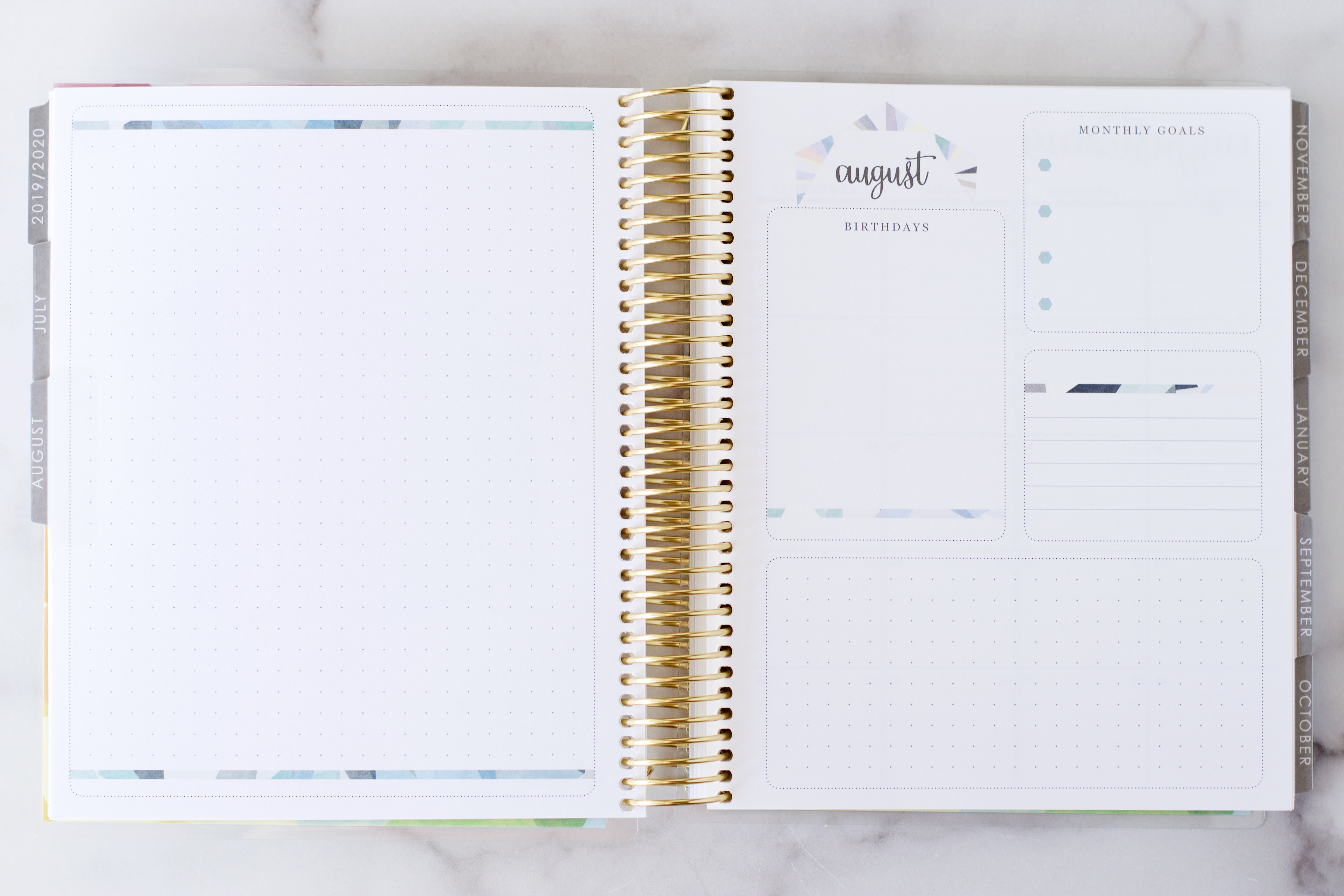
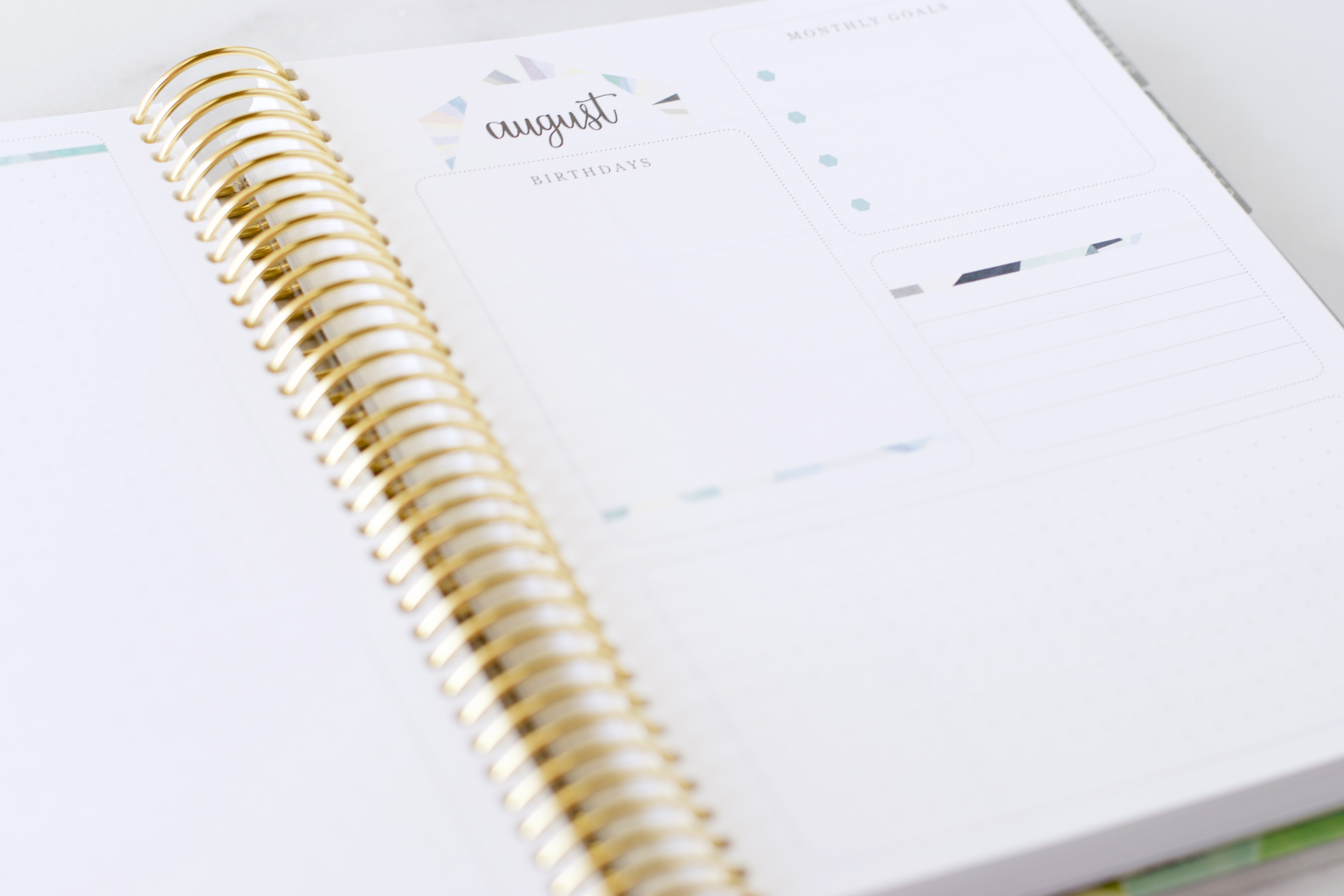
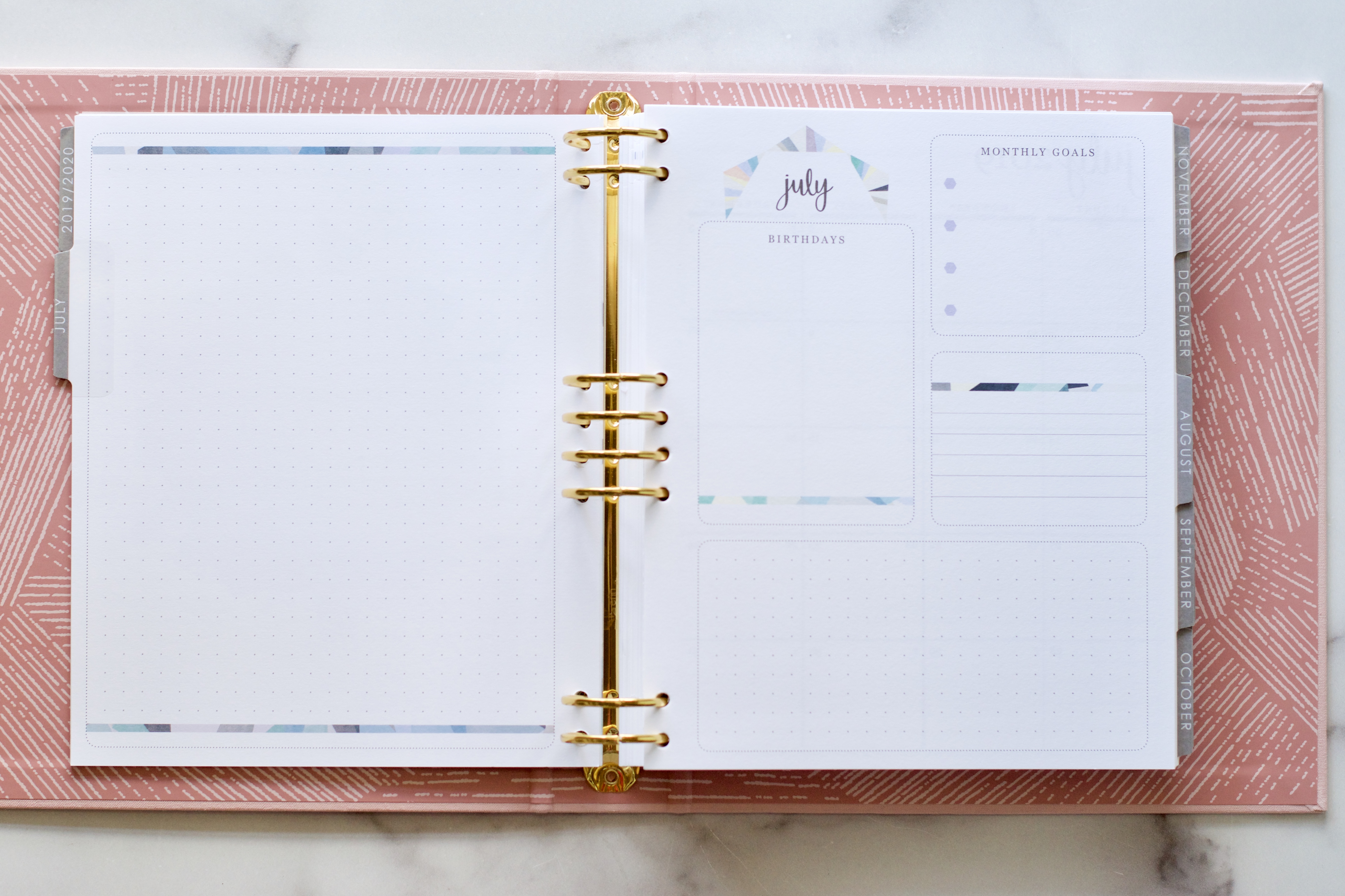
Pictured above are the last two pages of the new monthly layout for the planner this year. (Note that if you have a colorful color theme planner the layout of this page is exactly the same, but you will see a lot more color and box shading on this page.)
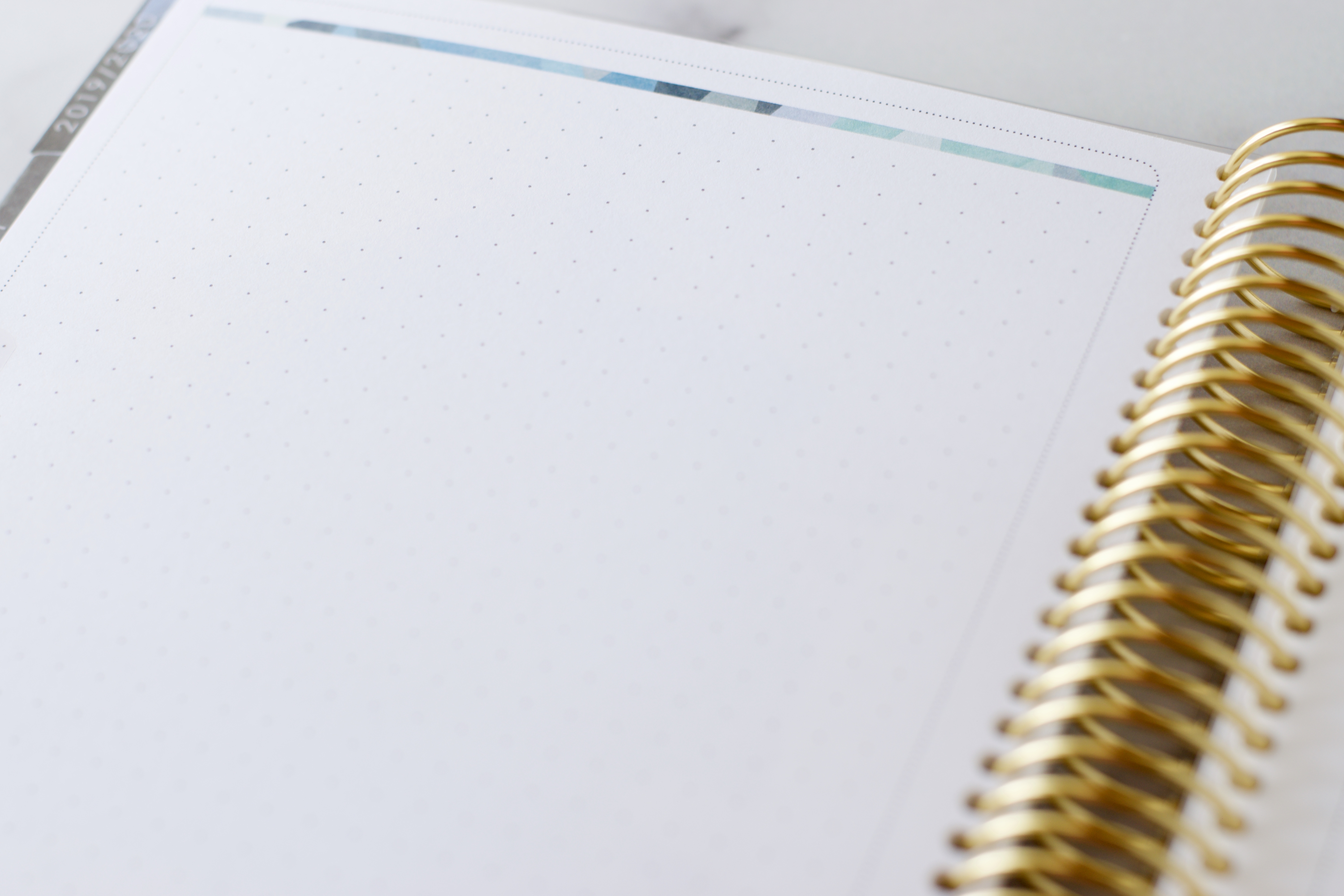
The left facing page is a full page of dot grid. The right facing page contains various spaces for monthly goals.
I know EC planner fans are going to have strong preferences with this monthly goal planning page, but I absolutely LOVE it!! For me, this will be a great place to set accountability markers for myself with my monthly goals! I cannot wait to move into these pages!
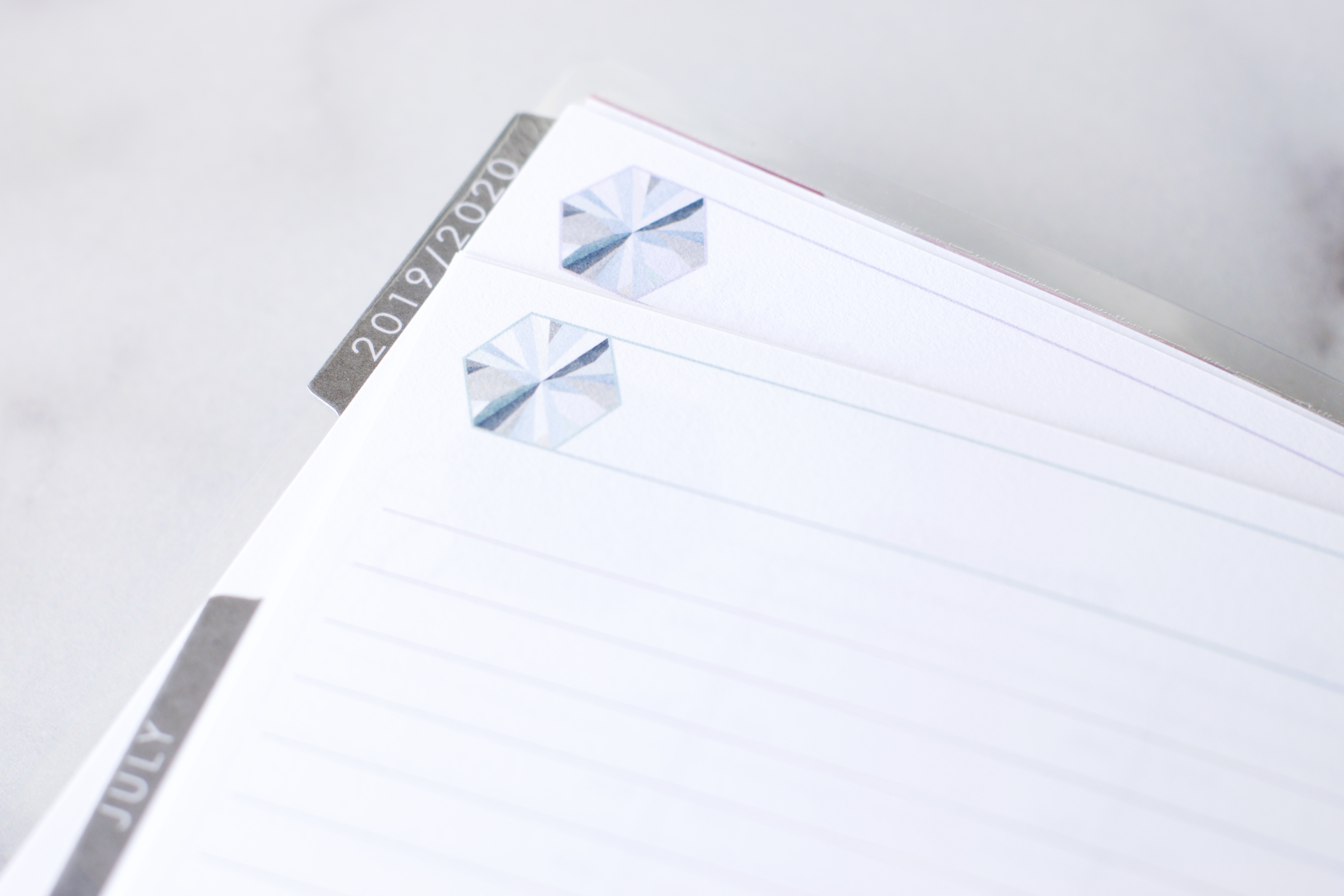
While we’re here, I wanted to point out some of the changes in the neutral planner this year. You may have to click on the photo or pinch/zoom in to see the very subtle differences between the months in the neutral, but pictured above is the soft aqua of August just below the lavender of July. It’s very, very subtle, but it’s there. Overall, the entire neutral reads cool – cool lavender, soft aqua, blush, slate blue. In the past, every month had a designated and unique color, but that isn’t the case in this year’s neutral planner. The four colors above repeat every 4 months.
And, you may have noticed that the text and the tabs are all in a charcoal gray, rather than the black of last year.
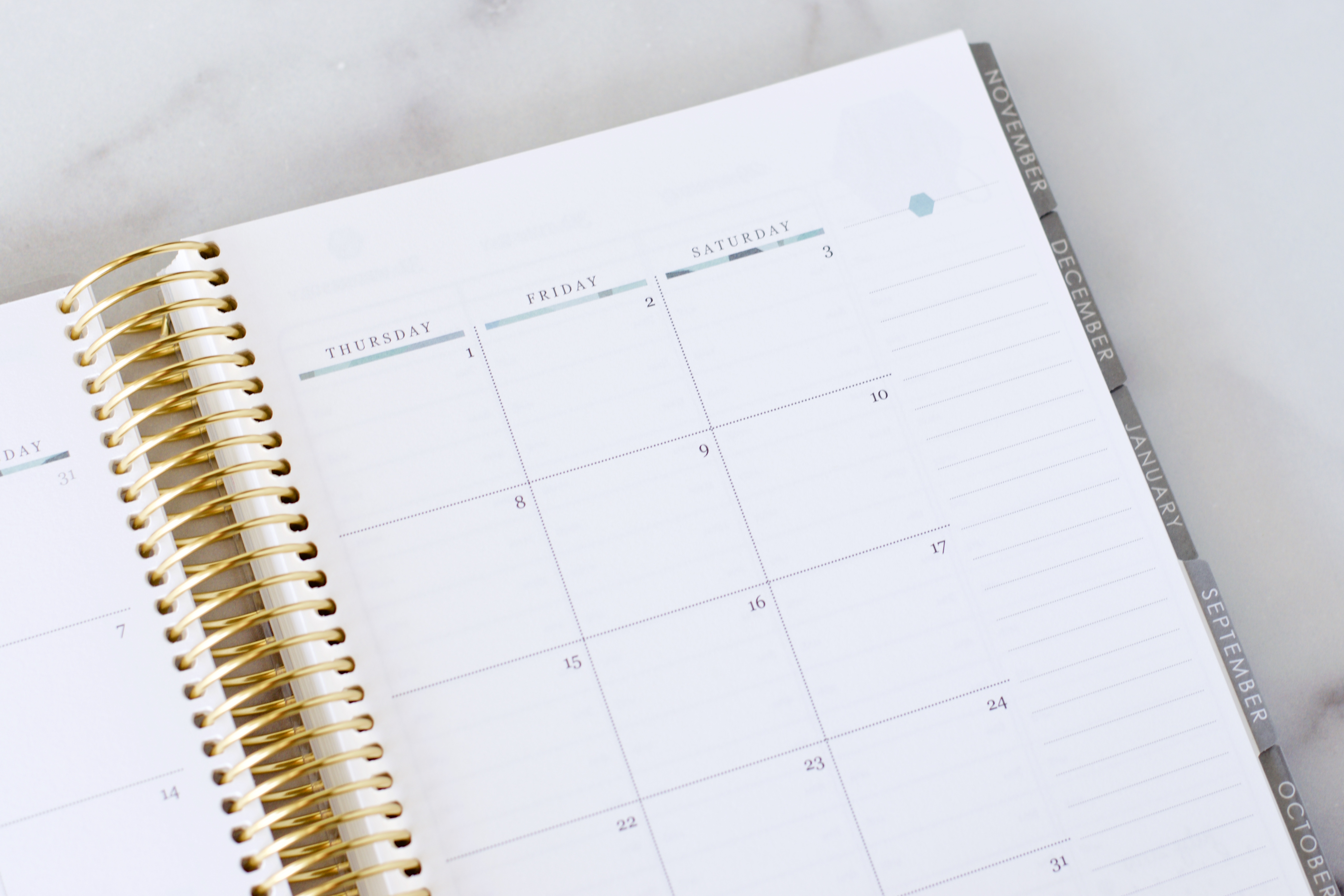
The monthly view remains very similar to the monthly view from last year’s planners…
…except in this year’s monthly view there is a slim neutral kaleidoscope ribbon as a header above each column on the calendar.
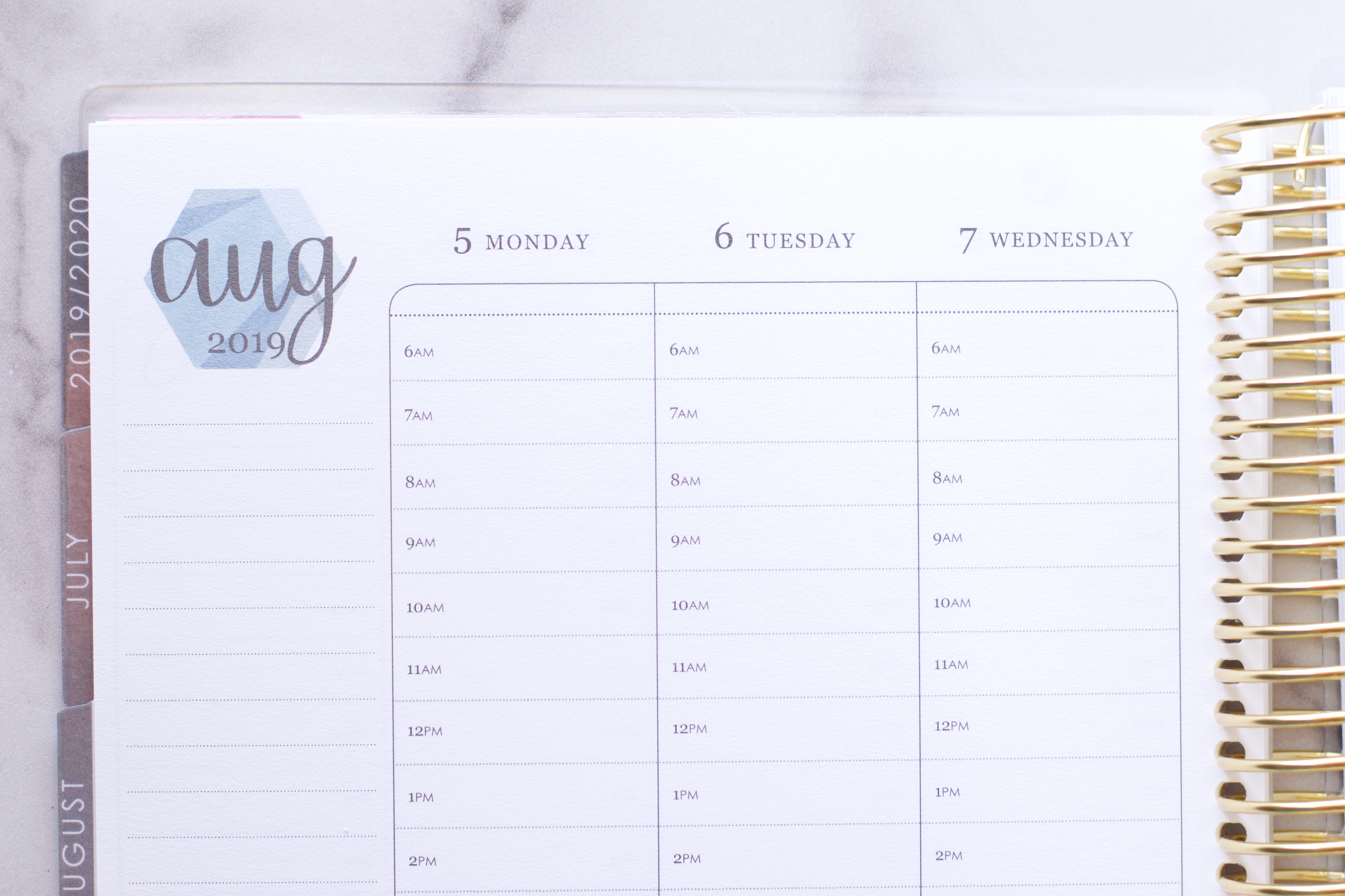
Alright. Let’s talk about the hourly layout on the weekly spread. If you happen to be new to the Erin Condren LifePlanner, pictured above is an hourly layout (there are two other layout choices: horizontal and vertical).
- The headers are now rounded. I do like the blank space in the header area of the neutral – it’s a place to note an all day event (birthday, anniversary, liturgical year).
- The empty box that used to be in the top left corner of the weekly spread is gone now.
- The little circle check boxes that used to be on the to-do list column are gone now, too.
- In the bottom left corner is a monthly mini calendar.
- And at the bottom of each daily column are some simple utility boxes. I love these! Add meals, workout routines, daily goals, a quote – I love the potential in this section.
- The hourly layout starts at 6 am, and goes through 9 pm – that’s a stretch of 2 full hours that are now in the hourly that weren’t there last year. This is a reflection of customer demand and I’m so grateful Erin Condren listens to her customers, and though she can’t make everyone happy, she does her best to build a planner layout that addresses the needs of most.
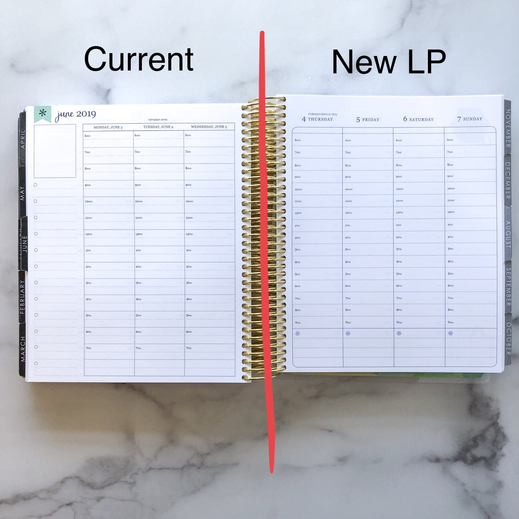
- One big difference in this year’s LifePlanner is the elimination of the half-hour lines (see below for a side-by-side comparison of last year’s planner and this year’s new planner. The size of the boxes had to decrease to accommodate customer demand for a wider hourly coverage on the weekly spread, and it follows that the half hour lines would have to disappear, too.
I confess, I am going to miss those half hour lines…a lot! I’m really sad that they’re gone. I am glad that the hours have more coverage, but I relied heavily on the half hour lines. So…this layout change will be an adjustment for me!
The size of the hourly box has decreased – formerly the box was 1/2″ high, and the new box is 3/8″ high. The width is unchanged at 1 9/16″.
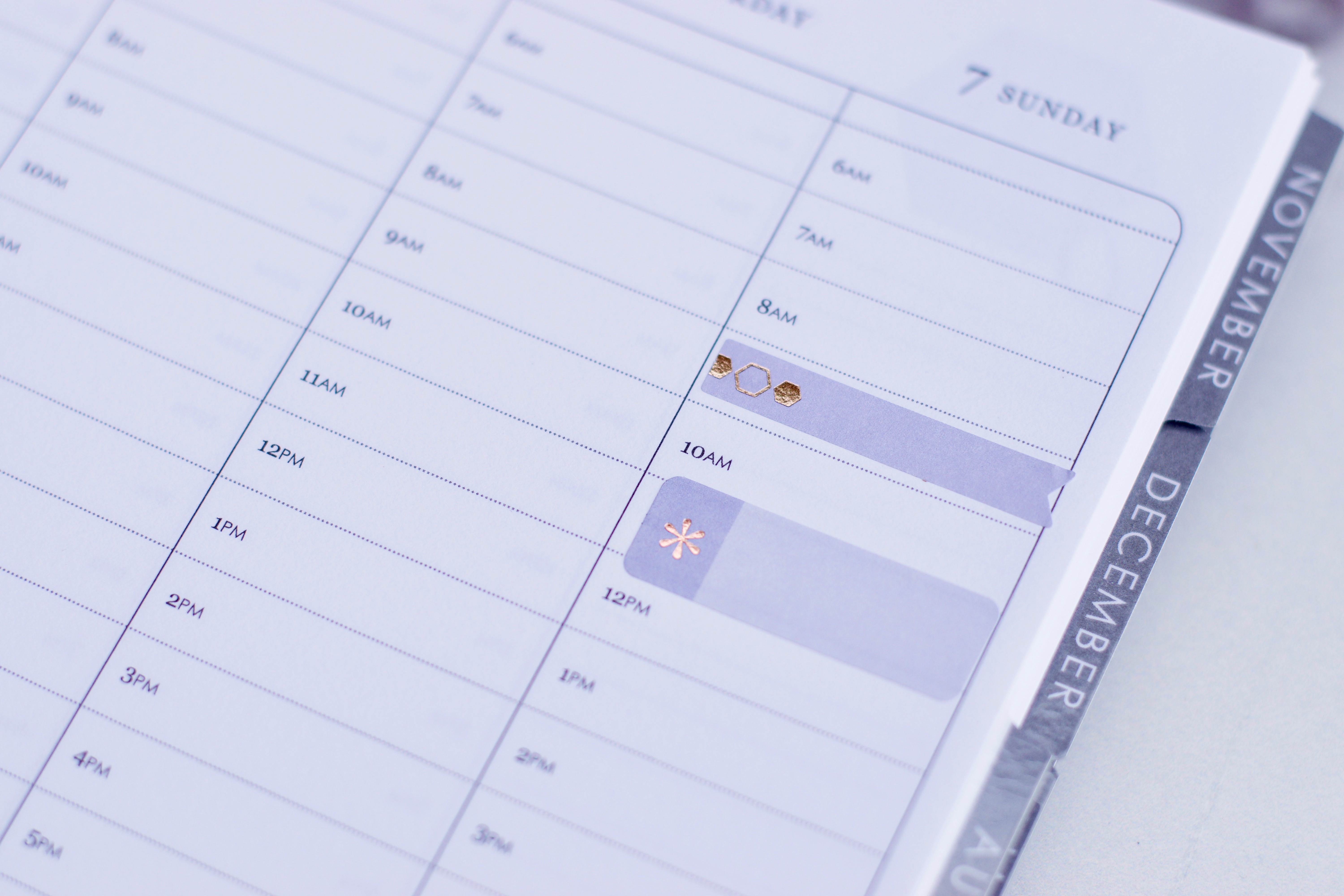
This layout change will also affect the way current stickers fit. As you can see above, the current event stickers (the ones pictured are taken from the back of the new LifePlanner) are slightly larger than the current hourly box (in last year’s LifePlanner the event stickers were a perfect fit in the hourly box), and the slim sticker flags don’t really fit the box either. I don’t use many stickers since I’m a functional planner, but I do use event stickers quite a bit to set off an appointment or an activity that I like to stand out in my day, and this overlap really bothers me. There is the fit issue and also the issue of taking up space in the box either above or below. My hope is that there might be a new set of event stickers that are sized for the new hourly boxes.
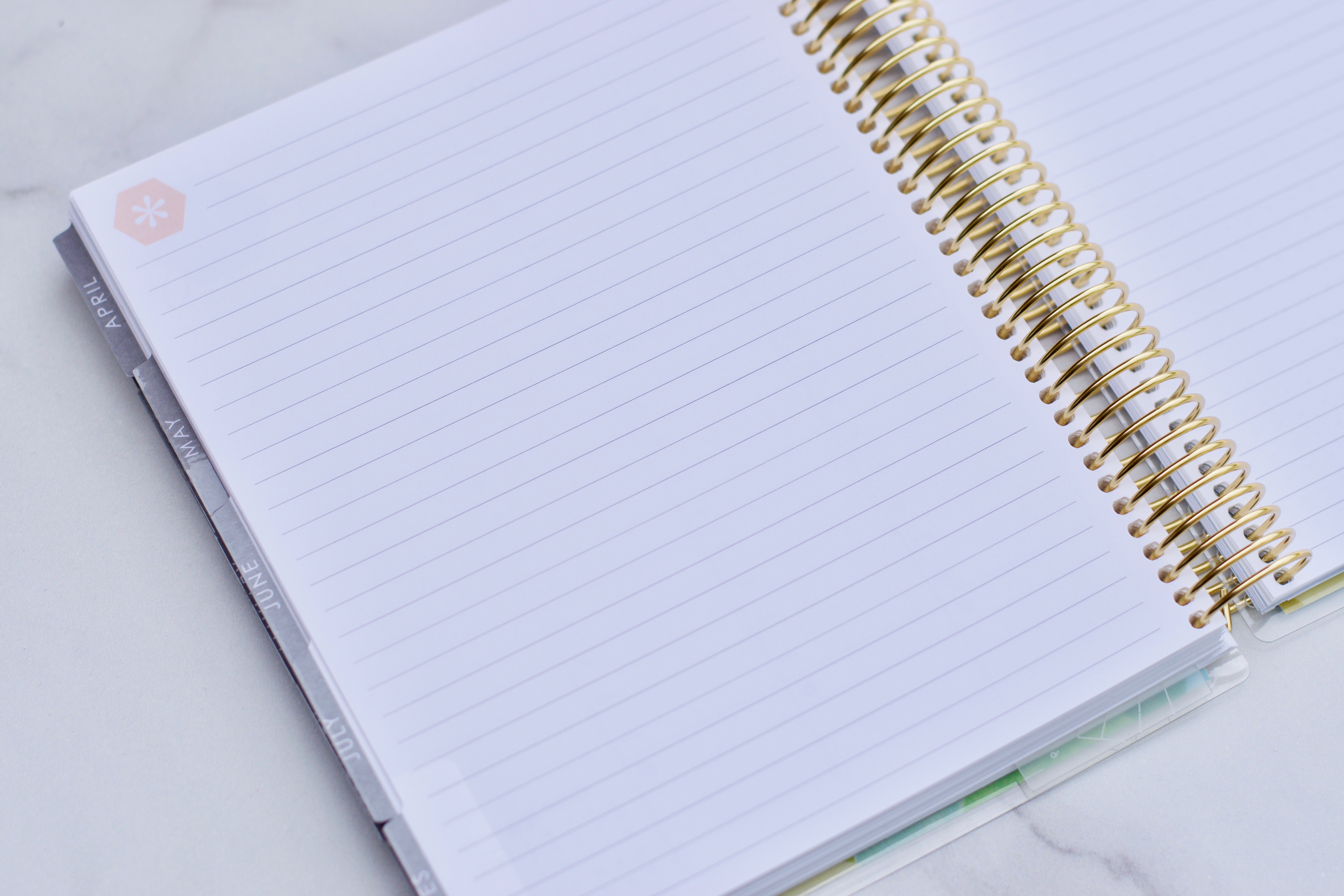
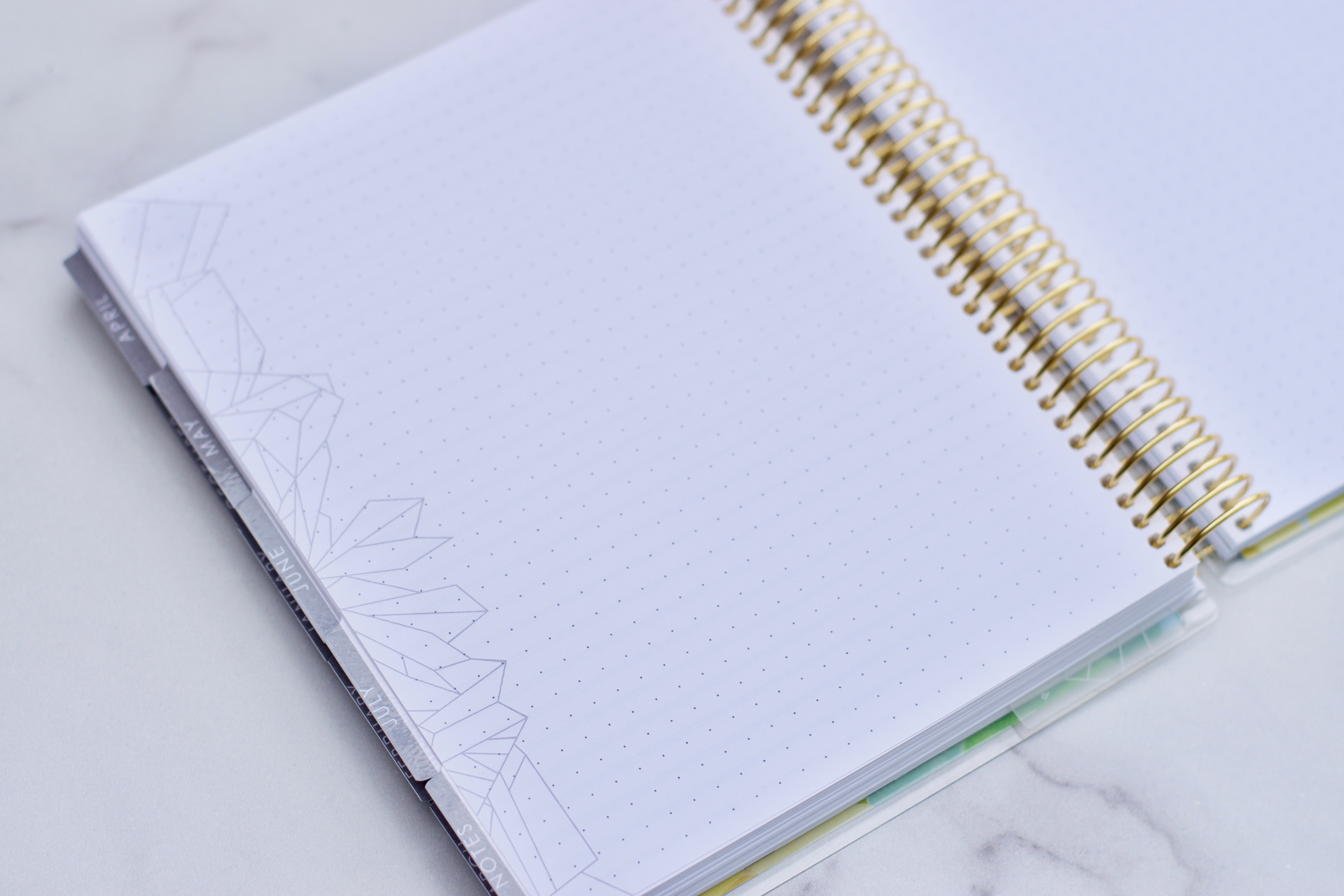
After all of the months and weeks of the planner are the notes pages. There are 3 lined note pages.
And there are 4 dot grid pages.
And there are 2 coloring pages.
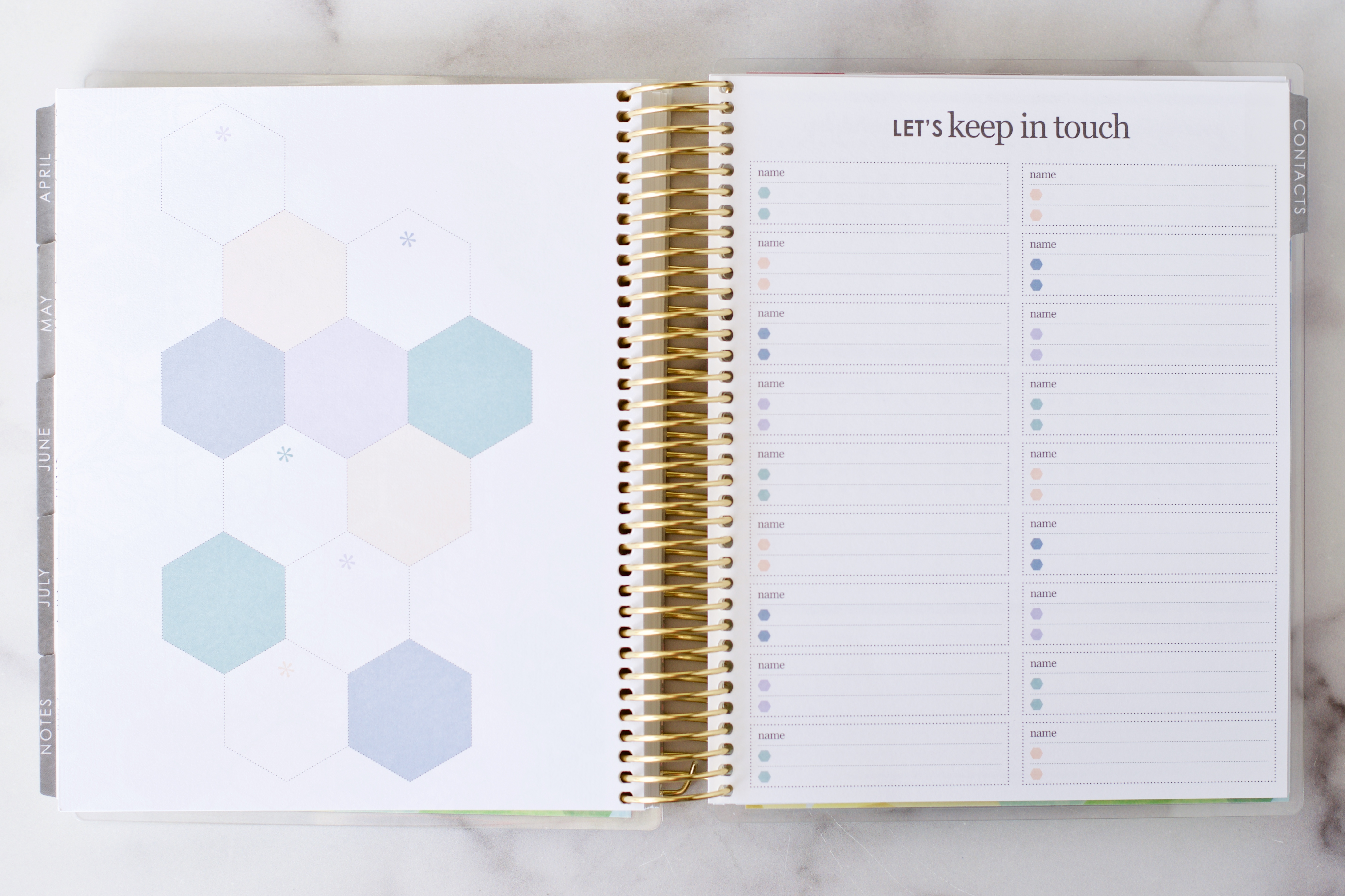
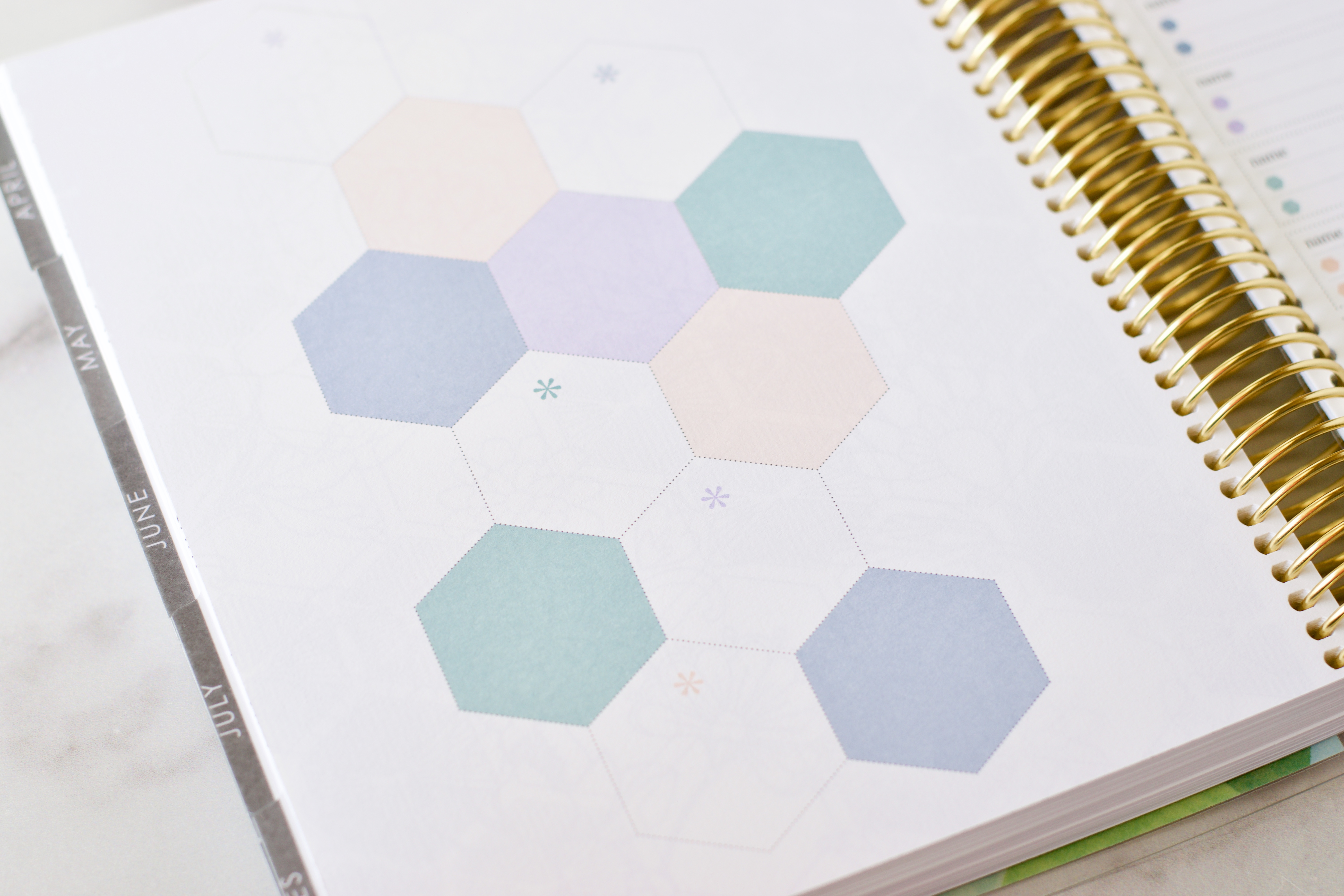
The hexagon page is a fun, new addition. There are 12 hexagons.
I’m not sure what I’ll include in the hexagons yet, but I was thinking this might be a good place to manage content milestones (followers/subscribers). You could also list monthly family adventure goals here, or primary contacts (neighbors, good friends, doctors, school numbers), or even passwords and login information for frequently used websites. I’ll be thinking of other ways to use this page!
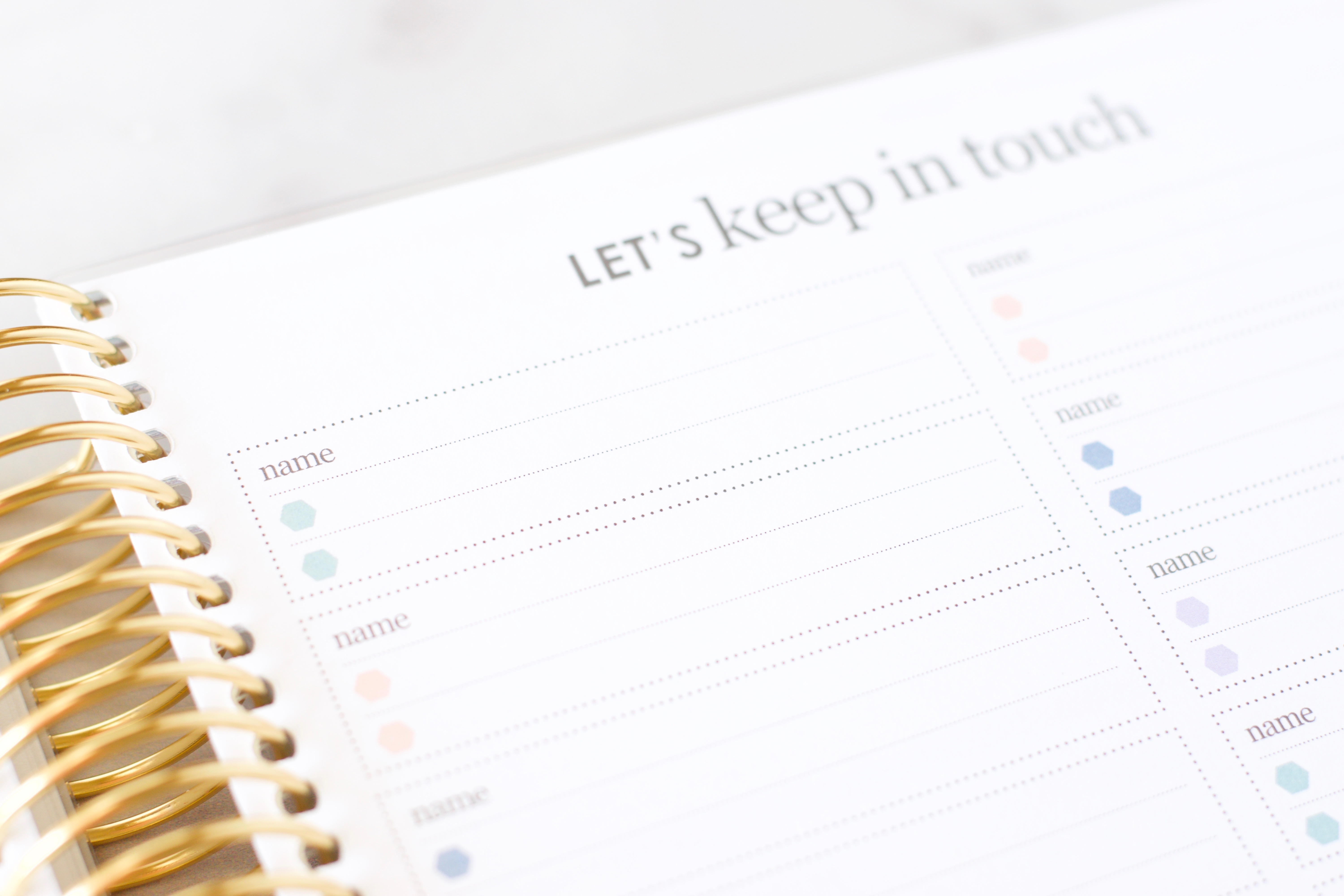
Opposite the hexagon page is a contact page.
Future planning lives on the next two pages toward the back of the planner. This is a great place to add events that are upcoming but don’t fit in the current planner – maybe a wedding or family vacation!
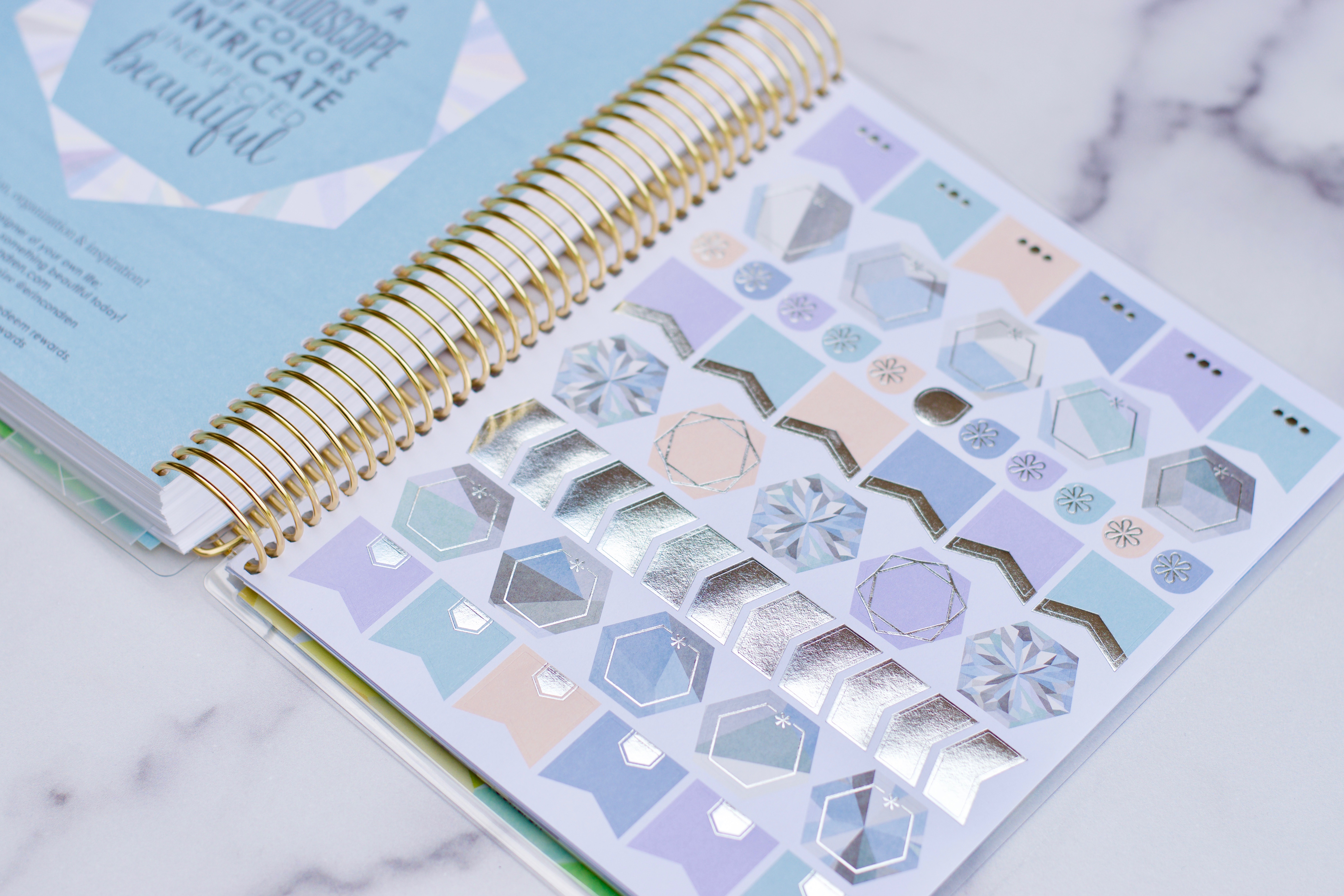
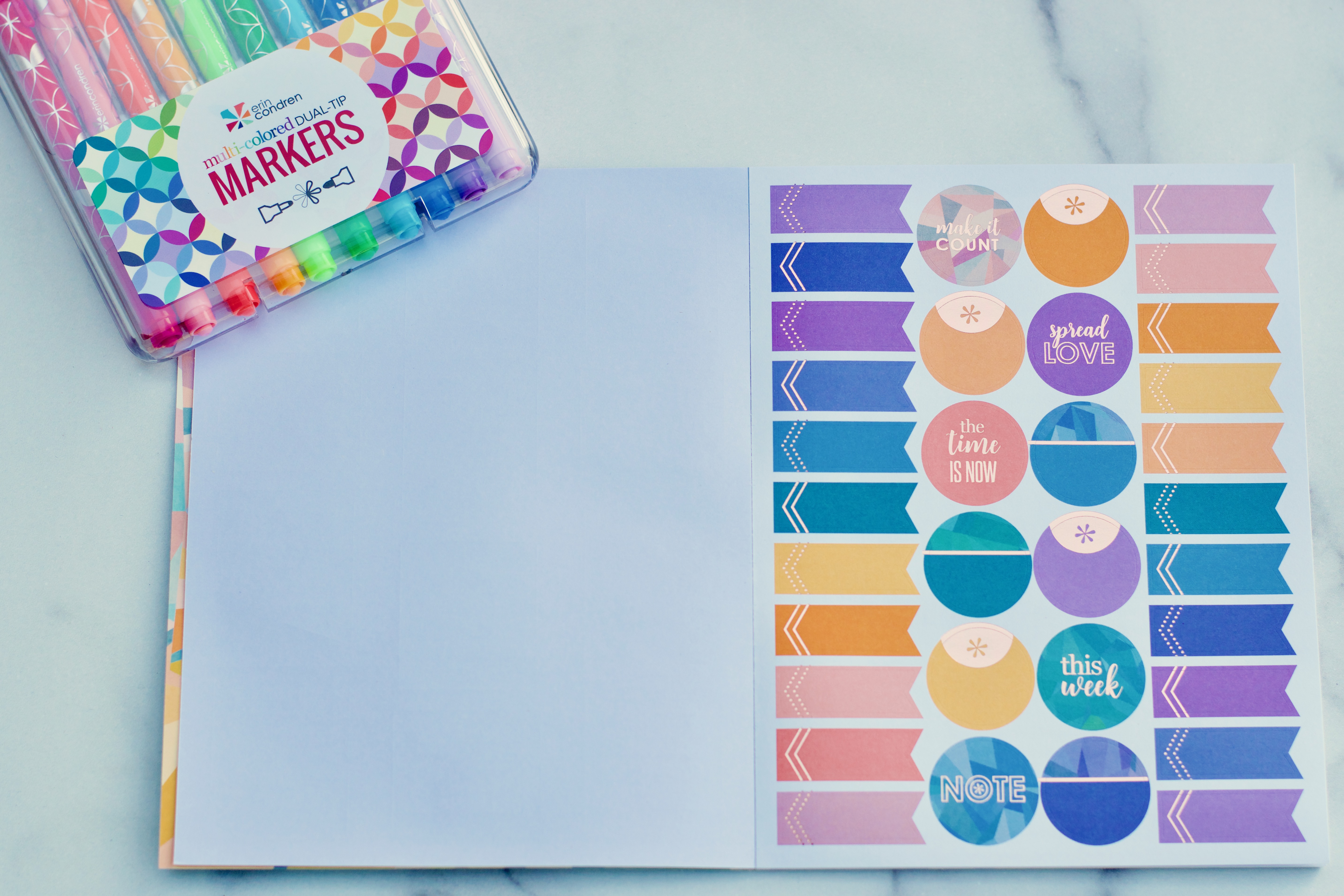
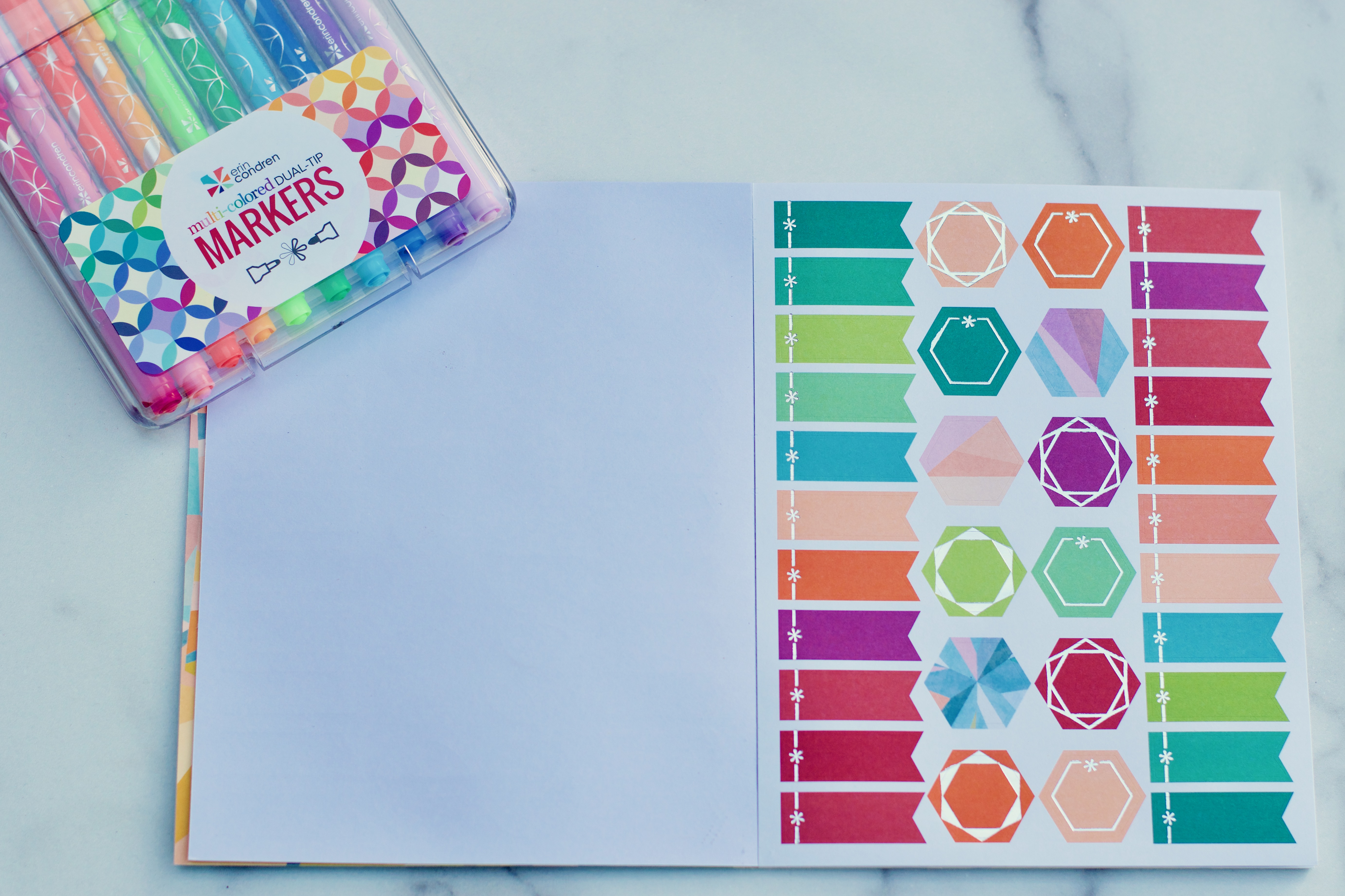
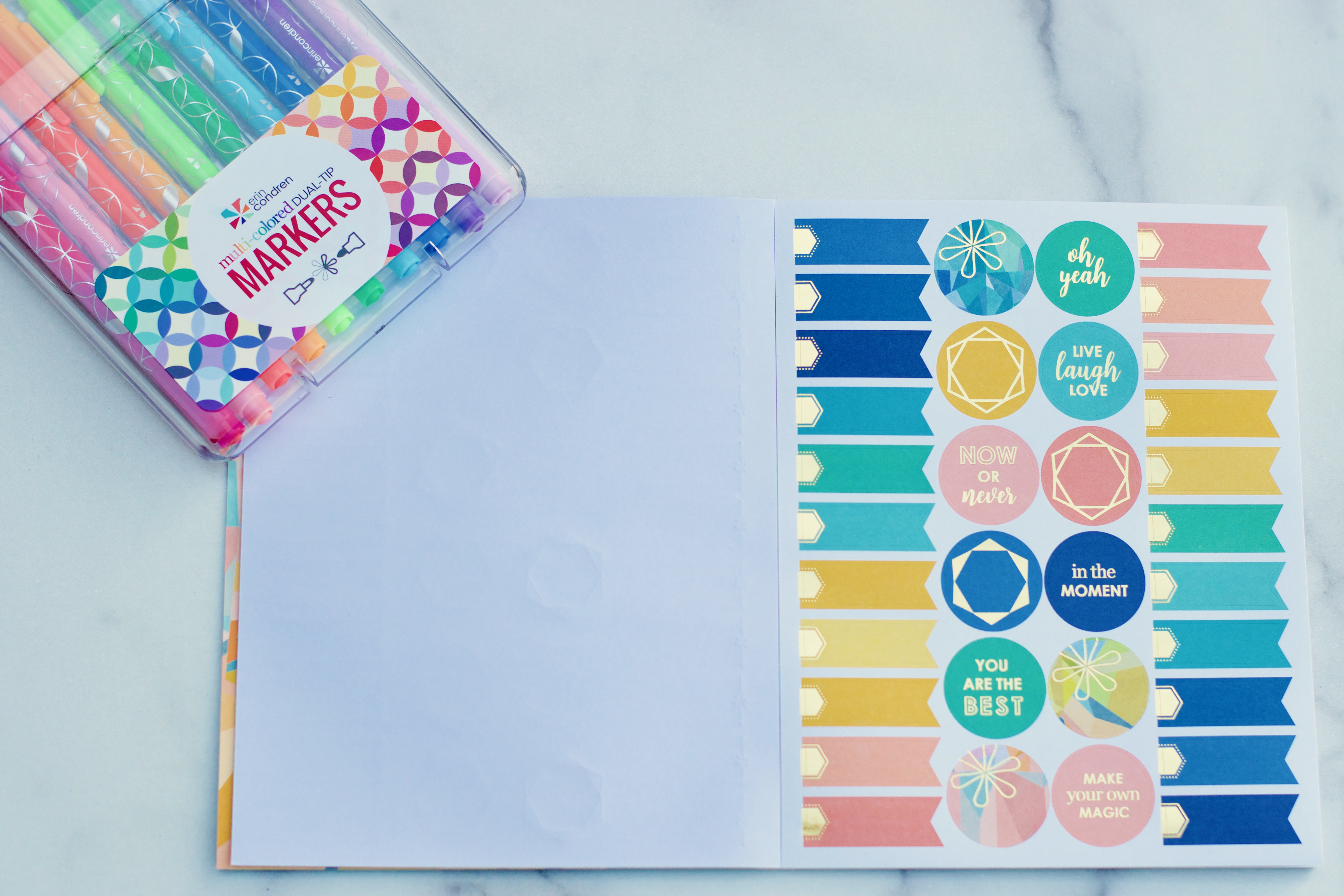
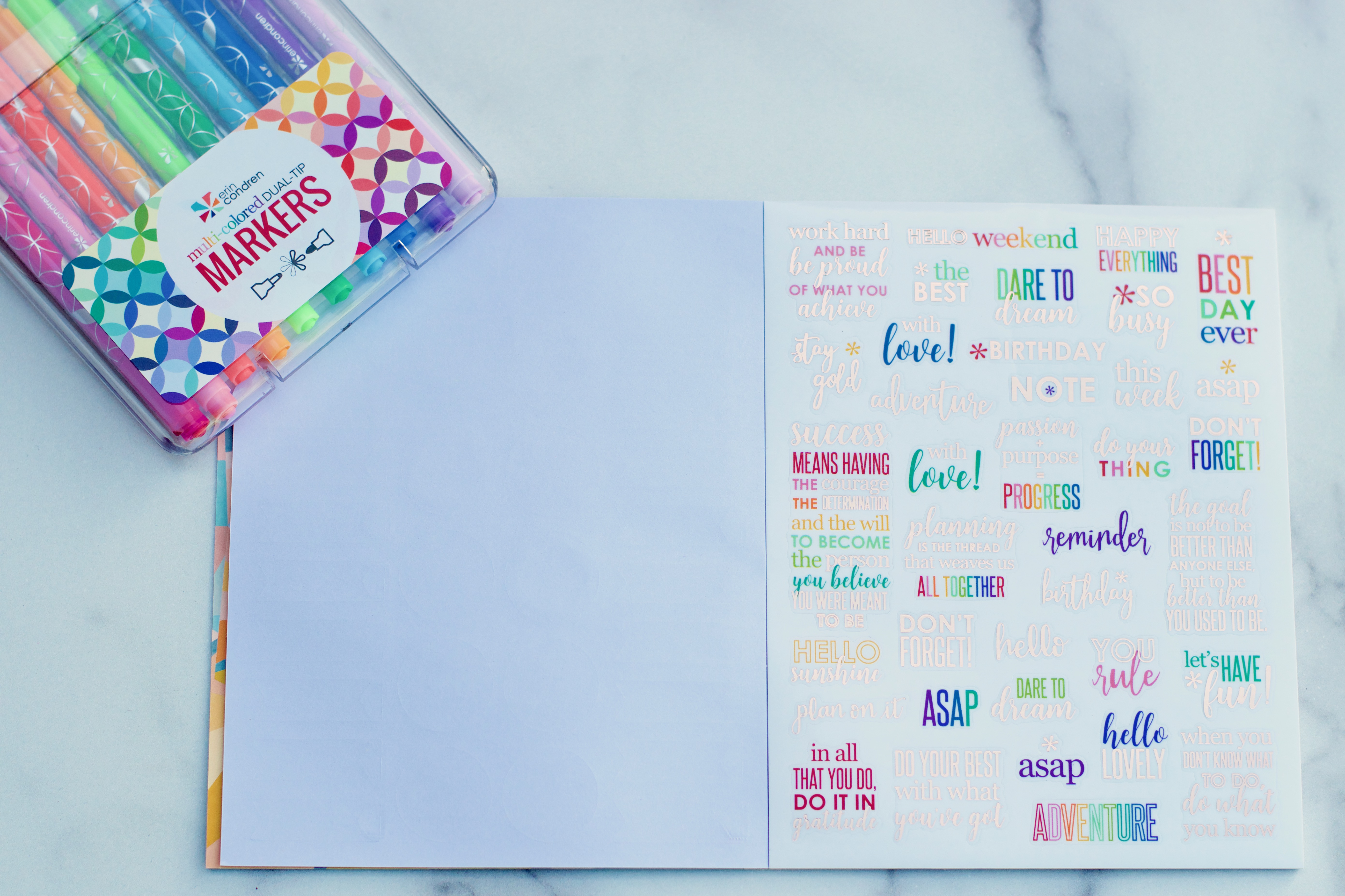
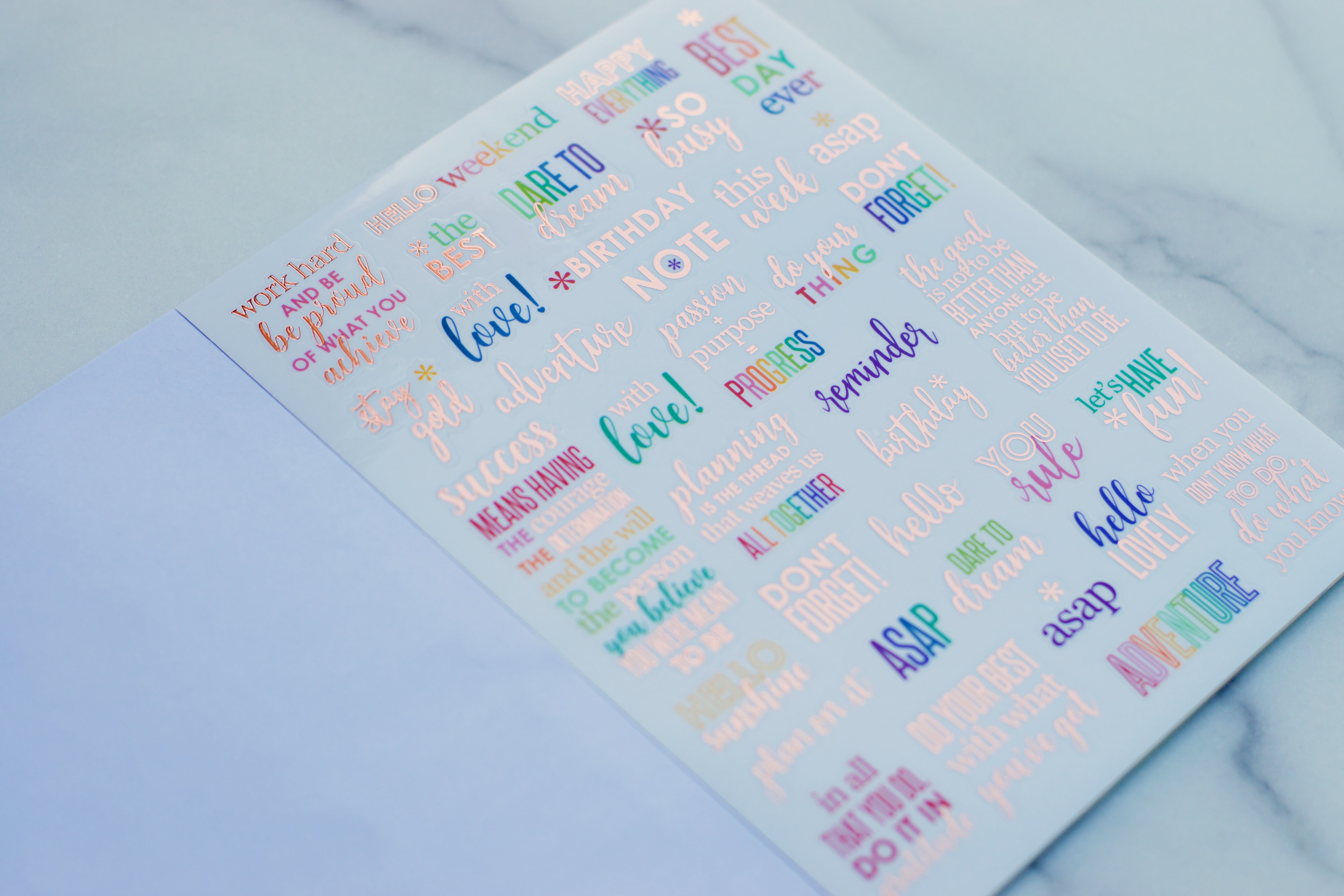
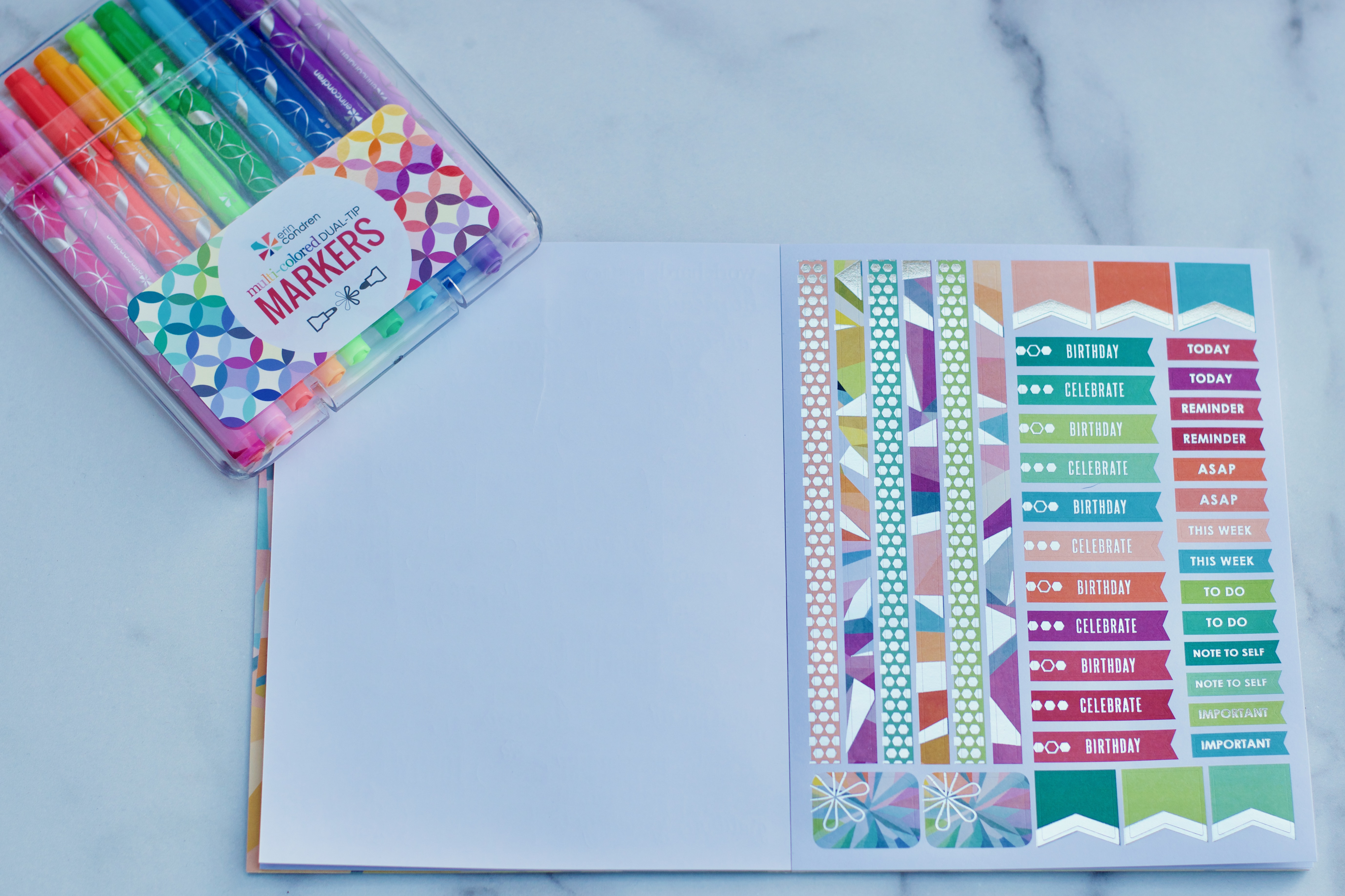
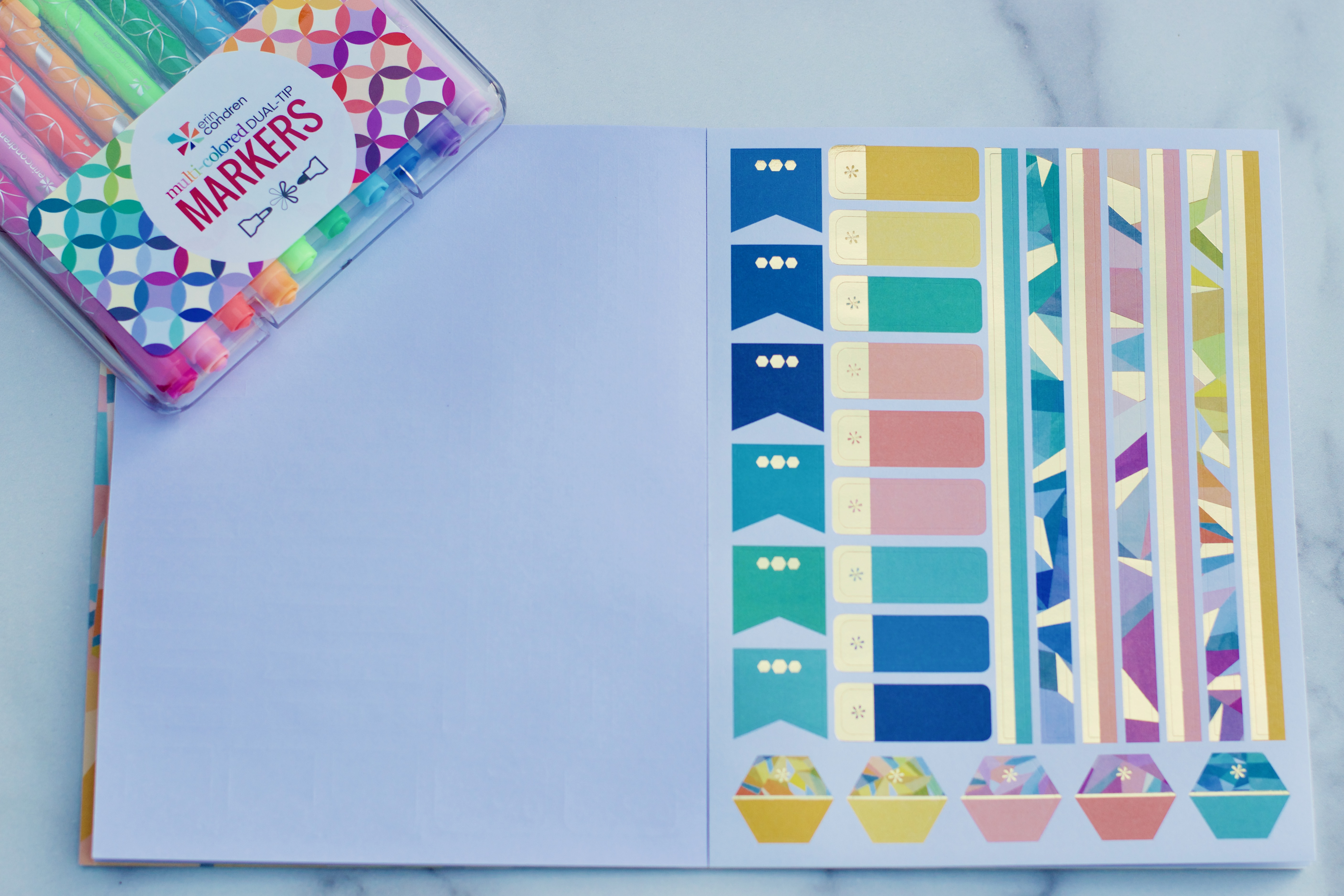
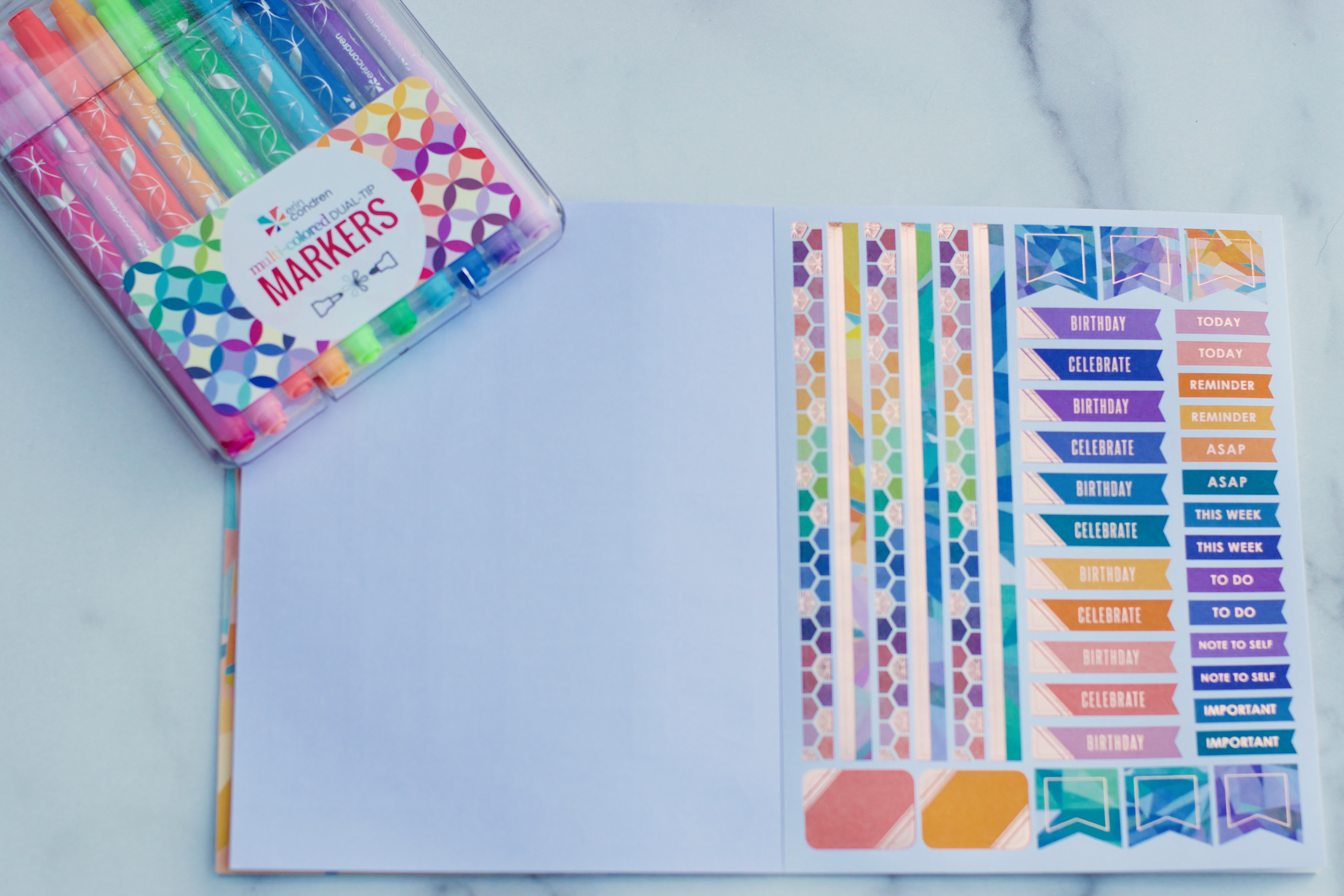
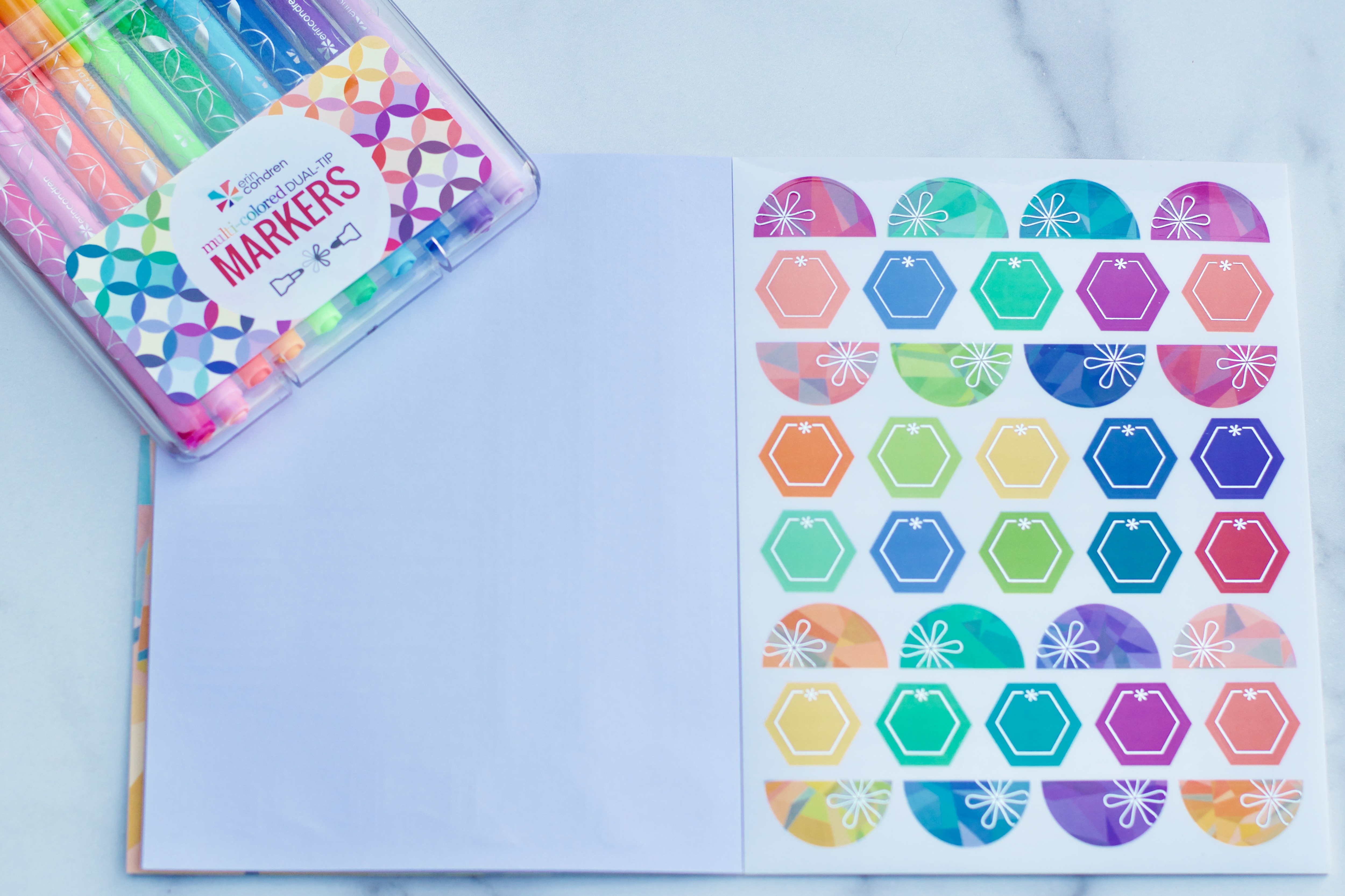
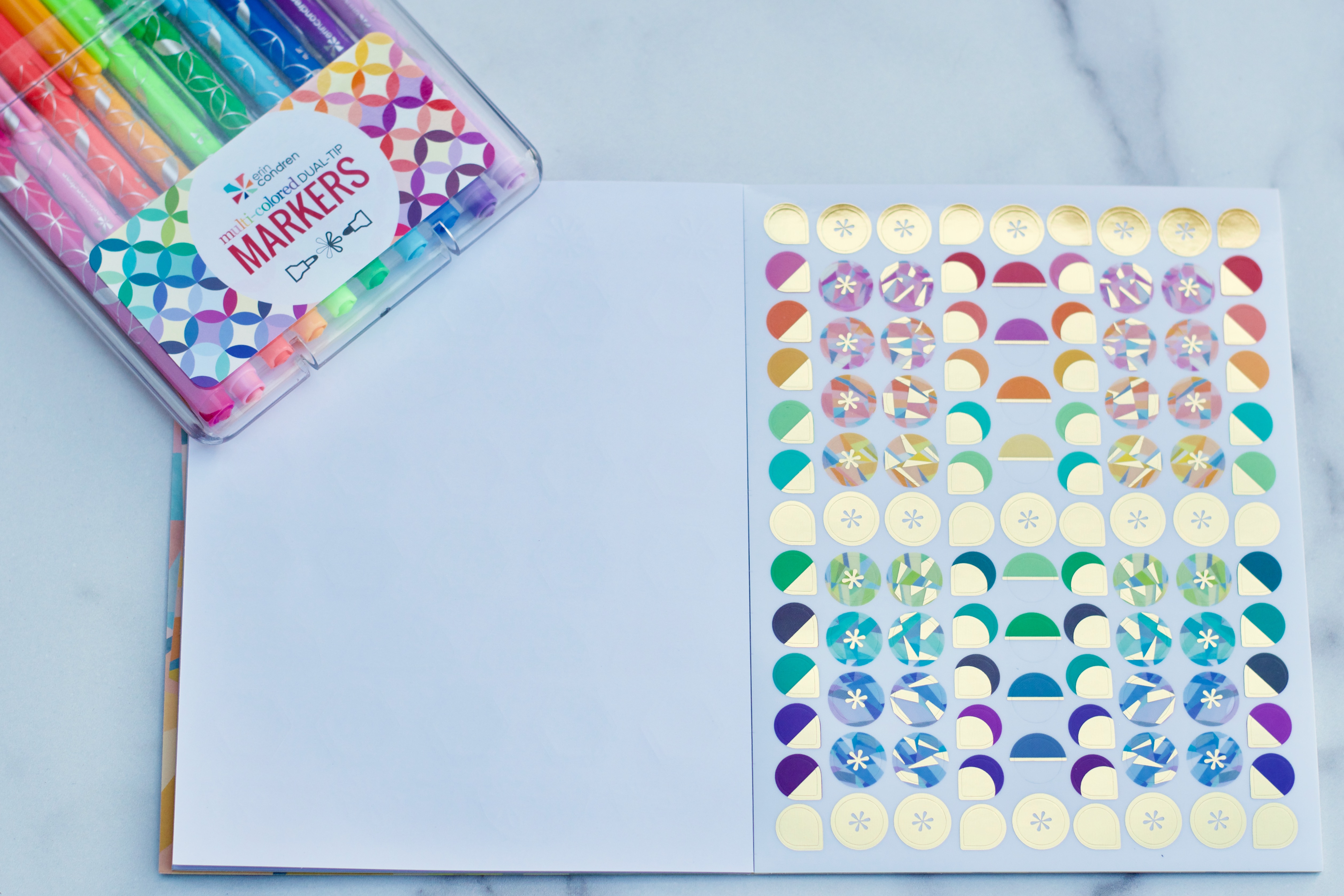
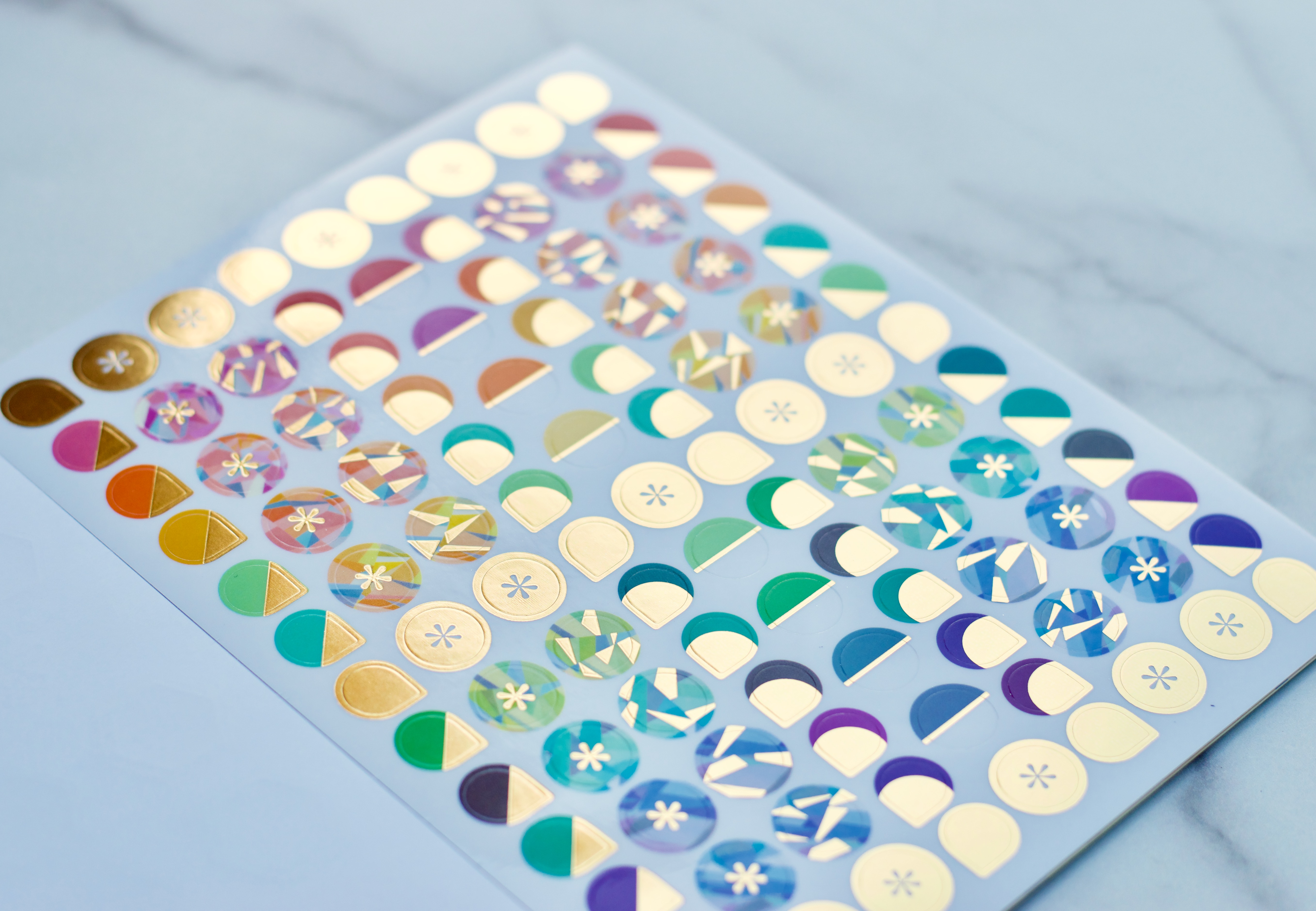
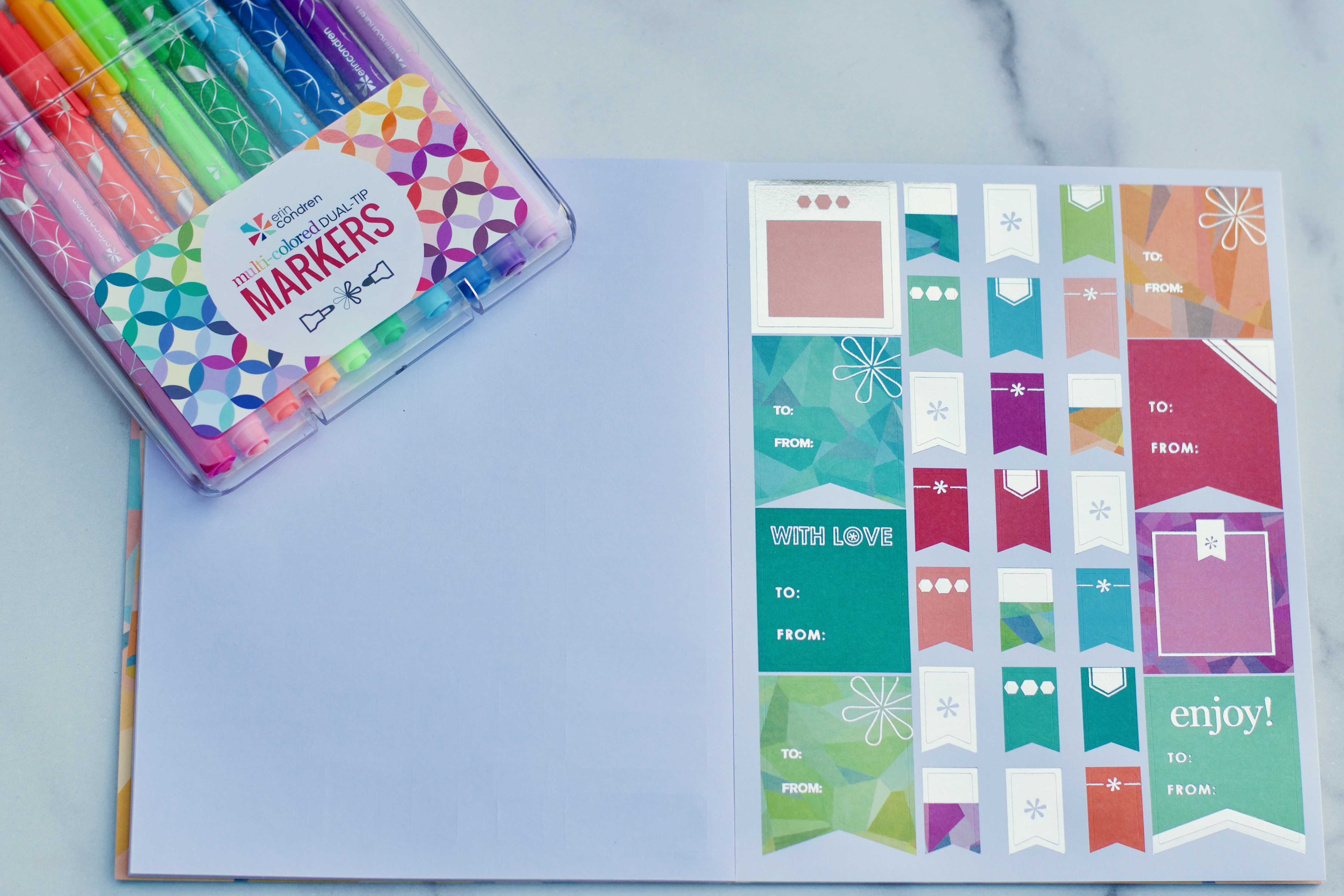
It has become standard for Erin Condren to include several coiled in pages of stickers in the back of each planner! This year’s stickers are stunning! And this year, your coiled in stickers are different (colors) depending whether you choose a neutral or colorful planner. The style and shape of the stickers is the same, but the colorful has…well…colorful stickers.
These seasonal stickers are utterly charming!!
This year’s event stickers are beautiful with a rose gold asterisk in the corner of each.
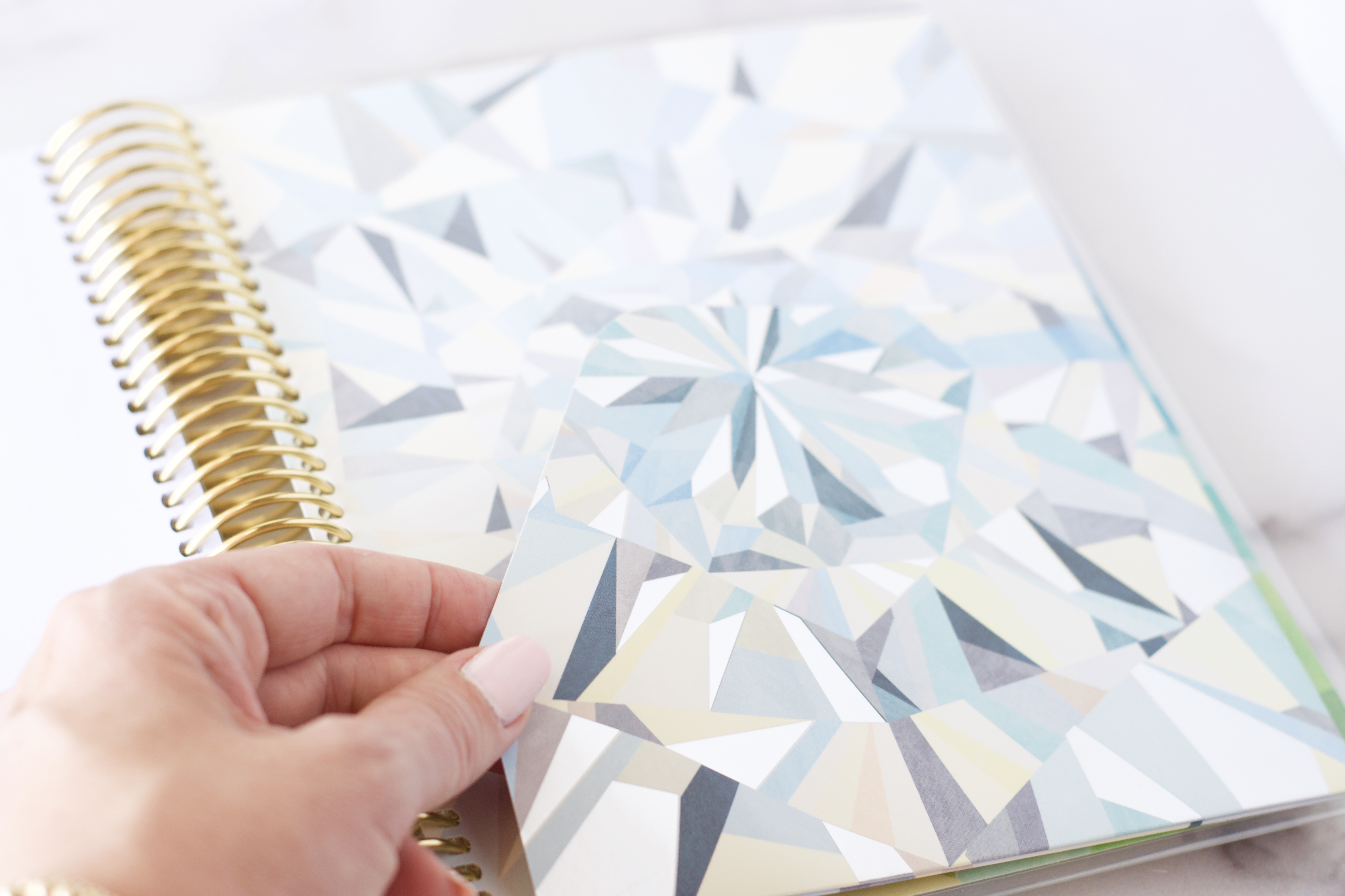
The back pocket is a big deal for me this year! Both sides of the folio have the same handy pocket flap!!! Hooray!!
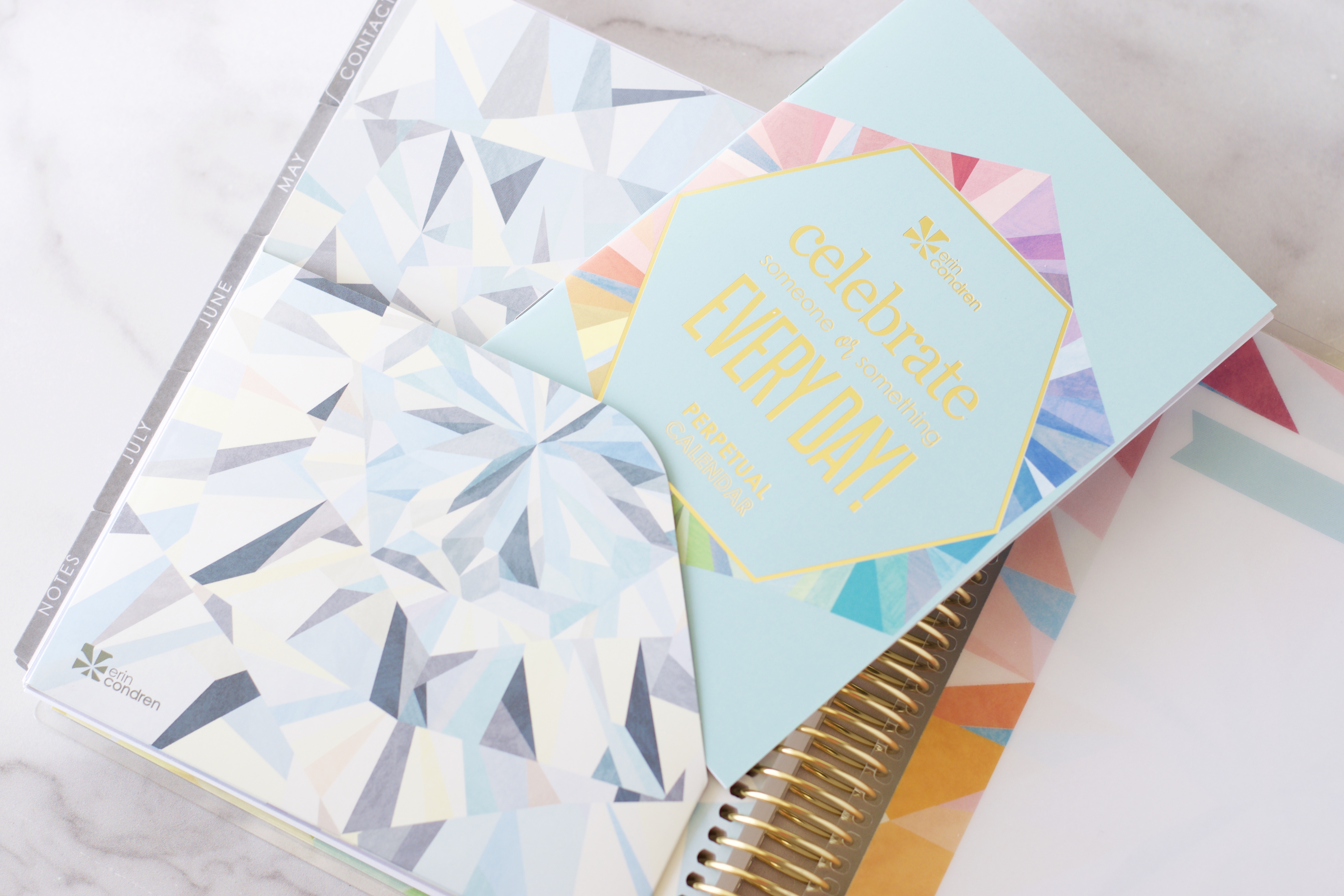
And, every Erin Condren LifePlanner comes with the small perpetual calendar (blue booklet) above.
I might have saved one of my favorite changes for last! The snap-in ruler which comes with every LifePlanner (and can also be ordered separately) got a facelift and a function makeover and I love it! It’s wider and made of a much better material for snapping in and out of the coils. I also think it might be a smidge thinner than the clear plastic snap-in ruler of last year. You can purchase additional snap-in rulers from the website for $4.50.
The 2019 LifePlanner Binder System
This year Erin Condren released a new sister to the LifePlanner girls – a binder system! I was able to preview an early release of the binder to share with you, but my preview was so early that the production team was still working out the details of packaging. I’m grateful for the planner and the peek I’m able to share with you, but I want you to be aware that I may not have all of the little details assembled here that you might have in your binder package. The Binder LifePlanner is $60, the same amount as the 18 month coiled LifePlanner.
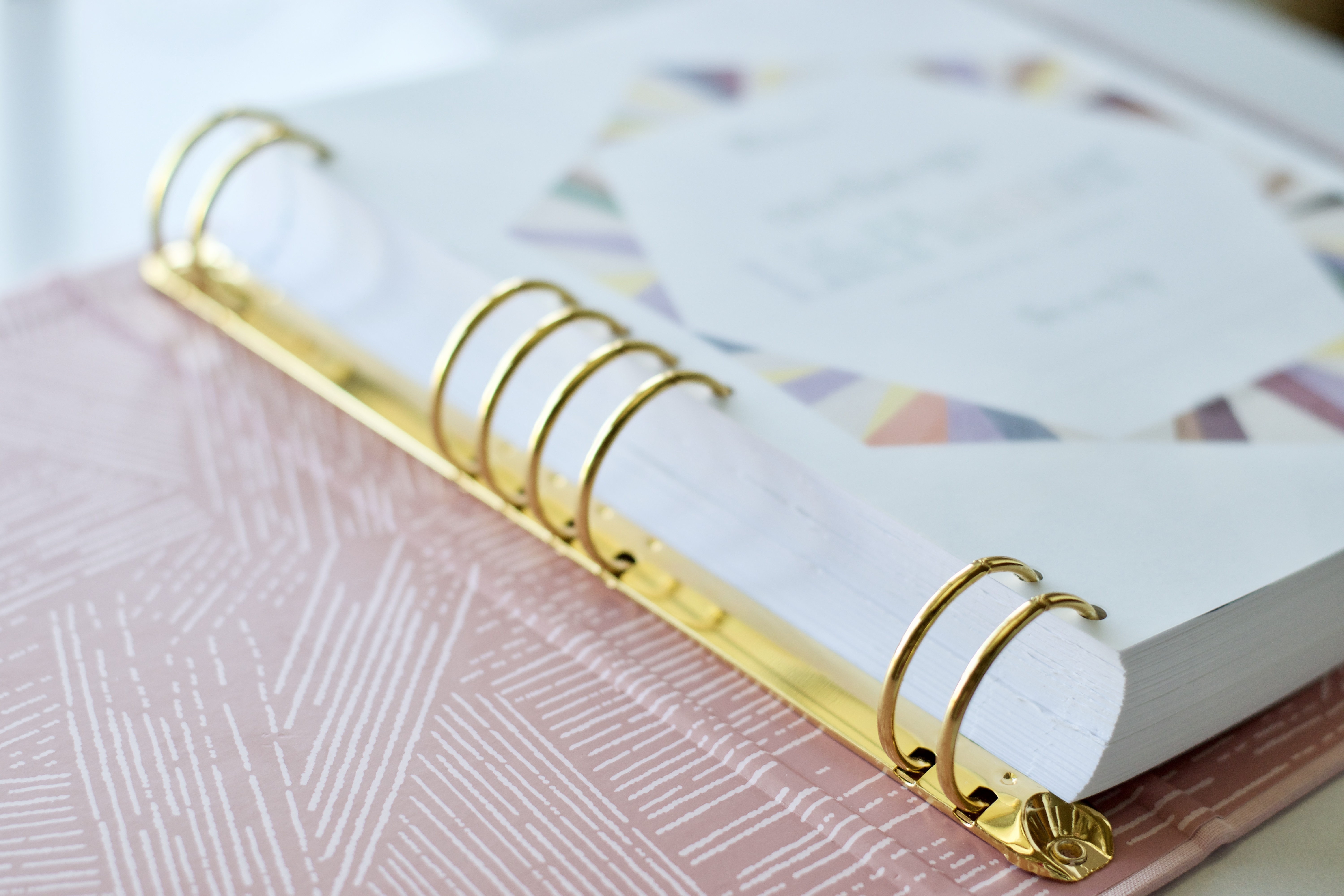
I requested the blush book cloth binder and it is lovely! It is a rigid, hard cover binder and mine has gold rings.
The binder itself measures: 10″ high x 9″ wide x 2″ deep. The planner “guts” are completely up to you – horizontal, hourly, vertical, colorful, neutral – and they are EXACTLY the same as the regular coiled 7″ x 9″ LifePlanner guts. You’ll have the following choices in terms of binder colorways:
- Bookcloth:
- Kaleidscope Neutral (silver rings)
- Kaleidoscope Colorful (gold rings)
The rings are beautiful and the inside cover of the binder is in a complementary tone with the woven wonder print.
The ring system is unique to Erin Condren. It’s understandable that the brand would make this ring system proprietary, but I also understand that a lot of you with planner binder systems who might want to transfer your own inserts into this binder…or might want to put an EC LifePlanner in your own cover are going to be disappointed. It is my understanding that there may be an EC punch coming to the store to be able to add papers to the binder, but we’ll all have to watch on launch day for that. In terms of function, that would be extraordinary! I was able to speak to Erin Condren and she shared some thoughts on the binder:
- The binder system was highly requested by YOU! And EC listens to her customers!
- The binder spacing matches the coil pitch of the EC coiled LifePlanners – this was done very intentionally so that you can use any dashboard or snap-in EC accessory in your EC binder or in your coil bound EC.
- This is a first run at a highly requested product. There are many possibilities being considered for future binder system accessories – lined pages, dot grid pages, etc. But future development will depend on how you use your binder! EC is listening, binder-users! Be sure to take your EC surveys that are emailed out to customers because it’s that survey that offers ideas and potential new products! Many of the new products we have now are in existence because EC customers requested them through the survey, and I’m so grateful for a company that listens to its customers so closely!
- The interior of the bookcloth covered binders have the woven wonder theme, which was chosen to add visual interest in a design that wouldn’t clash with the kaleidoscope.
- The neutral kaleidoscope binder comes with silver/platinum binder rings, all the other binders have gold.
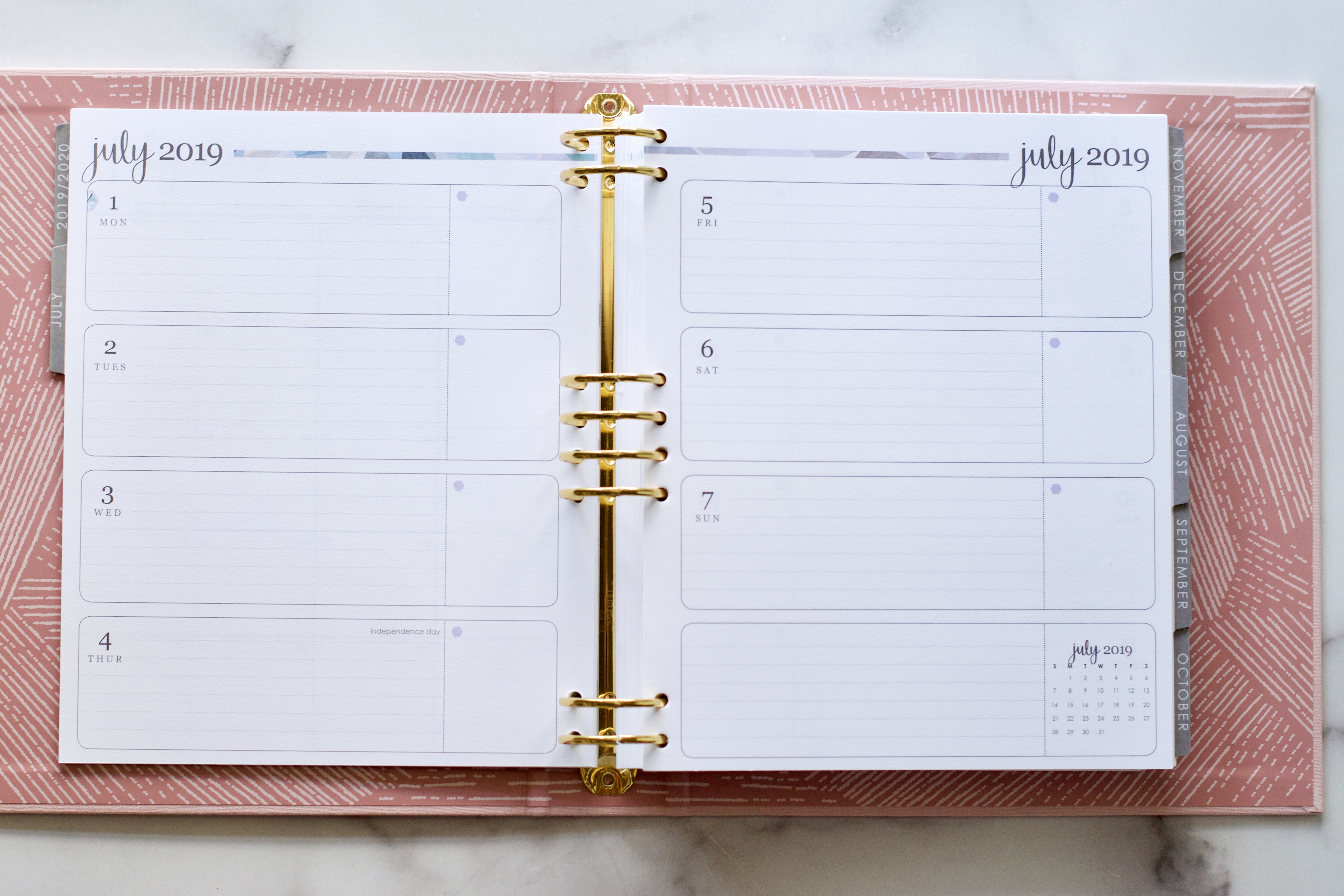
I have a full 18 month planner (pictured above) in my binder. It is the exact same “planner guts” as in the coiled LifePlanner, except that this planner is punched for the binder system. 18 months does fit in this binder, but it is pretty thick. When I took 6 months out of the planner (to make it a 12 month) it became much more manageable and it left me room for additions. If I were using the Binder System I’d probably order the 18 month and then just keep 6 – 12 months in at a time. The flexibility of a binder is that I could also add all of the months if I wanted and leave out some of the bulk by removing weekly pages. Lots of flexibility!
The next few photos are just to show you that the inside of the Binder System LifePlanner is exactly like the inside of the coiled LifePlanner. Think of them as “fraternal twins.”
I think the neutral color scheme looks beautiful in the blush pink binder!
These are the monthly prep pages that come before each monthly spread.
Pictured above is the neutral horizontal layout. It follows the same neutral gray-based theme, with a light touch of color in the kaleidoscope ribbon at the top of the page. Each day is lined and has an unlined side box. Each week has a lined utility box for noting weekly goals and to-do lists. The mini monthly calendar is in the bottom right of the page.
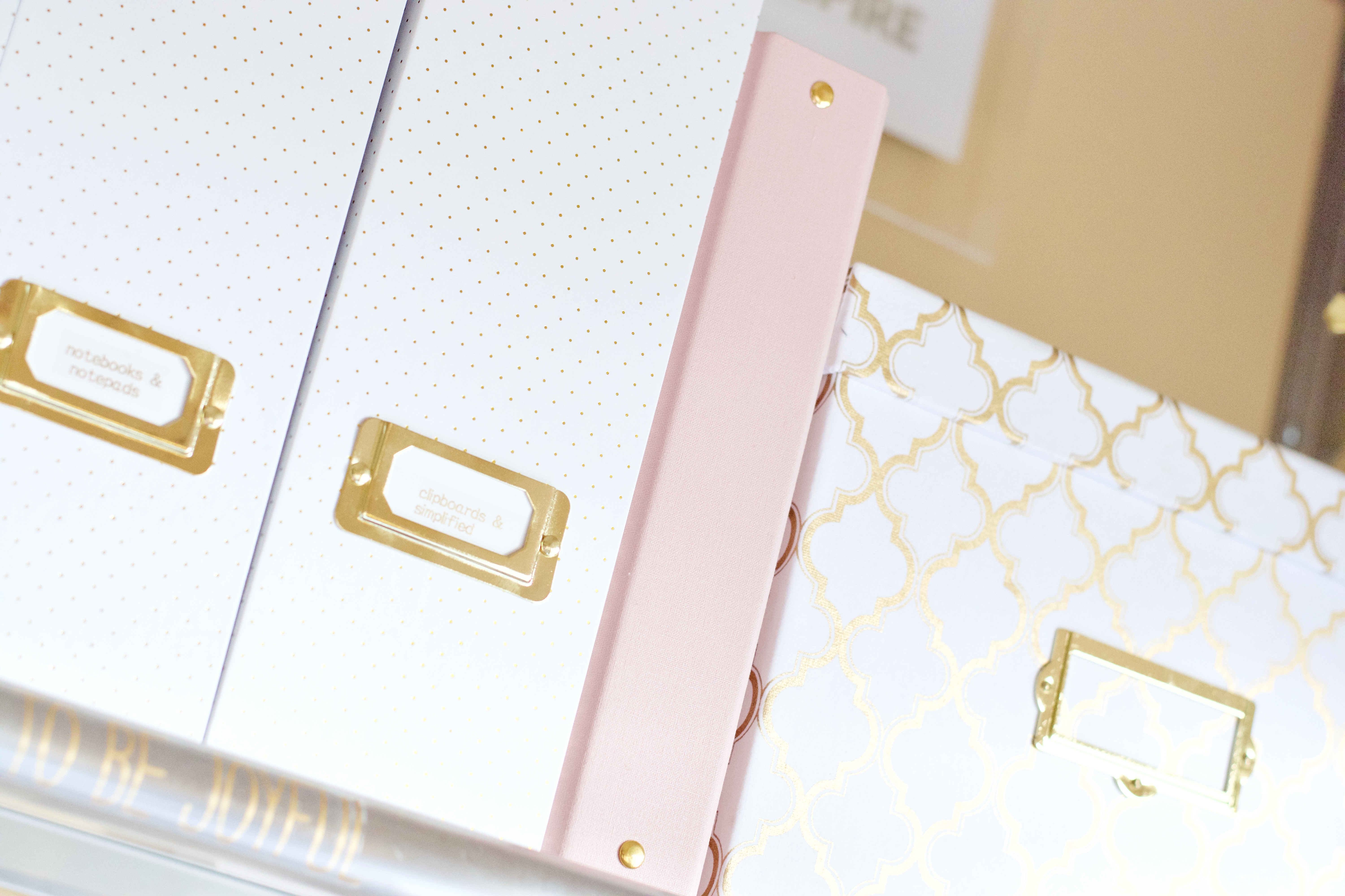
It looks beautiful on the shelf, doesn’t it?!
Let’s talk accessories
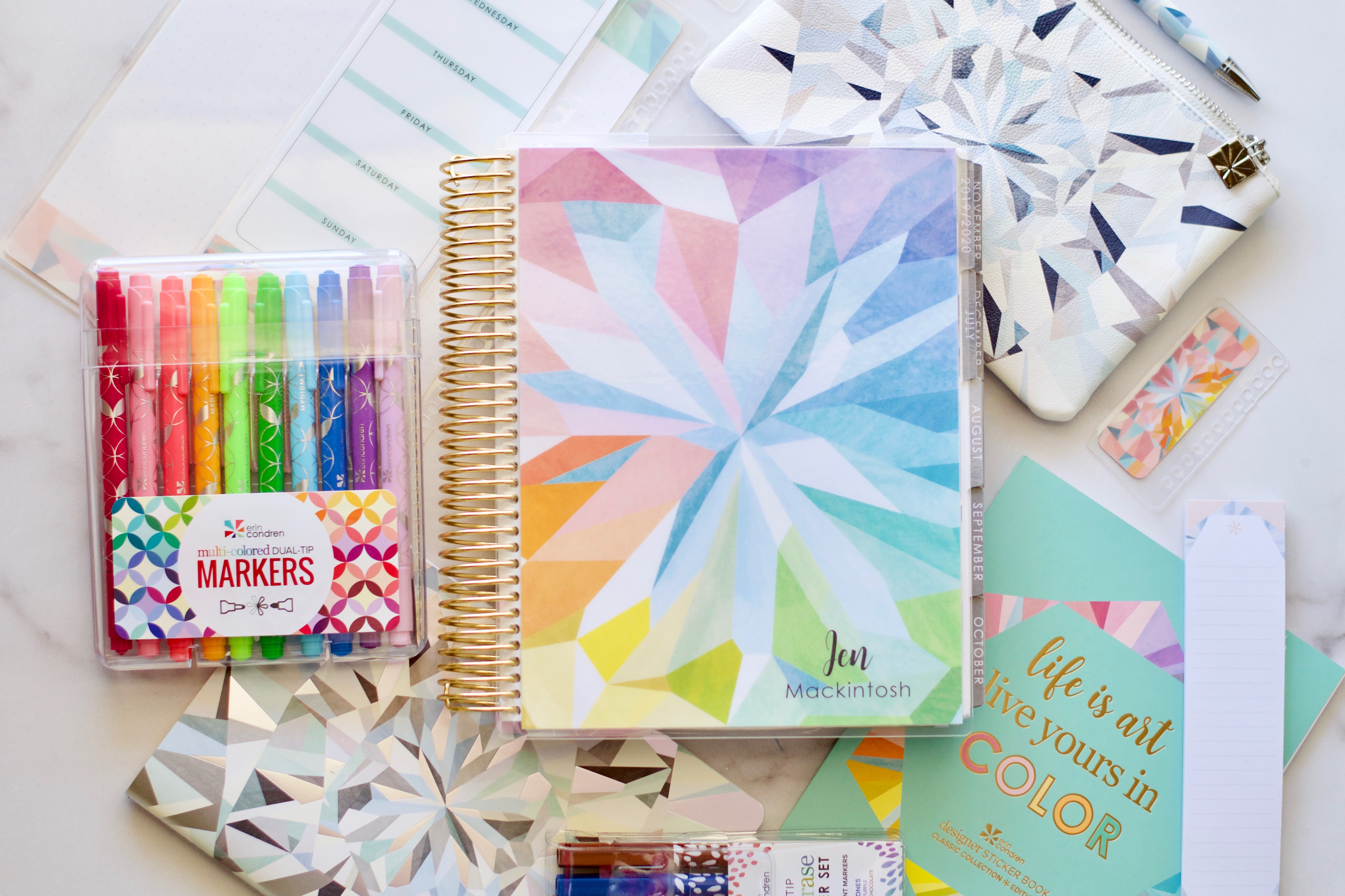
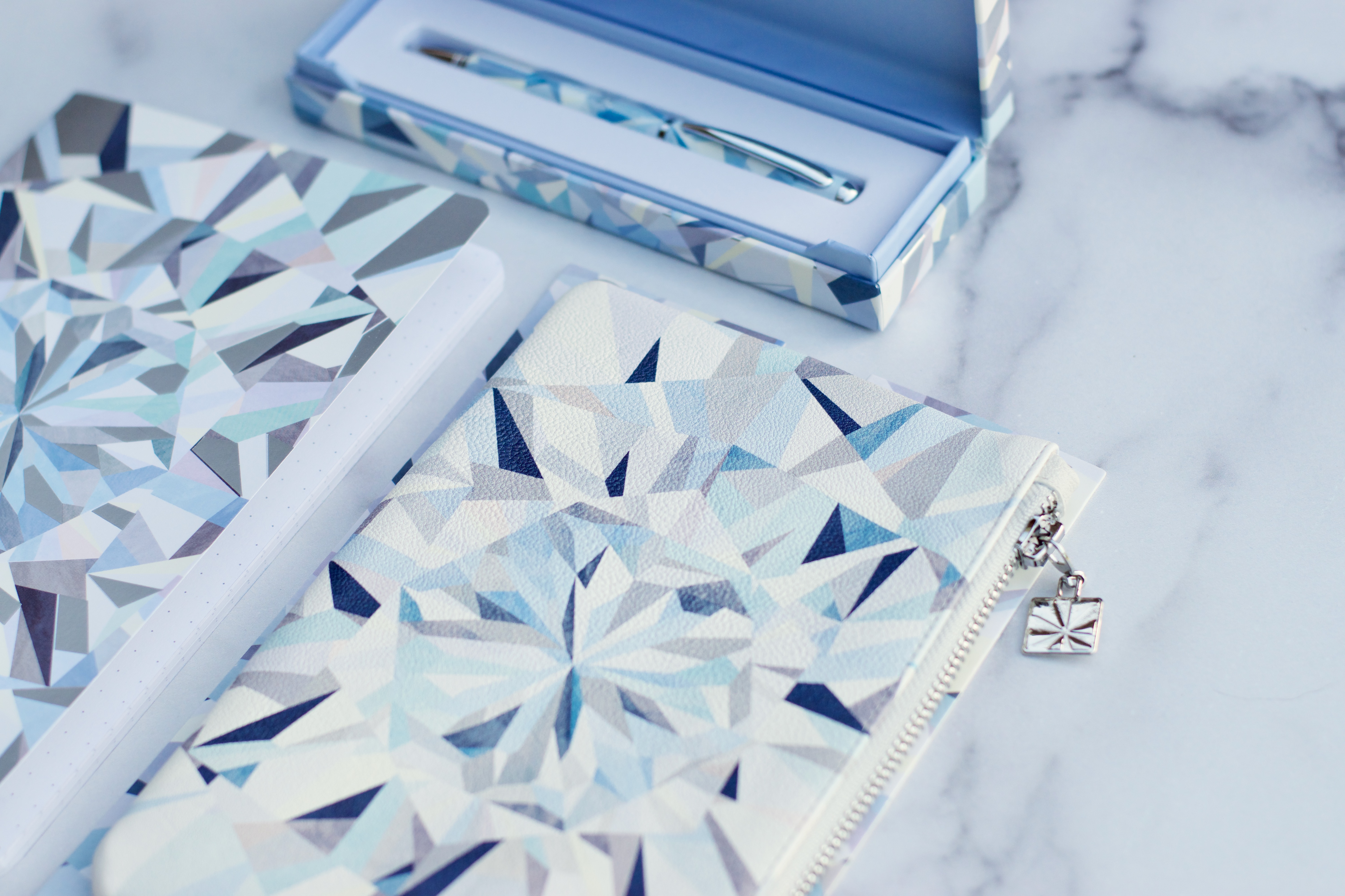
The accessories for this year’s launch represent the same kaleidoscope theme. This year there is a neutral themed set of accessories, and a colorful themed set. I’ve seen the colorful themed accessories and they are stunning! I have the neutral set that I can show you today.
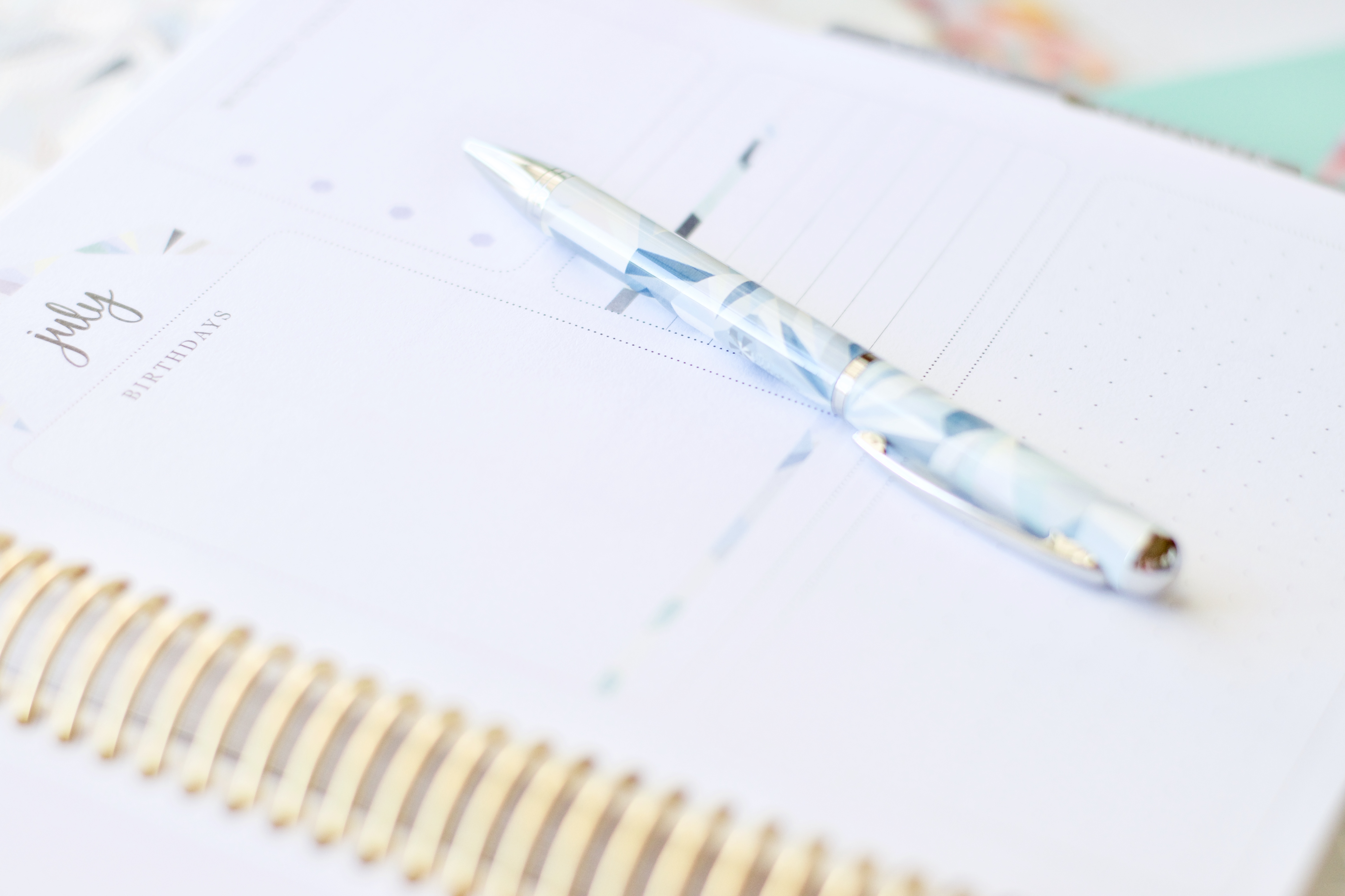
Above is the kaleidoscope neutral petite dot grid journal & the colorful lined journal ($9), the planny pack (neutral & colorful options – $20), and the new kaleidoscope ballpoint pen ( your choice of colorful or neutral – $18.50). The pen writes in black ink and comes in a beautiful box for gifting!
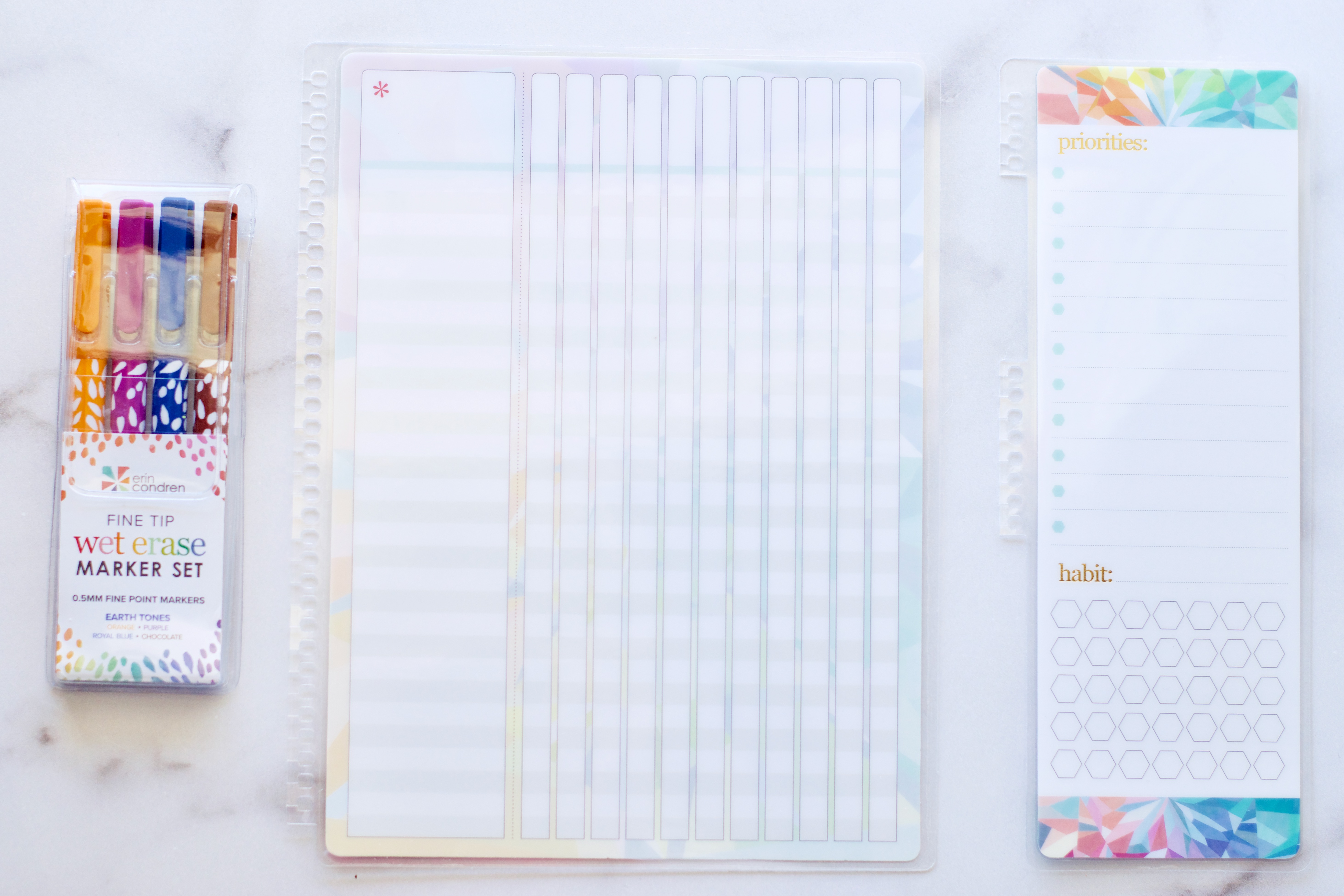
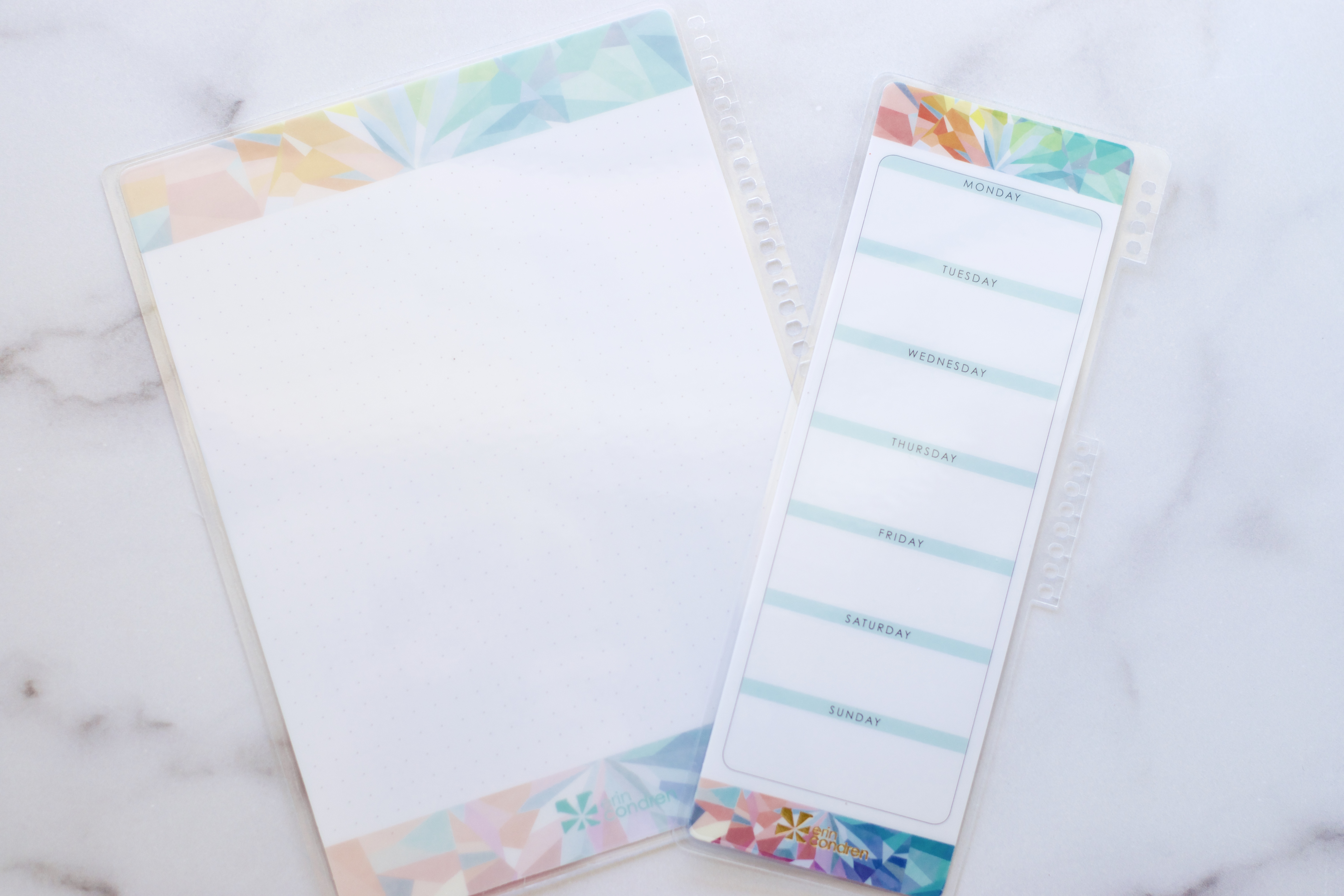
The fine tip wet erase markers have been released in new Earth Tones ($10.50) but a new Gem set is also available, and there are a couple of new dashboards. The full size Kaleidscope snap-in checklist dashboard ($7.50) is a perfect tracker! The only downside is that if you’re tracking recurring monthly tasks there are only 11 tracking columns, but you could always create a 12th column out of that first extra wide column where you’d list tasks. And the to-do list snap-in dashboard ($4.50) has a place to record weekly priorities and habit tracking.
The full size dashboard has a dot grid backside, and the snap-in to do list dashboard has the days of the week.
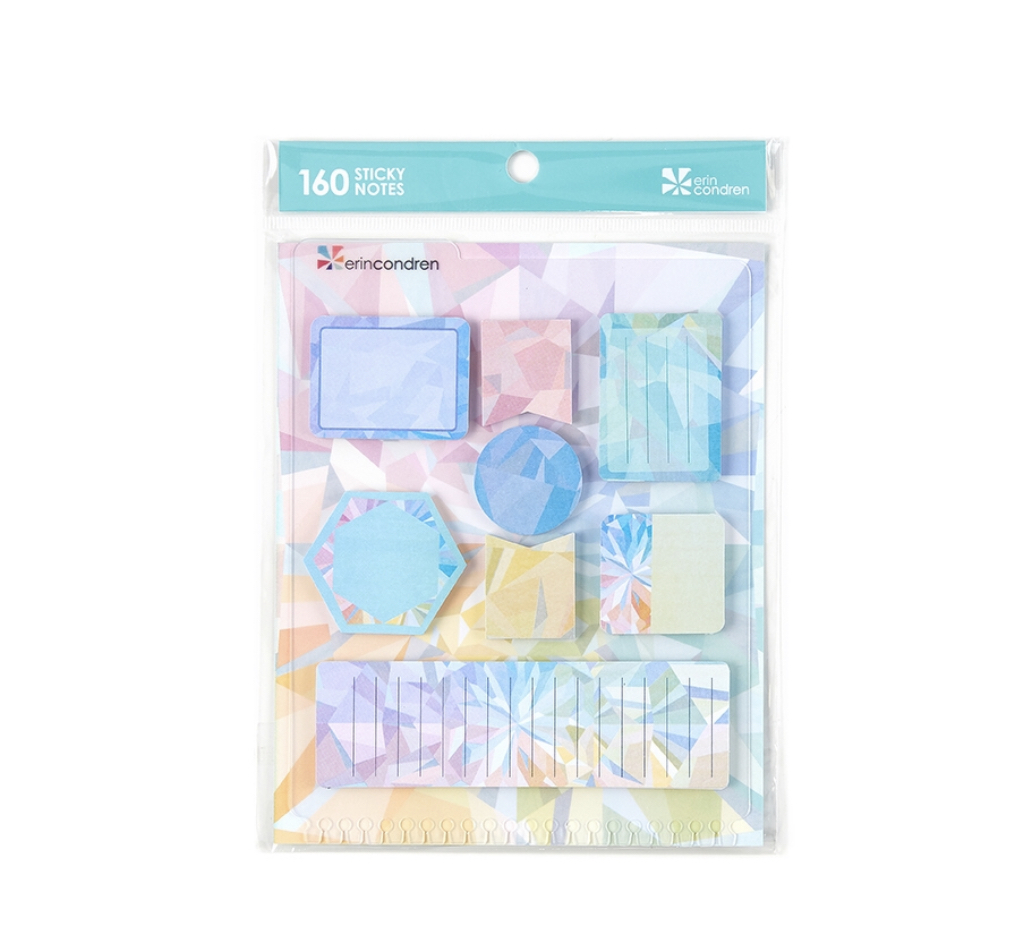
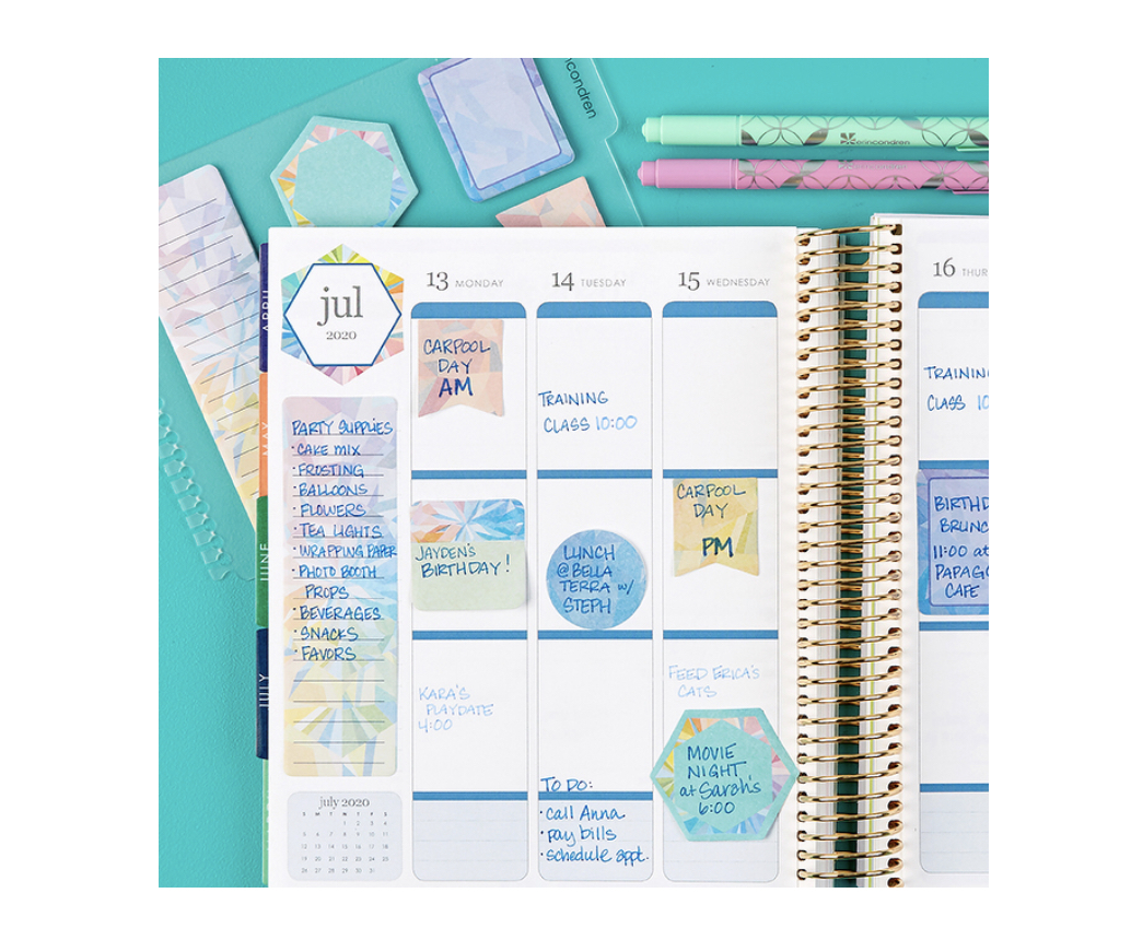
One of the accessories I use all the time in my EC LifePlanner are the sticky notes! I love that they coordinate with the theme! I usually run a strip of adhesive/glue and attach to my planner so that it functions more as a sticker and less as a post it note.
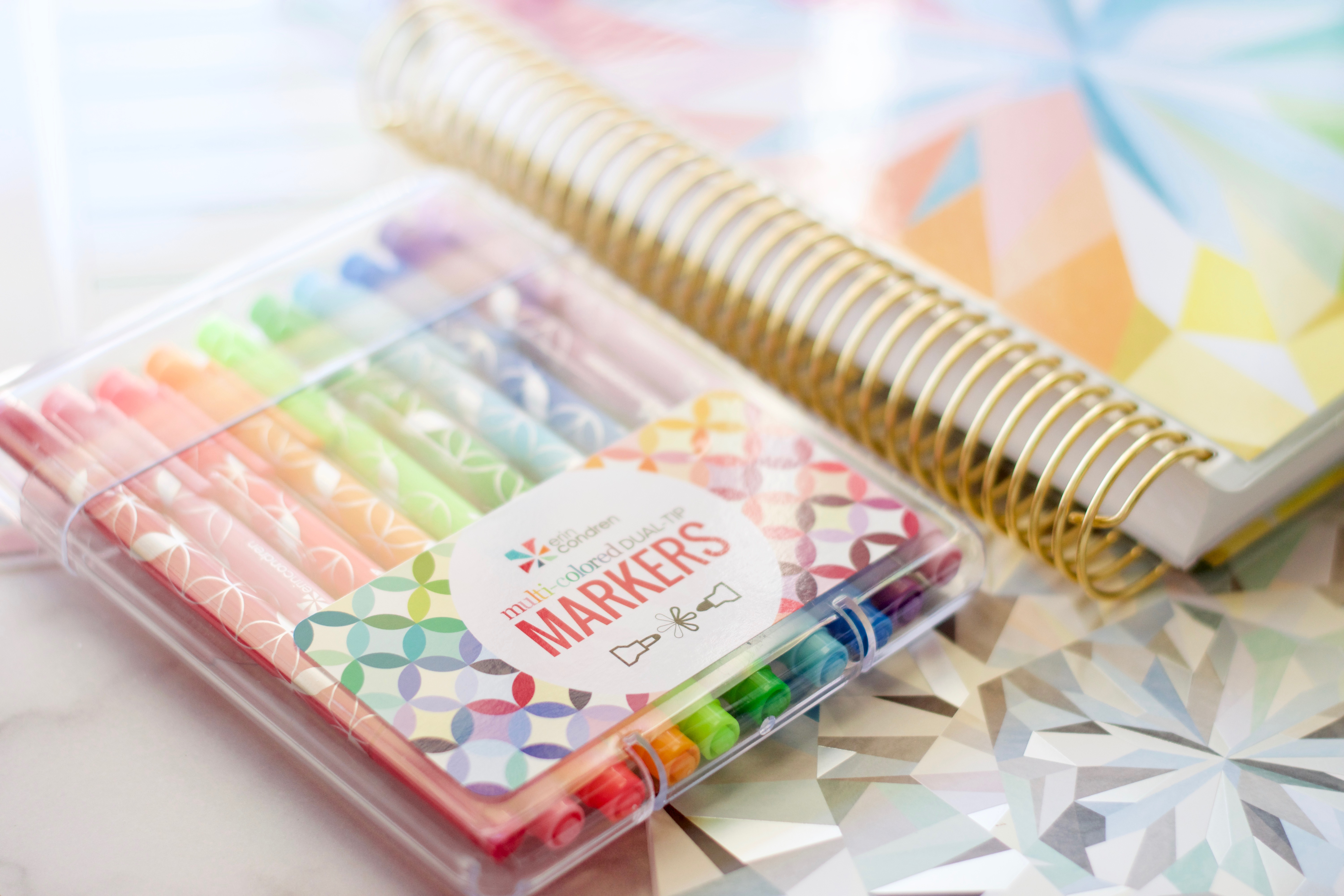
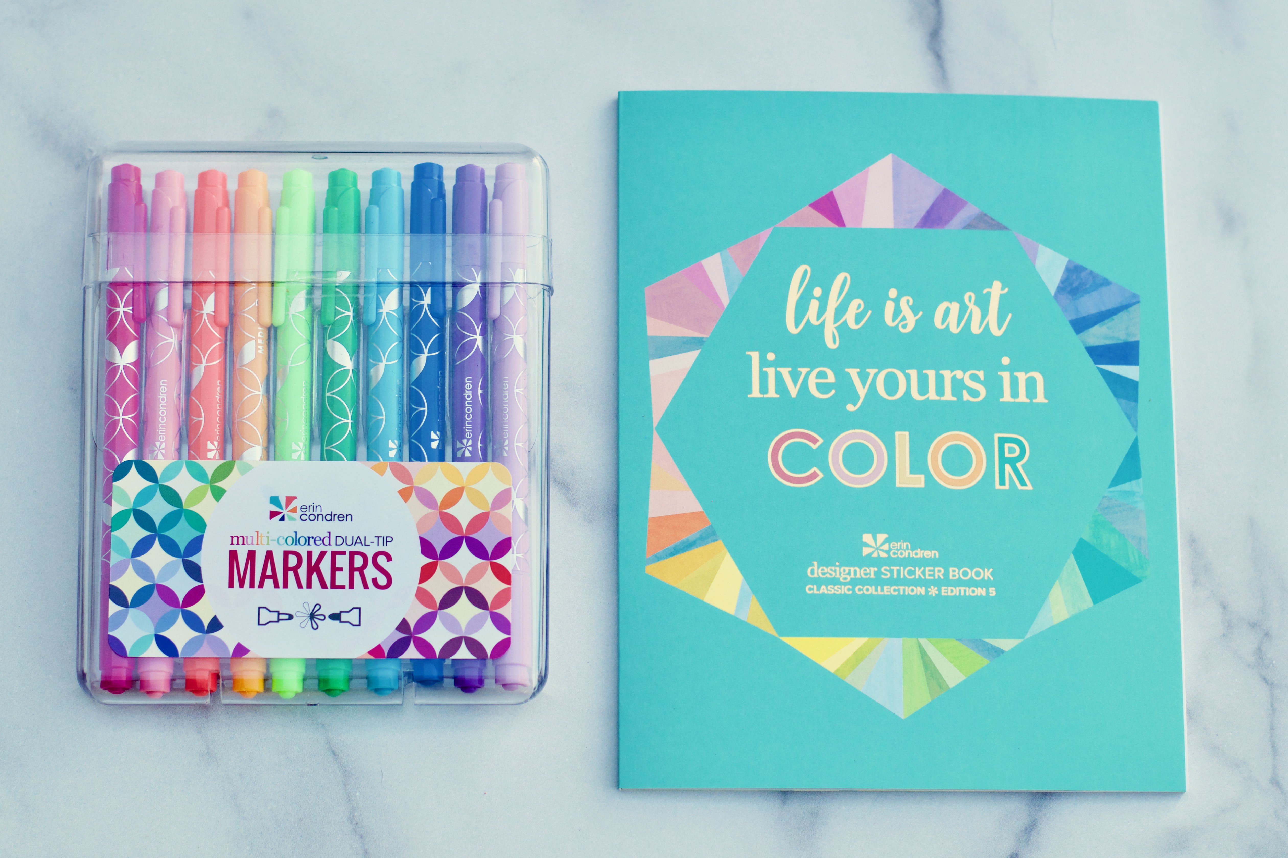
The 10 pack of multi-colored dual tip markers ($22.50) is a great starter set of dual tip markers! The fine tip is 6 mm and the medium tip is 1.2 mm. This set does have a couple of new colors (cerulean & aloe are brand new, coral and kelly green were in a spring surprise box but have never been available for sale before now – so that’s 4 new colors in this set). And I love that this a versatile, basic set of primary color dual tip markers. This is a fantastic option if you haven’t tried the dual tip markers before!
There is a new set of 3 metallic elastic bands ($10.50), a pen holder ($3.50), mini snap in bookmarks in the kaleidoscope theme ($4.50), compliment cards ($5.00), and the neutral kaleidoscope stylized sticky notes ($10.50).
And that brings us to this year’s sticker book, classic collection, edition 5 ($15.50) – which is a really great value for all the stickers in this book!). Below are all the pages of the sticker book:
Bundles!
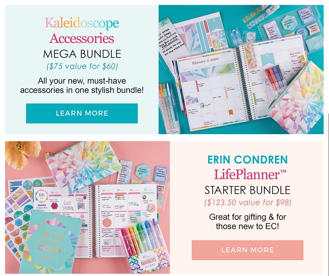
If you choose to order your LifePlanner through a bundle you can choose all of the customization options (calendar, coil, layout, color scheme) and save money. Some customization options may increase the price of your bundle and personalization may increase the price of your bundle.
Looking for more? Sharing the love!
A few of my planner friends have some preview planners and content for you, too – some have blogs, some are doing youtube videos, and all have fabulous content! I’ll list the social channel they’ll be sharing on, and below their name, I’ll list the planner and layout that they’re reviewing.
- Kayla Benda (Oh Hello Living) – blog post |youtube video
- Vertical | Colorful
- Julie Garza – youtube | Instagram content
- Hourly | Neutral
- Jen Dufore (jen_plans) – youtube | Instagram content
- Hourly | Colorful
- Ashley Ann Laz – youtube | Instagram content
- Vertical | Neutral
- Claudia Bach – blog post | Instagram content
- Horizontal | Colorful
- Briana Engebretsen (Diva and the Divine) – youtube | Instagram content
- Vertical | Colorful
- Jen Ross (Pretty Neat Planning) – youtube
- Vertical | Colorful
- Horizontal | Neutral
- Binder System: Blush | Horizontal | Neutral
- Jackie Perdue (Jaaack Jack) – youtube
- Vertical | Neutral
- Laken Edwards (PlanwithLaken) – youtube
- Hourly | Neutral
- Emily Goldsberry (Favorite Daughter Emily) – youtube
- Hourly | Colorful
- Naina Singh (nainaplanning) – Instagram content
- Binder System
- Sarah Klein (planwithronald) – Instagram content | video
- Hourly | Neutral
- Kristin Morgan (The Gold Project) – blog | youtube
- Neutral | Horizontal
And that is it, friends! Again, if you’re a first time Erin Condren customer and use this link to set up your account, a $10 coupon code will be sent to you! I hope this post was helpful as you consider the choice of a planner tool in your life! And I hope you’re as excited for this year’s launch as I am!


























Jen, once again — thank you SO much! Love these reviews you do. I am such a visual person, that the photos help me so much to see how this system might work for me. … really hoping and praying to be able to afford the LifePlanner this year 🙂
Thank you SO much!
Thank you so very much Jen for putting this together for us. I always follow you on instagram and love how you present your information. I was planning on switching from the vertical layout to the hourly layout this year but now I am probably going to stay in the vertical because I am similar to you in that I don’t like that the stickers do not fit the box properly. THank you for going above and beyond with your details.
Thank you so much!!
Wow! Thank you for being so in depth with this review. I have the hourly planner, and I’m also a bit sad to see the half hour blocks go away. But for me, that bottom section is super helpful.
I was disappointed with the change to the hourly layout. The half hour blocks were of great use to my system, I didn’t mind the hours running 6a – 7p, so I won’t be investing in the hourly this year.
However, it did give me cause to have more of a look around the website where I discovered the daily petite planners. I had never really paid attention to the petites – with exception of the original wellness, budget, meal, etc. – so I’ll be moving to the petite planning system, which may wind up working out for me better.
It’s a shame for me, because I LOVE the kaleidoscope design. It’s gorgeous. I just cannot get over the hourly layout change personally. That for me was a deal breaker. I don’t mind changes to tabs, I actually love the idea of the monthly little dashboard change. But for functionality and productivity, I liked how the layout was, and I don’t feel that the new layout will be what I need, and may even be detrimental. I hope that they put the kaleidoscope design on the on the go folios – I would die! <3
Wonderful review! I hope everyone looking forward to the new planners love them!
Thank you for the thorough pictures and links to everyone else’s videos!
You are so welcome!
Thank you so much for this beautiful post. Have you heard whether there will be a hardbound version available?
This is beautiful! I’ve never bought a planner that was bound (I just can’t have a planner that I can’t easily add my own pages) but this new notebook system might bring me over. It’s just lovely!
Yay! I’m excited to hear what you think of it!
Hi Jen, lovely review, thank you! I would love to see an update on how you are using the life planner this year, given your use of the Simplified Planner and your focus on stewarding your time. That weekly view is just so helpful! It’s easy for the lists to take over, ruining anything like balance! But not sure how much text can be included with the loss of the half hours. Love to read your unique take on it!
What a great idea for a future post!! I’d love to share!!
I have been using Erin Condren since 2016 and they are beautiful planners & I was obsessed, however, last year they sent me the incorrect planner & spoke to customer service who just offered me 10% off to buy a new covers so I did because I thought what the hell – love them anyway. Anyway this year I ordered the 2020 kaleidoscope planner and they had put the back cover on the front of the planner and vice versa and customer service said this was my fault even though I sent them a picture.
I am sad to say I will never be buying from them again because their customer service is terrible and this can really make a business lose customers.
Lovely blog btw =)