Review of the 2017-2018 Erin Condren Life Planner
I can hardly believe it’s time for a new planner, but it’s here! And Erin Condren will launch her beautiful new 2017 – 2018 Life Planners on May 4, 2017! Like all of you, I am eagerly awaiting launch day because there are some fabulous new products in the lineup, and the classic Life Planner has undergone some subtle (and some not-so-subtle) updates. If you’re new to the Erin Condren Life Planner world, stick around! I’ll walk you through this planner from beginning to end and share with you why I’ve been in this planner for over 4 years (and give you a coupon for $10 off)! If you’re already an Erin Condren fan, you’ll love some of the changes I’m going to share! Let’s get started!
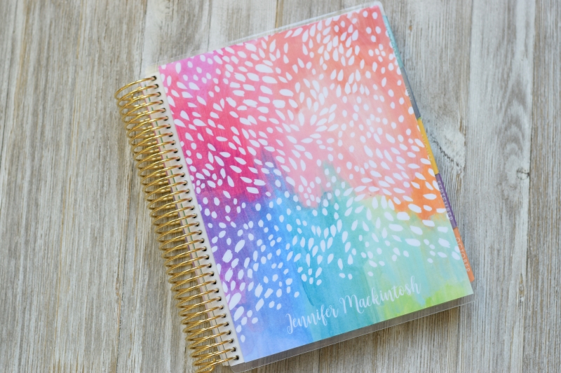
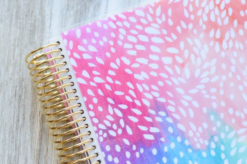
I have the brand new classic Life Planner in Erin Condren‘s gorgeous new Painted Petals signature design along with some of the new accessories, and I’m excited to share a detailed review with my honest thoughts and opinions! I will have several of the new hardbound planners in my hands right after launch, along with one of the beautiful new luxe planners – I’ll share more about those later! (Subscribe so you don’t miss those reviews!) I share a lot of pics and details of how I plan on my Instagram page – be sure to follow me there! I’d love to have you along!
S O P H I S T I C A T E D
My first impression of this planner only deepens as I turn pages, looking over every detail in every corner. It’s sophisticated in a way that earlier planners didn’t quite capture. Erin Condren has always offered us a whimsical and fun planner while maintaining function, and her magical whimsy still manages to move through the 2017-2018 planner, but the idea that kept striking me was how sophisticated this planner has become.
From the beautiful paper, amazing coil options, the more streamlined design within the pages of this planner, the updated font and sometimes subtle font changes, the beautifully simple neutral layouts (one of three layout options for you to choose from!), the new signature painted petals design theme, and the emphasis on metallic foiling throughout the entire Erin Condren line, the one take-away is that this planner brand is functional, beautiful and chic. Sophisticated!
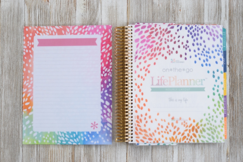
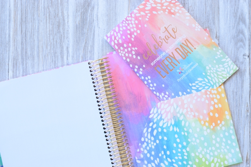
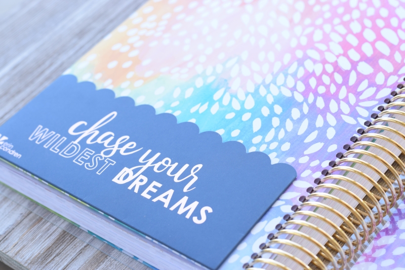
This year’s signature design theme is something Erin Condren calls Painted Petals. I fell in love instantly. There is the obvious pigment rich watercolor backdrop for the ethereal petals that float across the cover (and almost every accessory this year), but I think I felt a little poetic when I saw it first. It’s evocative of life – of the changing seasons through the rich colors, of movement through the seasons of life. Not a single petal is the same, and that’s so much like life – not a single day or moment is the same; each of them is unique, all are rich and treasured in their own way. I think when I saw this cover I saw a metaphor, and I liked that my days – goals, lists, dreams, to-dos, memories – our journey would fall between these covers and that seemed to be a rich metaphor for the seasons of my life.
Ok. I’m done foisting my poetic vision onto this planner cover! LOL!! I’ll share with you that this is one of many covers that you can customize the cover’s colorway – I’m definitely going to order one of the painted petals covers in a dark navy/midnight and white! It’s one of my favorite color combos! But do consider the signature cover – it’s stunning! I hope it encourages you to embrace your season of life – whatever it is!
P A P E R
The big news this release is the paper! It’s not something that’s going to jump right out at you (unless…ahem…you’re a paper nerd like me! hee-hee), and if you’re new to this planner you might not notice at all, but this is well-received news for planners and fans of Erin Condren!
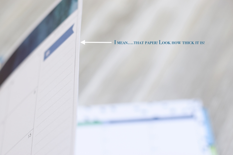
The paper in the Erin Condren Life Planner (and all future planners, I believe) underwent a major overhaul and change. This year, Erin Condren partnered and collaborated with Mohawk and the net result is a Life Planner printed on beautiful, archival quality 80 lb paper. (Here is a fantastic video detailing her new partnership!) For so many of us, these planners become more than a list of appointments and to-dos – they become a space for hopes, goals, and dreams to land, and then finally at the end of a planner they reflect the collected memories of past seasons. The archival quality paper ensures that these memories are preserved and protected! And I like that.
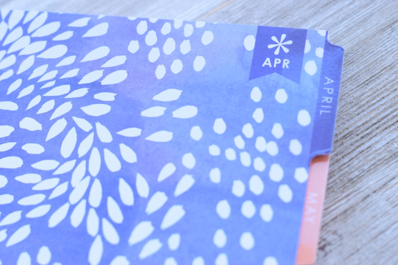
While the regular pages have more substance, it’s worth mentioning that the tabbed pages are even thicker than the regular pages in the planner and the tabs are more substantial, too! Look how this page stands up – by itself!
The new paper has a definite “tooth” and grit to it, and writing on it is a dream. When you turn pages you really notice the heft. It’s such a tactile experience – this paper – you need to touch it to appreciate it fully. And…because the paper is heftier, it can take almost every single pen you throw at it (except a permanent sharpie). So bring on your Flairs, your Le Pen, your heavy-handed ballpoint! Because this planner can take it!
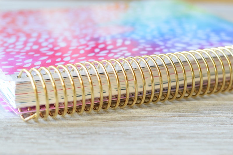
Now, one thing to keep in mind is that with thicker paper, comes a thicker planner. If you use lots of stickers, keep that in mind! My new planner is a 12-month academic and brand new, it’s almost as thick as my current 2016-2017 18 month planner.
O P T I O N S
I think one of the things I love the most about the Erin Condren Life Planner is all the options – you build your planner to fit YOU! How do you plan? How do you want your planner to look? What’s most intuitive to you? We each have different planning styles, so for a planning tool to be a good fit it should reflect that style! And there are so many ways to do that with an Erin Condren Life Planner. Planners this year start at $55.00; adding some options will increase the price. Let’s hit the specs and the details of ALL of the CHOICES you’ll encounter as part of the ordering process…
CALENDAR OPTIONS:
- 18 month planner (July 2017 – December 2018)
- 12 month planner (July 2017 – June 2018)
- 12 month planner (January – December 2018)
INTERIOR COLOR OPTIONS:
- Colorful (the planner pictured in this post is the colorful layout)
- Neutral (a black/white option that is streamlined and gorgeous!)
LAYOUTS – Each planner contains a monthly spread (for a big picture monthly overview), followed by the weekly spread – see your week at a glance. It’s this feature that brings me back again and again. What your week looks like in your planner is up to you – you choose:
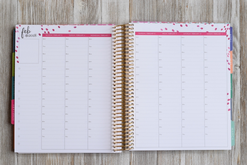
- Hourly Layout (the planner pictured in this post is hourly)
- Vertical Layout
- Horizontal Layout
COILS
- Gold (the planner pictured in this post has a gold coil)
- Rose Gold
- Black
- Silver
COVER
- Choose your own cover to reflect your personality – metallic, colorful, neutral – you choose!
- They’re all interchangeable so…choose lots of covers because you can swap them out! Swap with the seasons, with your mood, to reflect events! I love some of my older covers from years ago and still add them to my planner!
- Many covers are customizable – on the website, when you’re ordering, look for the square color swatch icon under the cover choices – if it’s there, you can choose your own colors for your planner cover!
- Luxe cover – the luxe planner is still an option this year and comes with a permanently coiled in cover. You have three cover color choices this year and you can add personalization in the foiling of your choice, or choose a blind imprint (that should be beautiful and it’s new this year).
T H E P L A N N E R – C O V E R TO C O V E R
Let’s start at the beginning and work through the planner – I’ll note anything new or updated! Every time you see a horizontal line you’ll know I turned the page (or left a section).
The covers of the classic Life Planner are all interchangeable – this is one of the most versatile features of this planner! The covers are all a thick, sturdy laminate, and the inside facing side of the front and back cover both have a wet erase feature. (I like using permanent ultra fine sharpies here – just use an alcohol wipe to “erase.”)
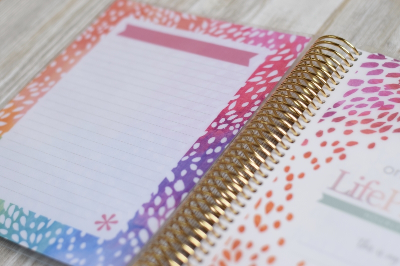
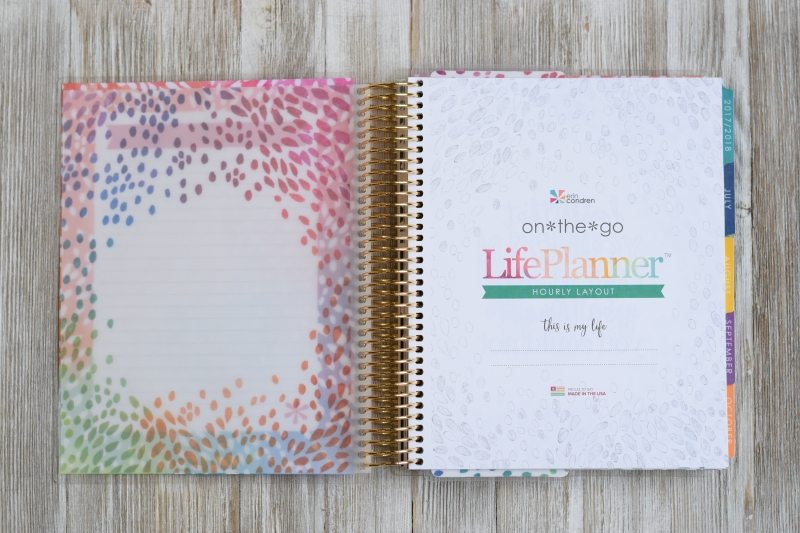
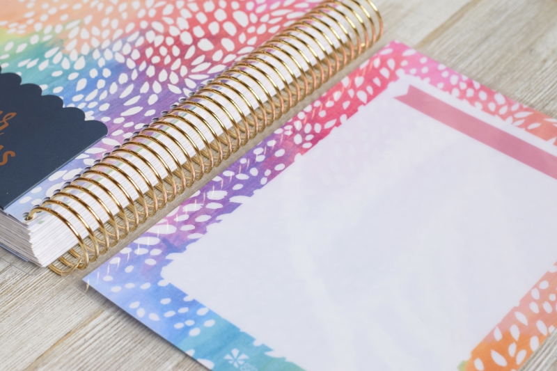
The first page of your planner is a gorgeous, thick vellum page with the signature painted petals design. Classy.
The cover page is exactly the same as last year with the exception of the painted petals that are present in a grayscale sketch around the page.
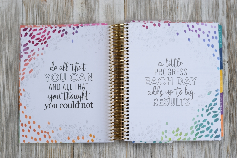
From there you open to a two-page spread that includes an encouraging quote to get you planning!
The yearly overview is next and this is the first two page spread that you begin to notice a few subtle changes – like the font and a simplification of extras so that you only see the future months. This is a great place to drop transparent dots over important or noteworthy dates so that you can use this page as your yearly big picture planning jumping point. I put dots on our homeschool schedule (it’s actually a great way for me to map out a year!), vacation time (what’s that?), important liturgical days I want to note, etc. This page can be really useful to your big picture planning!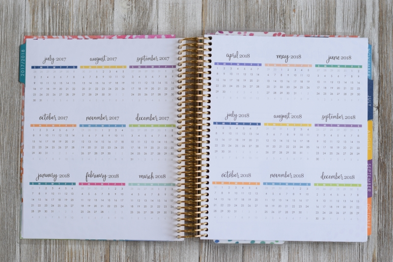
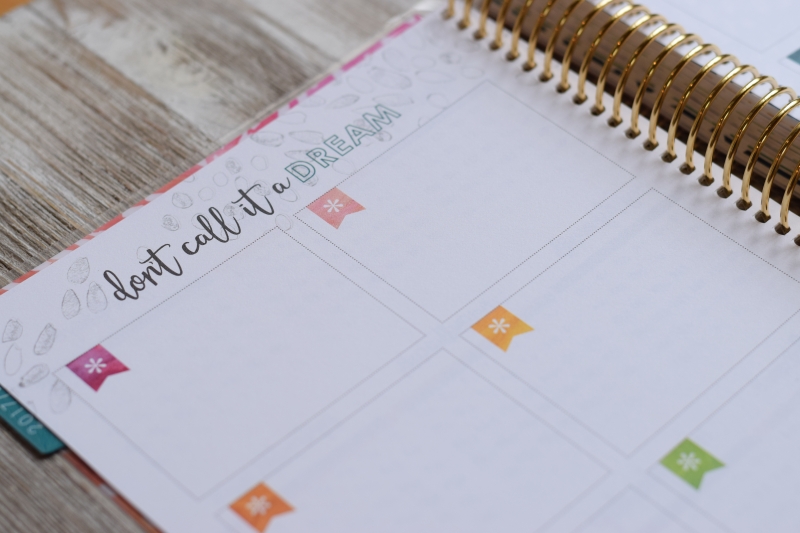
The next two-page spread was a bit of a mystery to me last year. It took me some time to figure out what to put here. There are 12 total boxes that correspond to the 12 months – or you can just use them as 12 empty boxes to set goals or record milestones! Use these for anything!
You can list personal fitness goals in one box, books you want to read, liturgical year ideas (by month or season), decor goals by room (I may incorporate that into this year’s new planner!). I love the addition of the little flags in each box this year. I do wish they were lined. sigh. I wish I could write straight without lines…sadly…I cannot. I’m working on it though!
FINALLY, WE GET TO THE MEAT OF THE PLANNER!
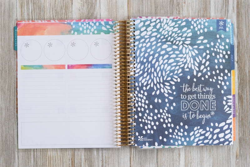
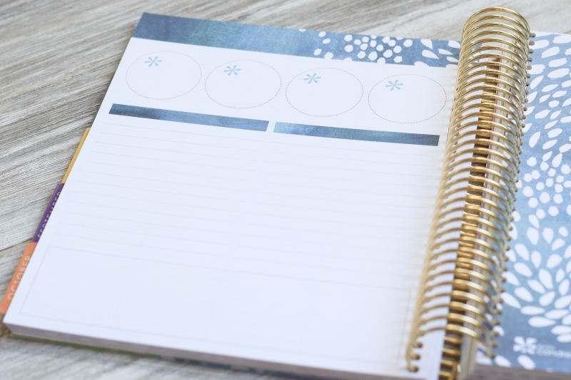
The lined page that comes before each month has been completely reformatted – and I’m a fan! I love that page and use it for my monthly to-do list and goals. The new changes simply reflect some extra formatting – think of them as “idea containers” – that help you organize this page. You can list budget goals, blog goals, home decor lists, chore lists, personal fitness goals and lists, significant baby moments – almost anything you can think of!
Each of the new monthly pages reflects the color theme for the month. The design incorporates four circles evenly spaced across the top, and underneath are two header ribbons that are followed by two lined columns. Hello listing happiness!! At the bottom of the page is a blank box that stretches the full width of the page – write your word for the month, verse for the month, the virtue your family will focus on that month, your favorite bottles of wine…or just list your major events here. I love the potential of these new pages! If you’d like to follow along to see how I plan on these pages I share weekly and monthly planner posts on my Instagram – I’d love to have you along – follow me!
You’ll find a monthly flag noting each month on the tabbed monthly page. The same petals theme merges with the color theme for a given month to create a beautiful palette of vibrant, jewel-toned monthly colors.
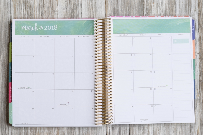
On the other side of that tabbed page are the monthly two-page spreads. What a beautiful watercolor wash!!!
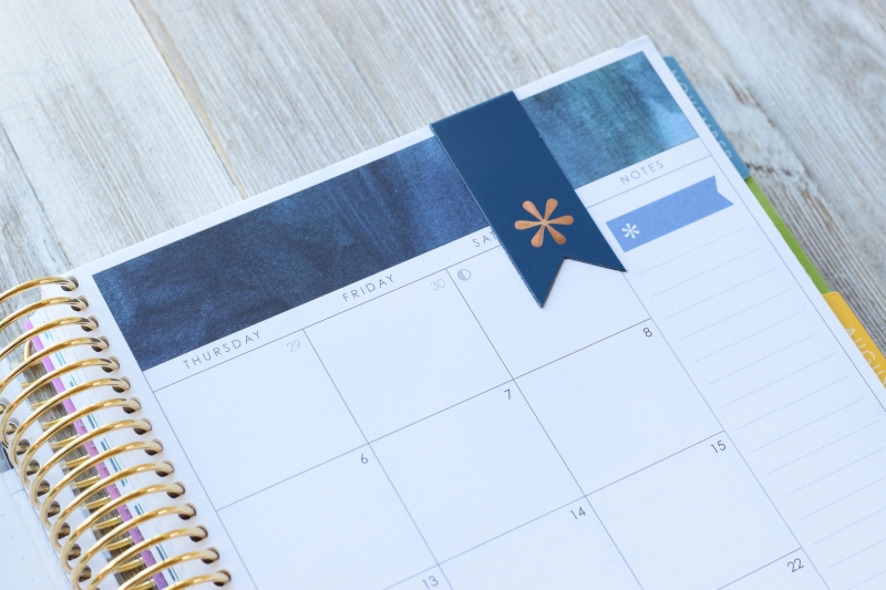
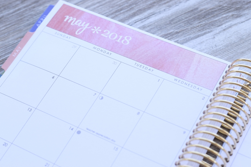
On the monthly spread, the ribbon of text (between the watercolor banner at the top and the monthly boxes) for the days of the week has changed. The days are now spelled out fully (LOVE! In the prior planners, to designate days of the week, there were only capital letters S, M, T, W, T, F, S). This used to be a solid, thick black filled ribbon with the white capital block letters – and now it’s white with text. Again…it’s a really small thing, but the streamlining in design adds to the overall sophisticated feel. It’s cleaner and ready for you to put more of your stamp on it.
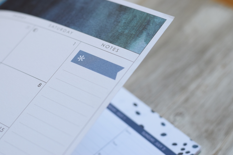
The sidebar has a minor change, too. Formerly, above the sidebar were the words, “goals and to-dos.” Now, there is a simple, color-coordinated flag – use it however you like – list monthly bills, home goals, books to read this month, chores, decluttering projects, etc.
The weekly two-page spread reflects a few minor changes as well. The box in the top left corner of every weekly spread is missing the words, “thankful thought” (which was in previous planners) and is now just another landing space for you to use however you like! Keep it thankful, add priority lists, themes for your week, a doodle – whatever you like! The box is YOURS!
Also missing are the colorful flags that used to be printed above the weekly sidebar (between the sidebar list and the box). And that gives us more room to list. Ahem.
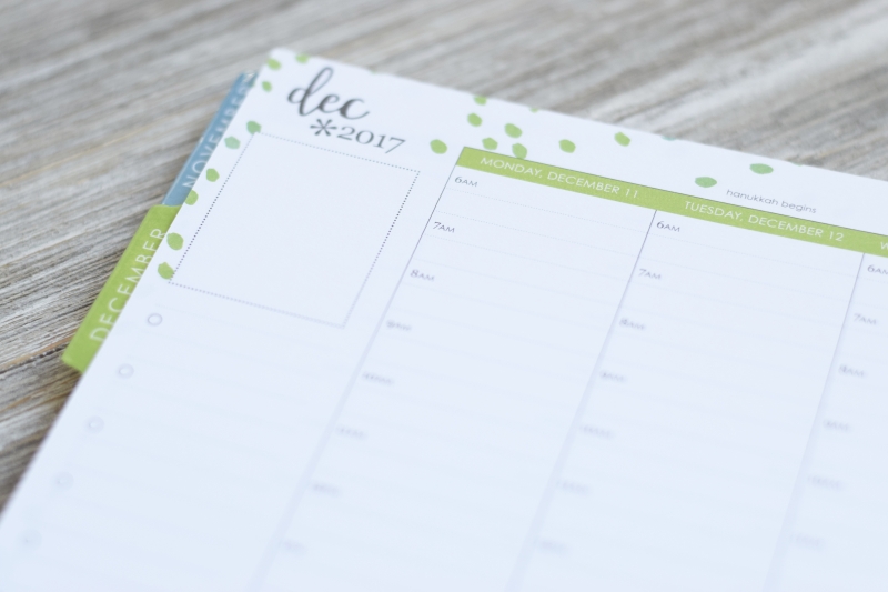
One more little detail to notice – look at December 12. Major holidays and events are noted on this planner. Last year’s planner included a wide, bold strip of black behind the text of the holiday that really stood out – it was weighty and a little clunky to me. I much prefer the current planner that includes the simple text.
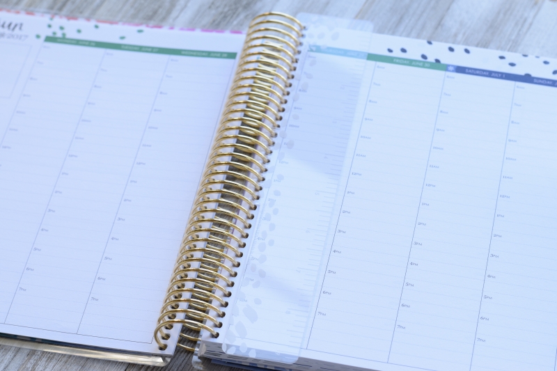
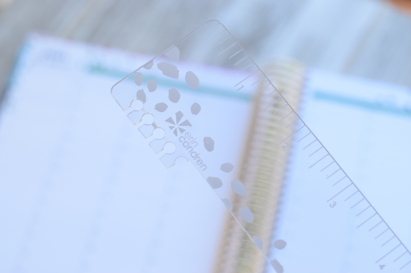
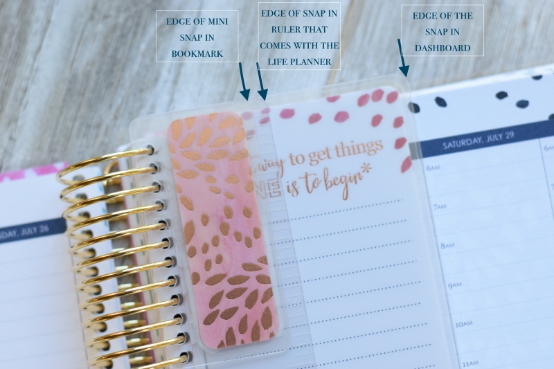
With each planner, you receive a snap-in bookmark ruler – use it to mark your place or edge a line in your planner. The open teeth allow you to move the ruler from week to week in your planner, and the ruler is completely transparent so that it doesn’t obstruct your plans when your planner is open.
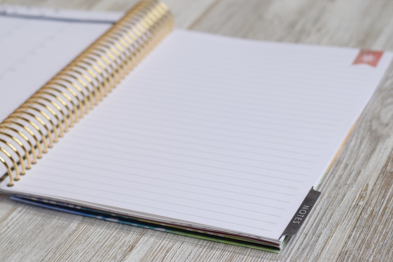
The notes pages remain behind the last days of your planner, but they, too, reflect some subtle changes.
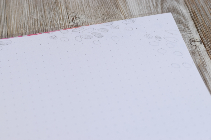
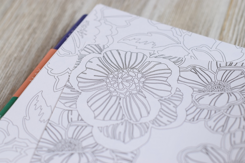
There are (3) lined pages, (4) dot grid pages, and (4) coloring pages! If you like to doodle, you’ll have fun with the coloring pages.
If not, throw a lined sticky note on the page and keep-on-listing! LOL! I’ll probably use mine for various pen tests (which you’ll see more of below…).
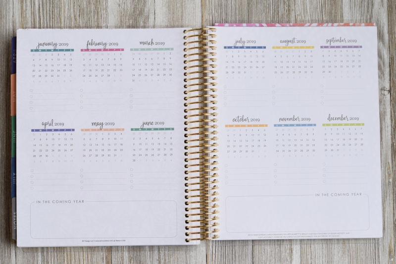
I love the future planning pages! Why didn’t I remember to use them last year? I had such good intentions. Mental note! I love the idea though – add transparent dots over pertinent dates, or list upcoming weddings or graduations. Note big events! It covers all of 2019.
The idea of this page is so appealing to me – I need to make better use of it this year!
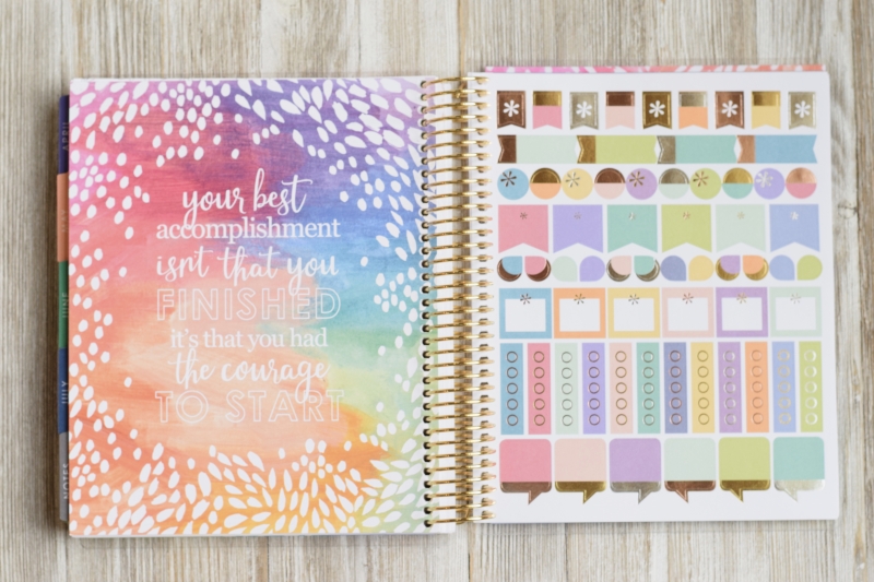
The last page of the planner itself is a beautiful wash of watercolor and petals and an inspiring quote – it’s so pretty it almost begs to come out so that it can be framed and hung in your office area!
And after that, we get to the stickers…
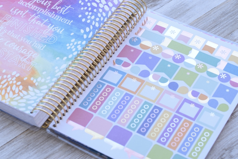
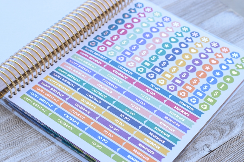
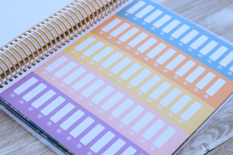
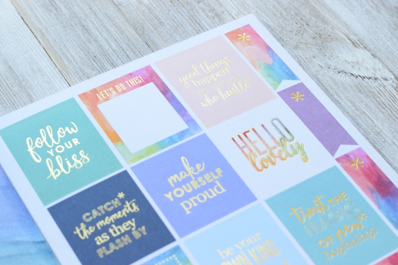
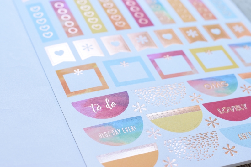
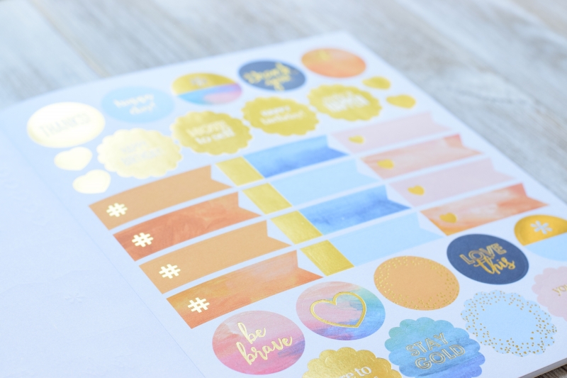
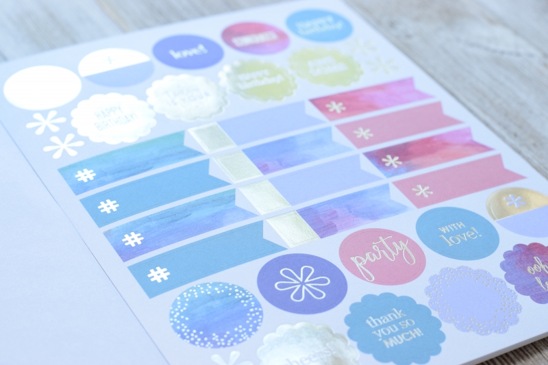
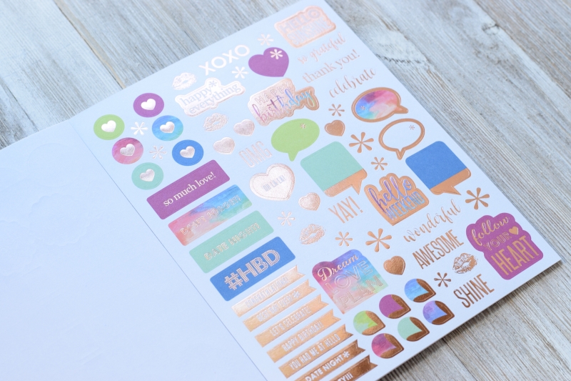
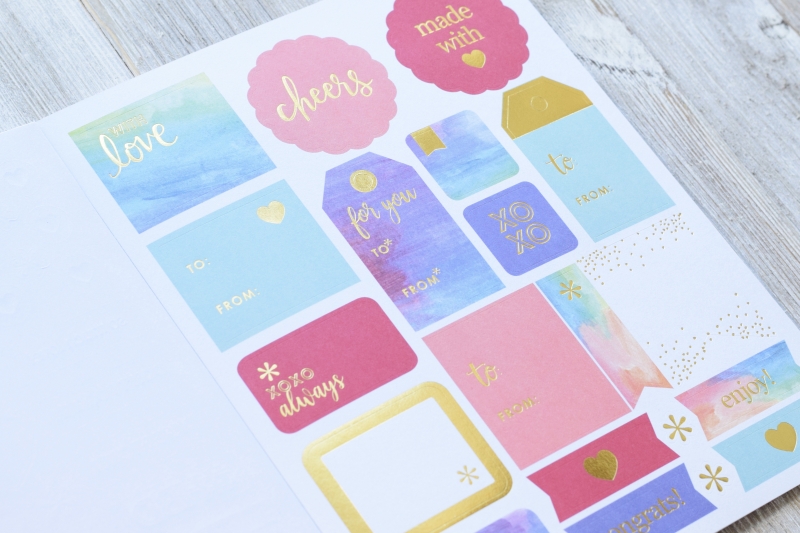
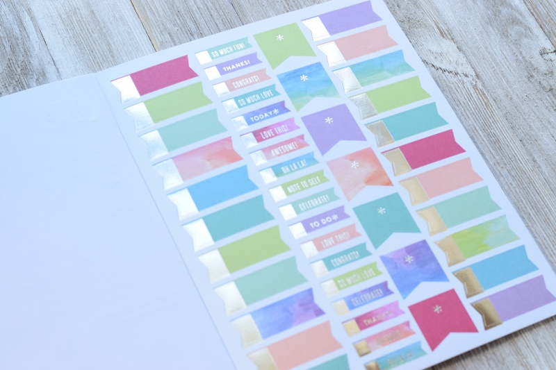
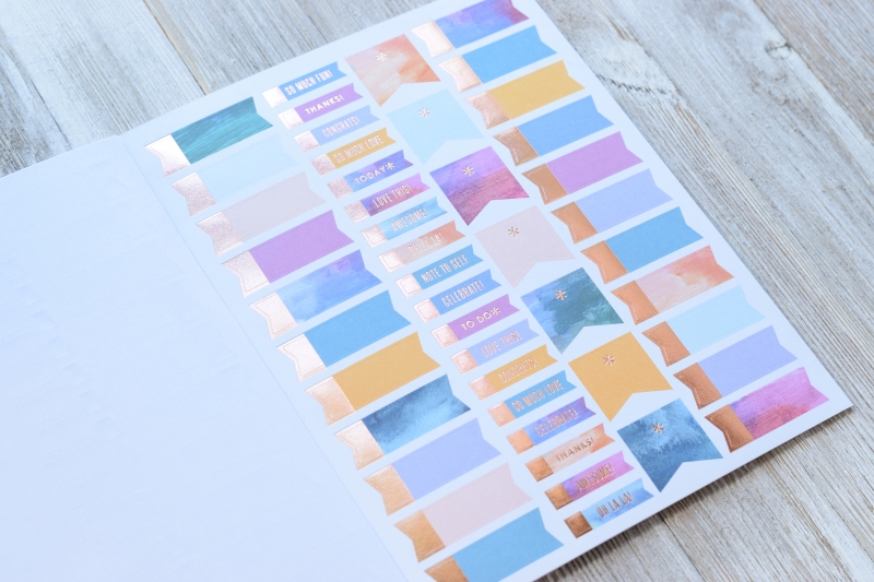
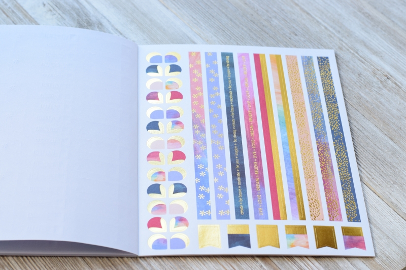
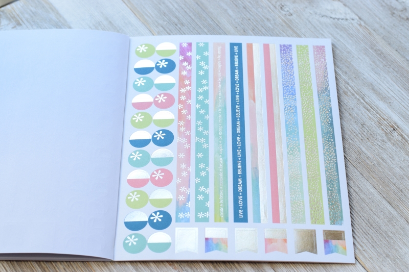
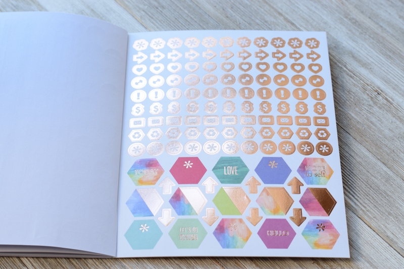
The included and coiled in stickers in the back of every Erin Condren Life Planner have become signature to her brand. Every planner, every year, has had stickers coiled into the planner so that wherever you are, you can grab a sticker. This year, Erin Condren knocked it outta the park – the new stickers are foiled metallic and are absolutely stunning! The colors match the monthly colors of the planner, and the styles are vibrant and fun and still supremely functional! Which I’m grateful for because I grind my days out in the practical…but it’s fine with me if there’s a little bling in the practical corners. And thus the joy over Erin Condren’s new metallic planner stickers!
It’s hard to tell in my photos, but there are a variety of platinum, yellow gold, and rose gold stickers on this page.
And she doesn’t stop there…
Look at those icon stickers!! Minimalist gals, you’ll love them! I can’t wait to use these on my monthly planner pages! And…can you tell…they’re all metallic again!
More…
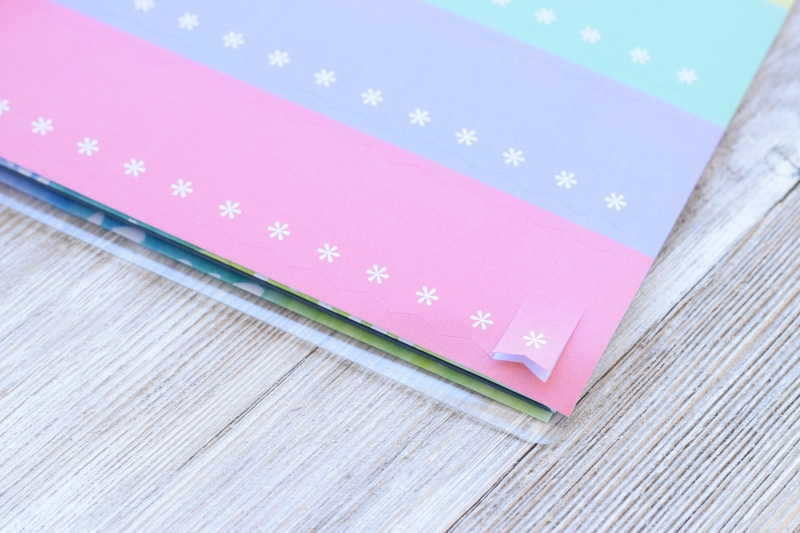
I lifted a flag sticker (below) just so you could see the outline.
Four pages of stickers – coiled into every single Life Planner!
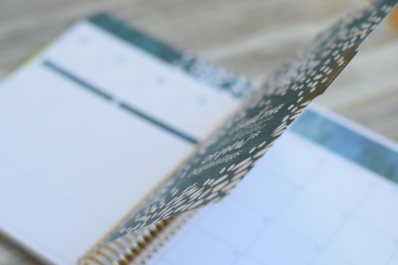
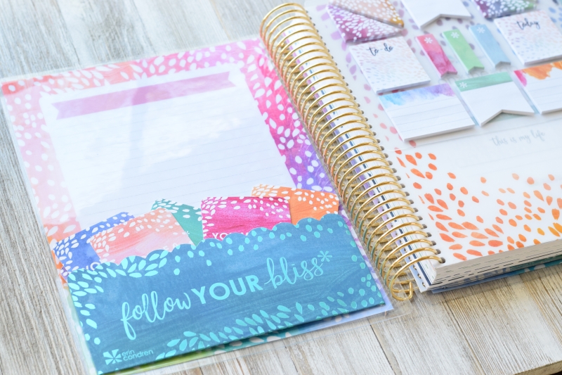
The back of every planner has always included the keep-it-together pocket that reflects the overall yearly theme. This year’s painted petals theme looks vibrant on the back folder pocket. Included in every Life Planner is the small perpetual calendar. The pages of the perpetual calendar list the days of the month – one month/page. You can list all the anniversaries, birthdays and repeating events here so that you can easily fill out your planner next year! Now, if you’re like me and you still have your perpetual calendar from your first EC Life Planner, you can use this in so many ways! Make it a small gratitude journal, a mini purse calendar (appointments only), menu planner, etc. Get creative! Because it comes with every single Life Planner!
The back of the keep it together folder has the small storage pocket. It isn’t super wide, but it will hold a few sheets of your favorite stickers or invitations and small memorabilia.
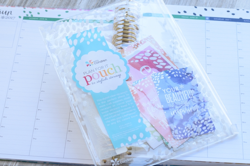
THE PLAN FOR IT POUCH
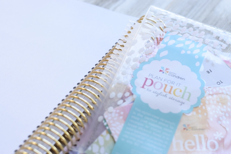
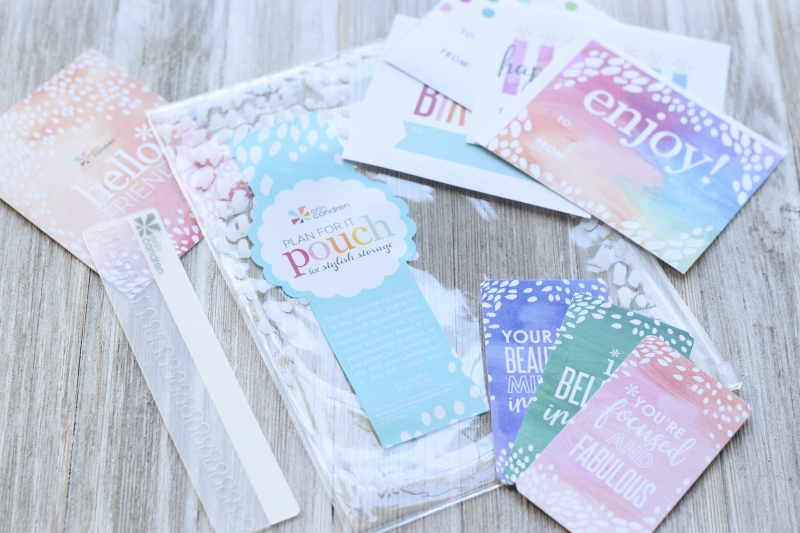
This pouch used to be coiled into the back of the planner, and it used to have an impossible little pressure based zip-top opening that drove me crazy…and made the pouch difficult to use. But last year, Erin Condren uncoiled the zipper pouch so that it was no longer bound into the planner, gave us a long coil clip with adhesive, and now we can move the pouch anywhere in the planner! Anywhere. That is brilliant! And the same design approach for the plan for it pouch is in this year’s planner.
And with the new design the zipper now slides with ease – oh my stars! I love, love, love this. It’s the little things, people! And when you’re buying a premium planner like this, you want the little things to rock!
Attach the included transparent coil clip to your planner – et voila! Your plan for it pouch can snap right in…to this week…or this month…or maybe you like yours in the front of your planner…or…no, you’re a back-of-the-planner-pouch-girl? You can move the plan for it pouch anywhere in your planner you like!!! OR – don’t add the coil clip and just keep the pouch in your planner bag and you’re good to go – less bulk in your planner, right? Whatever works for you!
And everything in the pouch comes with every planner – (3) compliment cards, the long coil clip for attaching your pouch to your planner, a little card with (2)!!! coupon codes for you or a friend to use when ordering from Erin Condren and the gift labels are back! There are 4 of them in each pouch!
And now…a quick nerdy word about the pouch…just look away if you don’t want to hear my phenomenally deep thoughts about plastic quality! This is a supple plastic, which means it bends and moves and gives. Why-oh-why do you care, Jennifer???? Because when you put a sticker sheet (or 23), or a set of pens, or anything, you don’t want to rake your knuckles off trying to get things in and out, and you want the pouch to feel nice in your hands…and this plastic pouch does. Ok. I’m done geeking out over plastic qualities!!
And that’s it, friends! That is the entire 2017 – 2018 Coiled Life Planner from cover to cover!
N E W T H I S Y E A R — H A R D B O U N D P L A N N E R S
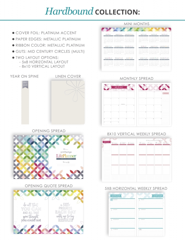
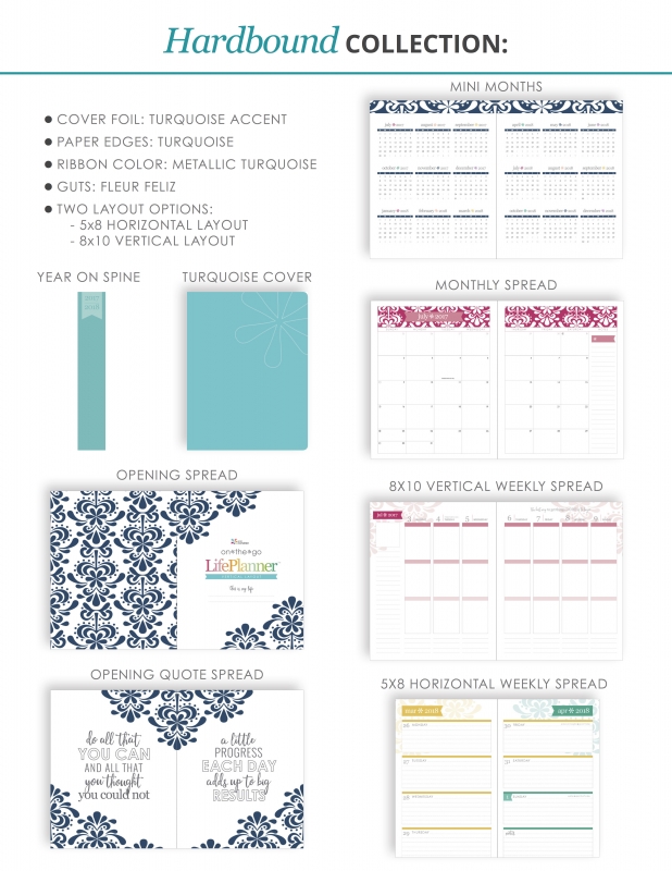
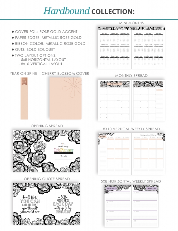
BIG NEWS!! There is now a hardbound version of the Life Planner!!!! I have a few on the way! These are a new product so they only come in two sizes and two layouts with four color options. The price point for the hardbound planner is awesome, and there are options for personalization! I’ll try to break down the choices because there are some limitations in terms of color and layout and it was a little confusing to me at first. You can choose:
- 5″x8″ hardbound planner – It comes in horizontal layout only! (No vertical. No hourly.) There are 4 different color options (black, linen, cherry blossom, turquoise) and this size is $30.
- 8″x10″ hardbound planner – It comes in vertical layout only! (No hourly. No horizontal.) There are 4 different color options (black, linen, cherry blossom, turquoise) and this size is $35.
– L I N K S T O S H O P F O R P L A N N E R S –
- You can shop for the Classic Coiled Life Planner HERE.
- You can shop for the Coiled (Permanent Cover) Luxe Life Planner HERE.
- You can shop for Hardbound Life Planner HERE.
- You can shop for the new accessories HERE.
A C C E S S O R I E S
These don’t disappoint this year! There are some fabulous new accessories so let’s get right to it!
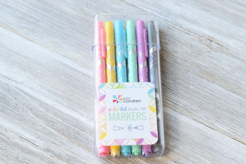
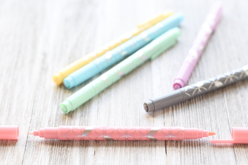
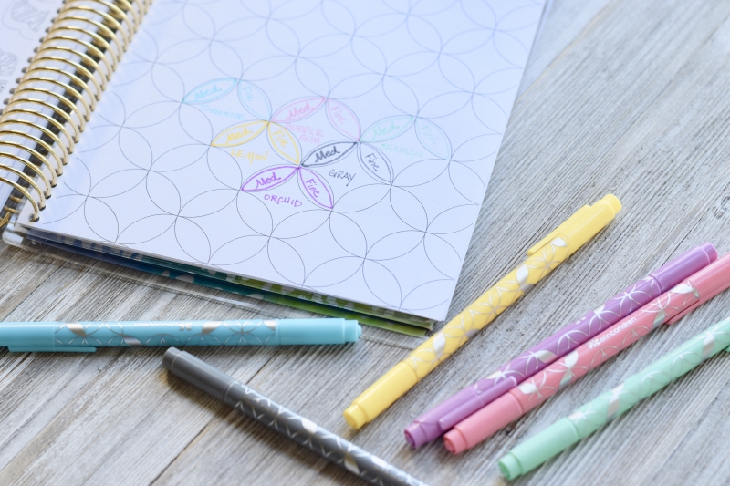
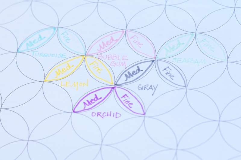
The new dual tip markers are available in softer, pastel colors, and they are just fabulous! Like their bold cousins they offer two tips – fine and medium.
These are my favorite pens for writing out my chore charts and fridge calendars – pop over to my Instagram to see examples of those!
The seafoam is very light, as is the turquoise, but the lemon color is surprisingly vibrant! Lemon is going to see a lot of use here!
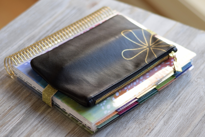
The planny pack is a brand new accessory, and it is going to be a big hit! There are three color choices for you:
- black with gold accents
- linen with platinum accents
- cherry blossom with rose gold accents
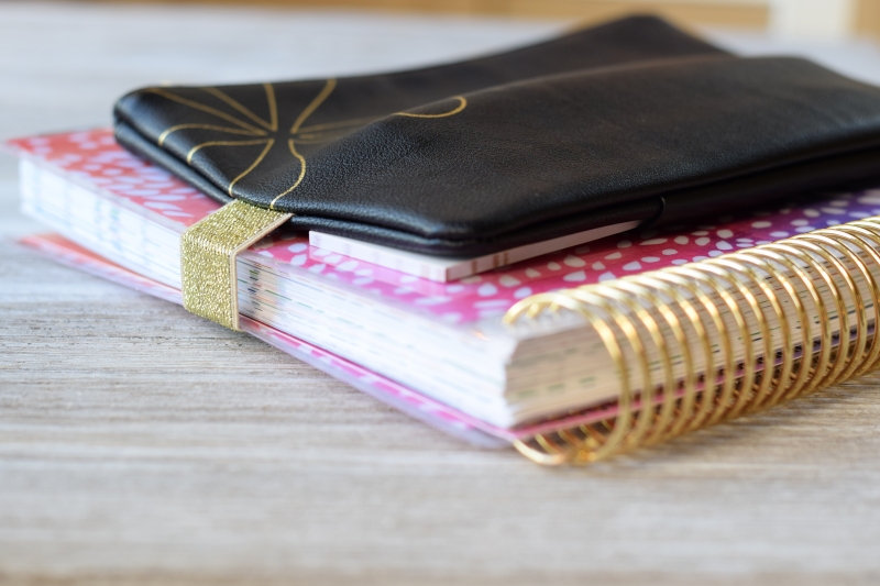
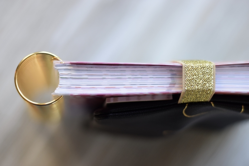
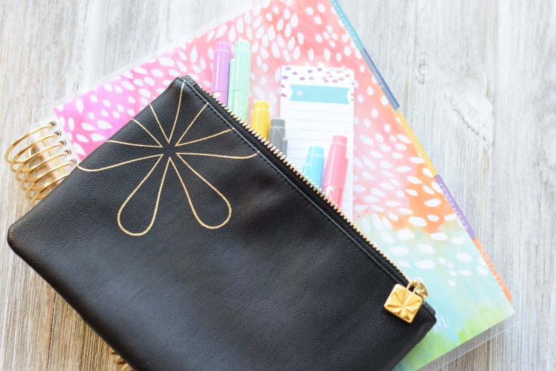
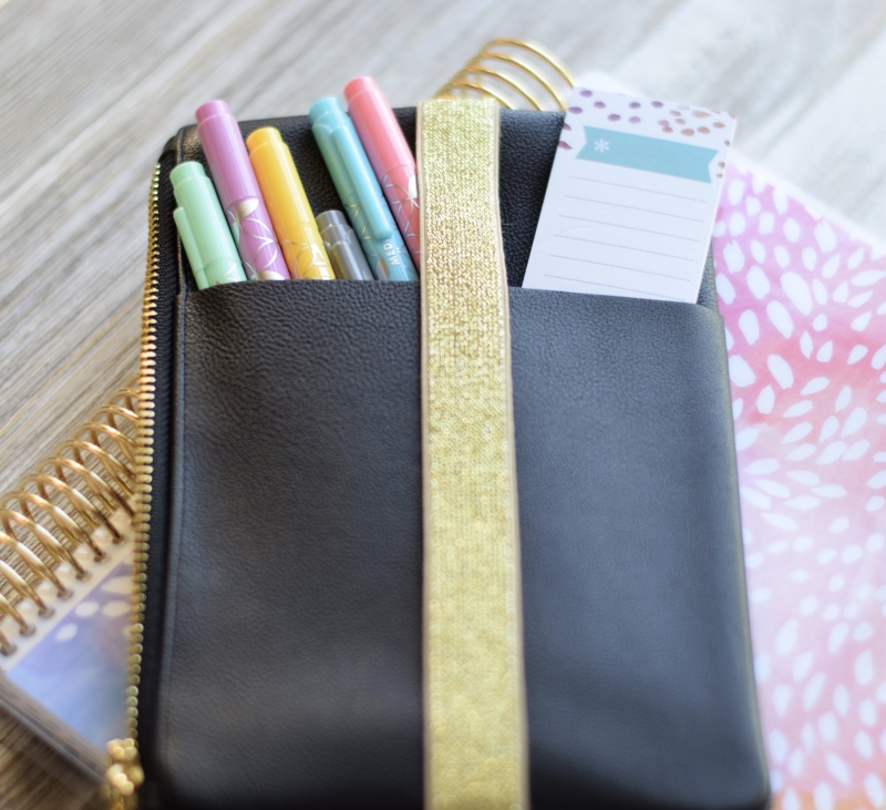
Each planny pack has a coordinating elastic that will wrap around the entire planner, or just the front cover – your choice!
With that elastic wrap, you can use this to hold your planner together when you’re on-the-go!
Add your pens and planning supplies to the interior zipper pouch…
Or keep a few essentials tucked away in the exterior pocket! This new pouch is going to be so popular!
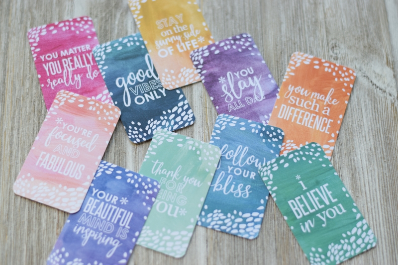
The compliment cards got a vibrant makeover! And they’re just gorgeous!
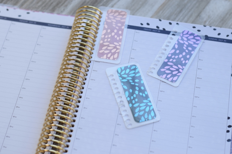
The metallic mini snap in bookmark was my favorite “little thing” from last year’s release. They’re small and easy to pop in to mark my place or move around.
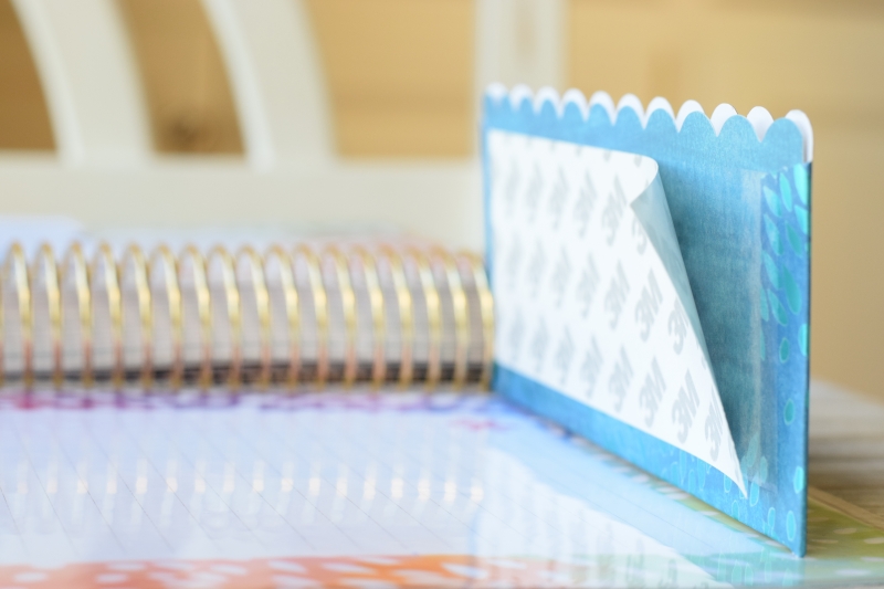
And the mini storage pockets reflect the same jewel tones with a pop of metallic.
They each have a wide strip of 3M adhesive on the back – stick them wherever you need a little extra storage in your planner!
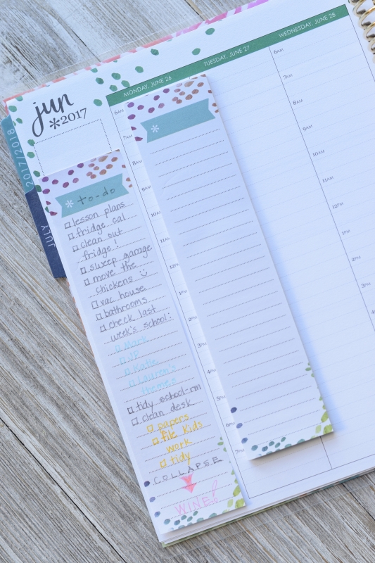
This super inexpensive ($4) sticky notepad is definitely going to be one of my new favorites!!! It has adhesive down the back 1/3 of the paper, and you can add some serious listing wherever you need it in your planner! Since the sticky/adhesive extends a substantial way down the note, it stays put so well! It fits within the vertical column of my hourly with just a teeny bit of overlap, and it fits in the sidebar of the weekly spread perfectly, as well as the sidebar of the monthly spread. And y’all, I moved this same sticky note around again, and again, in an attempt to get a good photo and to show you how versatile it is…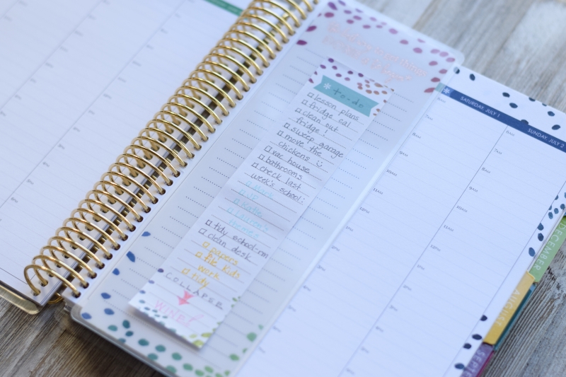
…and it just kept on sticking! Here’s my final move for this one sticky note (the visible crumpling is my fault! I pulled it up hastily and bent it over on itself and thus…a bend) and this is probably where it will live in my planner – on the new painted petals dashboard. I love, love this little notepad!
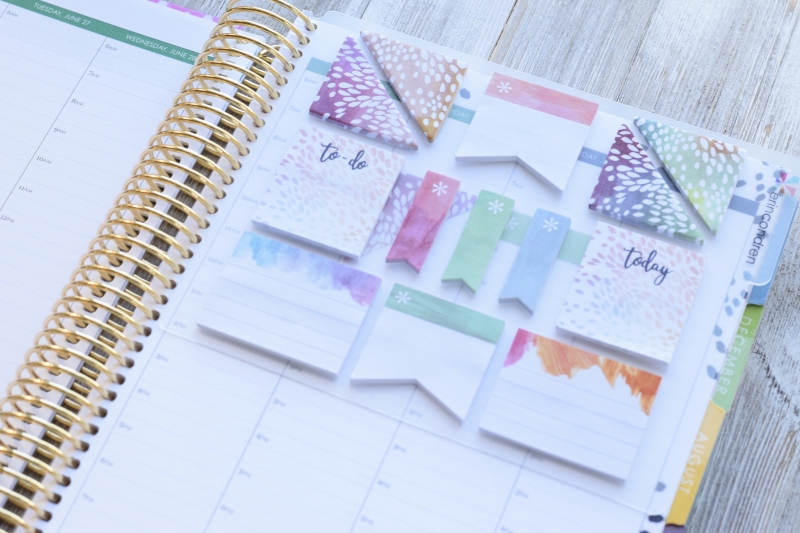
Oh. my. stars. The new and redesigned snap-in Stylizedsticky notes are beautiful! They reflect the painted petals theme and include some different shapes. The update that you can’t see is how much sticky adhesive is now on the back of these sticky notes – the adhesive extends halfway down the back side of each little note paper. A full half of the note is stick-y-fied. It’s a little thing again…and it’s a big deal if you’re using these on your planner and you want them to stay put! The little dashboard snaps right into your planner! Use the sticky notes for pre-planning (jot an event or to-do on a sticky note and then make it more permanent when you have time to sit down with your planner and really think your week out), or use a little rolling adhesive to ensure the sticky stays put and make these a more permanent part of your planning. I do this a lot when I plan because I love ALL of the designs in the stylized sticky notes. They’re super affordable ($10 each) and add a little somethin’-somethin’ to the daily plan!
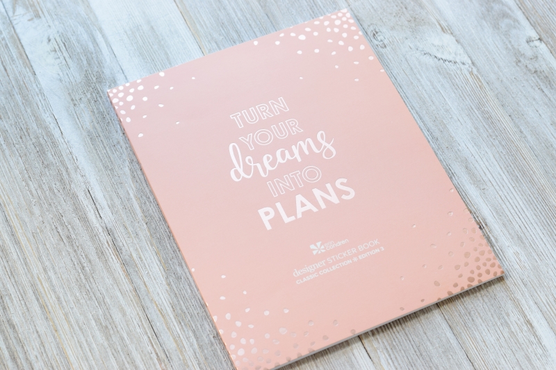
Last…but not least…is the new sticker book! It’s full of metallic foiled stickers in many new designs and shapes! It’s eye candy from beginning to end. Each page alternates with a different metallic foil – the first page is yellow gold, the second page is platinum, and the third page is rose gold, and that just keeps repeating through the book. The style is unmistakably Erin Condren, and the variety is unbelievable. Stickers. Oh yes. This book needs to be on your list! Hang on…because I’m going to give you a glimpse of almost every single page of this metallic beauty!
BONUS FEATURE
This is a comparison of the different tools you can use to mark your pages in the planner and how far out they extend into the planner. In case you were wondering. But you probably weren’t. Because only *I* geek out over such details. But in case you’re a closet planner geek…behold…a graphic. LOL!
Still not sure which planner style is perfect for you? The Classic Coiled, the Luxe Coiled, or the new Hardbound Planners? Click here for a comparison on Erin Condren’s website.
Phew! We made it!!! If you made it this far then you are a serious #plannergirl and you must have really been interested in the details of the new Erin Condren planners and accessories releasing on May 4, 2017! And if that’s the case, you might be interested in this link –> it’s a coupon link for you! If you’re a new Erin Condren customer, click through, set up an account, and Erin Condren will email you a coupon for $10 off your first order! Every little bit helps!!
If you’re still on the fence about the cost of this Life Planner, consider that a classic Life Planner that lasts for a year starts at $55. If you spread that cost out and divide it up monthly it works out to be $4.60/month. So, a little over $4 to manage your time and lists and family and appointments….for a month? And in style!! That’s a fair price for a worthy tool! This planner won’t fall apart, and keeps up with you, whatever your season of life – ask me how I know! I’m a hard working mom of 5 kids and my days are full. If I review something here it’s because I love it – because it works itself out in the practical corners of my day and brings some beauty to it. This Life Planner has walked with me for 4 1/2 years now, and it’s a product I love to use! Erin Condren products are all so carefully and thoughtfully designed! All completely made in the USA – so important to me! And Erin Condren started this business from one single idea – it’s home grown and now it’s a thriving business. Way to go Erin!
I’ll be back to review the new hardbound planners for you soon! Let me know what you’re ordering when the new line launches on May 4 – I love hearing!! And drop me a question in the comments if you have any!!
H A P P Y P L A N N I N G
Interested in past Erin Condren planner reviews?




What a thorough review – thank you! I can tell you really loved it…lol! I think this design is just that bit more elegant than past designs too, as you say – sophisticated. Planner dreams 🙂
You introduced me to Erin Condren planners a few years ago, and I’ve made many purchases through them, but I have been so disappointed in them using OMG in their advertising (I did write in and they apologized and basically said it wouldn’t happen again) and NOW they not only still use it in advertising, but also are putting OMG on their little post-its. Really?! That’s offensive to me, (hello second commandment!) and I already told them about it. So disappointed. I’m moving on to Limelife Planners, which are very similar.
I understand your objection and I’m not a fan of the phrase either. I’m glad you’ve found another planner you’re pleased with! Happy planning, Amy!
It could mean “Oh My Goodness”
If you don’t like it, don’t buy it. I personally think that OMG is cute, it could stand for many things. I think you may be being a little too sensitive about it.
It’s the most beautiful review I red still NOW! thank u so much, i’m gong to receive my first EC planner and I’m so excited(.. how can i resist to decorate it, I bought the 2018 annuale planner,,)
I’ll follow u in Instagram tooo…
By,
Mariangela from Florence, Italy
I love the design. I would love to see the same design throughout the teacher planner. Do they ever update it? I’m fairly new to EC.
It’s my understanding that there are some updates to the Teacher Planner this year, but I don’t know what they are yet.
That’s exciting news! Thanks for your response. I’m curious as to which layout or book do you currently use for your homeschool needs? I think I saw somewhere that you use a lifeplanner for lesson plans. Am I wrong?
You’re exactly right. Right now, I use a horizontal layout Life Planner for all my Morning Basket plans and attendance and administrivia. I love the LP layout for those plans! I build and print my own lesson plans for each child’s individual work. You can find those in printables.
I had not considered using a life planner for my homeschool needs, I do a mixture of printing lesson plans and writing some in my planner as well. I’ll have to give it some thought, and see if it would be something that would work for me.
I appreciate your prompt reply, especially since I know you are busy with wedding preparations. God Bless.
Jen,
An odd question on the planner post but could you reply with your home wall colors? They look great, we’re in the middle painting the entire interior of our home and are basically tonal using beige and brown and as the main swatch. Thanks so much.
Hi Anastasia,
The main wall color in most of our home is teatime in satin finish, Behr Premium. The color of my schoolroom is fennel seed by Sherwin Williams (it’s a soft, creamy yellow color).
Thank you for the GREAT review! I am most interested in the new paper. I hope it is like Plum Paper, I love their paper.
Absolutely loved this post! So thorough and helpful!! I have been using EC planners for 4 years and get more and more obsessed every year! lol! I am just about to order mine and I know I want the Painted Petals cover but can’t decide if I want the gold or rose gold coil!? I have had both in the past and love them both. I was thinking gold since I had rose gold last year. After seeing it in person would you still choose gold? I think they would both look amazing but I was just curious if you thought one would match better than the other (with the stickers packages etc). Thanks so much for you help! xoxo
Hi Nikita! The painted petals cover is so gorgeous! Personally, I think the vibrant tones of the painted petals cover would look best with the gold. The gold coil just pops against that cover. Enjoy your new EC!!! 🙂
Thank you so much for your response, I really appreciate it! I am happy you said gold because I feel like that was definitely what I was leaning towards! Enjoy yours as well 🙂
This is great! I love EC and have been using her planners for 5 years 🙂
Any clue what font the script is that is used for the months and throughout the planner? I must have it!
Hi Julie! I think the font EC uses is something custom she created in house…but you can get REALLY close with buttercup, which is free at dafont.com.
Thanks so much for your detailed review! It really is so lovely. We are embarking on our first year of homeschooling this fall and I’ve been looking for the ideal planner–I thought the horizontal layout might work well for us and I saw in another comment that you use that as well! I know there are actual planners designed for homeschooling families, but so far I think I like the EC planner better than the ones I’ve looked at!
I love my horizontal for homeschool, Chrysti! Although…the new Erin Condren Teacher Planner may give it a run for the money! I just received the new teacher planner yesterday…and it’s gorgeous. I love some of the layout deigns. I’m keeping my horizontal, but I’ll review the Teacher Planner soon – so watch for that review. And if you’re on Instagram, I’m @jenmackintosh, and I’ve been sharing pics as I set up my horizontal planner for homeschool! I always share homeschool set up pics as well as lots of planning pics there! I’d love to have you along!!!
Hello!
I’ve been pouring over your review and trying to decide between the Life Planner and the planner put out by Blessed is She. Have you seen it? I like the style and look of the EC planner, but I really like the two page weekly layout before each two page daily/hourly spread for the same week in the BIS planner. If that makes sense? 🙂 Anyway, that’s a practical feature that I don’t see in the Life Planner–unless I’m missing it? I like that I can have a running list of all my to-do’s, weekly menu etc. on a page, then turn the page and plug those things into specific days. And that is there for each week.
Does the EC LP have that feature? Or would her equivalent be using the long sticky note that you showed to have your running to-do list, and then plug in those items to each day? I’m not sure if this makes sense, but I’m interested in any advice you have! That weekly page in the BIS planner may be the tipping point, though I prefer the EC design! How could I make it work?
Thank you so much!
Hi Jenny!! Thanks so much for your note!!
I haven’t seen the Blessed Is She planner, but I do know the planner you’re talking about! It’s a pretty planner!
While the EC planner isn’t going to have the fixed two-page spread that you’re referring to, let me give you a few ideas of how you could incorporate that SAME idea in the EC planner. I love having my to-do lists in my weekly spread, but somewhere along the way last year, my to-do lists outgrew the weekly pages. EC offers an inexpensive product on their accessories page called a coil clip (https://www.erincondren.com/accessories-coil-clips) and I use these extensively in my EC. It’s a small piece of plastic that clips into your coil anywhere in your EC – and on the other side of the clip is a sticky strip to attach to a piece of paper. I used this to build lengthy to-do lists and goal lists and coil clipped it into my planner. The great thing about the coil clip is…it MOVES!! So, if you don’t finish your weekly list, just pop it out and move it to the next week!
Another feature of the EC that works well for bigger picture monthly goals is the monthly page before each monthly layout. I often drop repeating tasks there – like house cleaning, or budget check-ins.
And a final idea – if you really need a dedicated daily page for a particular day – just use the coil clip idea and clip it right into your week. The coil clips are the most versatile accessory on the Erin Condren website and they work for so many things – adding lists, invitations, business cards, important reminders, monthly/seasonal menu lists, home tasks (I build mine by season and check them off so I like that my list can coil clip into a month, and then move to the next month!).
*IF* you’d like a recommendation for paper for your lists – I recommend the EC journal – https://www.erincondren.com/journals (I like the dot grid). The paper is perforated in the journal and is the exact same size paper as in the Life Planner so you can just tear out a sheet, build a list, coil clip it into the Life Planner and go! And the journal will provide a constant supply all year long!
Hope these ideas help, Jenny! Good luck deciding on the planner that is the best fit for YOU!!!
Thank you so much! I appreciate your suggestions and insight, and your quick reply… now I have more to think about before I make a decision 🙂
Have a blessed day!
Thank you so much for your review! I was actually one of those who left ECLP a couple of years ago because of the paper quality being so bad, but I love the new look and I’m so happy to hear the paper is so awesome! I think i’ll be trying it…
I’ve been very disappointed with the service that Erin Condren provided. For as expensive as this product is for a planner, and for having to still pay shipping, I expected my planner to arrive at least close to the delivery date. My purchase was not even shipped until a day before the due date. A couple of days difference I may understand but it’s now a day past my due date and I still will not receive my package for at least a week. Not only does this company not have a way for me to immediately speak to someone on the phone and solve this problem, but their ‘chat’ that is supposed to replace that fast service did nothing to help. I am left disappointed and upset and my package hasn’t even arrived yet.
Rachel, I’m sorry your experience has not been good!! I have heard from some customers that communicating through their Facebook page yields rapid communication. I have had some orders arrive with a mistake – no one is perfect – but the EC customer service has always made every order right. I truly hope your order arrives soon and you’re happy with it!!
Hi – I am thinking of buying my first EC planner, but I’m curious as to the weight of the planner. Is this easy to carry around or is going to really weight down my work bag?
Thanks for the thorough review!!
Shelley, I don’t know how much the planner weighs although that detail may be on the website. I carry my planner whenever needed and though it does add to my tote, it’s not a bother to me. I guess it really just depends on how tolerant you’ll be of a Life Planner in your work tote.
thank you for such an amazing detailed review!